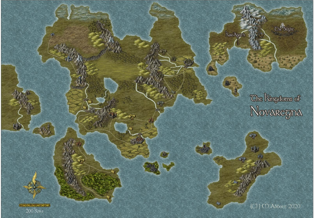
WIP Novaregna
Welcome to a dark and gritty world. A world where you live & die by wits and steel in equal measure. Where the Lords of Order and Lords of Entropy battle for your soul. All the while, the Elder Gods, unspeakable beings from the great beyond, infect the dreams of men to hasten their return so they may feed...
Welcome to Novaregna. Champions are needed, will you measure up?


Comments
I might have a chance in the wits category, but the steel is going to get me every time.
Great map, but I did wonder a bit where the large lake in the middle of the largest island was getting it' water from.
Hi Jim :)
It's me - Sue Daniel.
I can see your map a lot better here on the forum than I can on the FB Group page. It's looking good, too. I suppose that the catchment area of that inland lake Remy (Monsen) mentioned above could be fed by lots of little streams too small to be shown in this world map?
I always love seeing maps from this style and this one is lovely. My only recommendation might be to add some shading to the ocean.
Thanks for the comments and encouragement folks.
Remy, regarding the central lake - it's magic! No seriously, it really is an oversight but as of this minute let's say it's an underground watercourse rising to the surface and combine this with Sue's idea of some small waterways that are too small to see at this scale trickling down from the hills in the northwest.
Shessar, I thought that as well and whilst I'm at it I'll add some reefs around that group of islands for the pirates that will undoubtedly call one or more of them home.
I posted on the FB page that I read the mapping guide after doing the map and didn't realise the idea of styles with terrain fills for forests, like this one and I guess the Jonathon Robert's style also, was to put a scattering of appropriate tree symbols on top of, as well as around the fill. I thought you were meant to use the tree symbols just on the edges...silly me. So, rather than delete and re-do what I've got already which doesn't look too bad, I'll add some extra sheets and try that out to see how it looks and if it looks better I'll keave the existing sheets hidden or delete them entirely. I don't mind the jungles on the southern islands which is what prompted me to read the guide.
Great job on the upgrade of the Forum as well Remy, BTW.
PS: the name of the map is a portmanteau, bonus points for deciphering the meaning.
That's weird must be a FB thing, the one on FB is much higher resolution - they must compress them.
New Kingdom?
I think Remy has tuned the settings since I made that comment ;)
Larger images can be "uploaded" than pasted - up to 2 MB. And then there is always your personal gallery, where you can go up to 5MB. Though I would be inclined to use that facility only for my finished maps.
100% Correct, though I thought it was Kingdoms... now Google translate is giving me different results...
You may be right, regna may also be plural
Here is an update, apart from perhaps adding a nice border to the map (I'll have to read the Tome) the 'World" map is more or less done. Well, when I say that, it has as much detail as I'm going to put in. I'm sure someone will see something I've missed or have a better suggestion for something...
I 'fixed' the errant lake with no apparent source (thanks Remy), changed the river widths (thanks Sue), labeled the Kingdoms, re-did the forests using the fills, it actually looks quite good now that I know to put trees both in and around it?, added some ocean contours and decoration (thanks Shessar) and changed the scale to miles just to make it that little bit larger, well 1.6 x larger in fact.
Next job is to create a regional map of Galarith and some associated, set-piece encounter maps and then take it from there I guess. Wish me luck...Depending on time frame and when we start playing, I may have to 'borrow' some maps, creating new ones for what I publish...
Nice. Love the improvements.
I can't help but suggesting those cliffs north of the lake should be home to a waterfall though, if you can find a way to draw it.
Depending on time frame and when we start playing, I may have to 'borrow' some maps, creating new ones for what I publish...
The community atlas is full of maps you can borrow for your game sessions.
Looks like a great starting map, Jim :)
Remy is right - the Community Atlas might be a good place to source some additional maps if you need stuff in a hurry.
Nice map, the largest island appears to be 1000 miles wide so there is a lot of space for warring kings to fight over and ancient dungeons to loot.
I can't help but suggesting those cliffs north of the lake should be home to a waterfall though, if you can find a way to draw it.
@Monsen I like that idea - a lot. I'll have a play around with that once I get things up and running. I think I'll do some small rivers coming from the mountains on either side of the plains using the same drawing tool (colour key effect on the land sheet) for the rivers and then have another sheet for the 'falls' done with a fractal polygon filled with a similar colour as the rivers in front of the sheet with cliff symbols and add a transparency effect. At this scale that should look OK and give the desired effect.
Looks like a great starting map, Jim :)
@Loopysue By starting map do you mean, a starting map for the campaign or as a starting version of the map itself? Either way thanks! Apart from some minor tweaks, like a waterfall?, I probably won't do too much more to this actual map.
Nice map, the largest island appears to be 1000 miles wide so there is a lot of space for warring kings to fight over and ancient dungeons to loot.
@Beltharas69 Thank you. That was indeed the general intention! A peaceful realm is a fairly boring one from a role-playing perspective. Then of course, there's the ever expanding Blight to contend with, cannibalistic pirates (why not!) and of course the machinations of the higher powers...let's not forget also, the Elder Gods who wait to re-enter the realm with a fierce hunger...
I've decided not to label the structures and other geographical features at this point as the purpose of this map is to give an overall sense of the lay of the land, kind of a 'political' map.
This group of Island's represents a complete 'sphere' of the multi-verse as per the advice in the Elric of Melnibone setting published by Mongoose Publishing for the MRQII ruleset (IMHO, one of, if not, the best RPG supplements ever!). I'm pinching (and re-skinning) bits and pieces of that to use with Mythras 3E from the Design Mechanism which is an updated, and far more robust, version of Runequest. One of the PCs, as yet to be determined, will find themselves cast in the role of the Eternal Champion of this realm...whether they save or destroy it is up to them. Obviously, to avoid any copyright issues, I'll need to take care not to reference anyone else's IP in my published adventures and avoid key terms.
I also noticed, that the sea contour under the Eastern peninsular of the main island, looks kind of like a whale...very cute and unintentional.
I meant it the first way - a great base map to start developing the rest of your campaign in a series of larger scale maps :)
I wouldn't think that a waterfall would be visible on a map at this scale. That would really be for one of the larger scale regional maps.
I meant it the first way - a great base map to start developing the rest of your campaign in a series of larger scale maps :)
@Loopysue Cool. That's what I thought you meant, just checking. One can never be too sure in a purely text based medium. You're probably right about the waterfall, as is Remy, the rivers look the correct size now and that's using the small rivers tool. I'll save the waterfall for the regional map (if I make one for that area) and put your latest Annual masterpiece to good use! Can't wait to watch the Live Mapping video tomorrow!
Map nerdiness: Map scale is a funny thing isn't it? Topographically speaking, the smaller the actual scale, the larger the map 'scale' is considered. The map above, for example, is drawn at a scale of something like 1:2,000,000 and is considered a small scale map, whereas a regional map would be drawn at a scale of something like 1:100,000 and be considered a larger scale map despite the actual drawing scales being the opposite...no wonder non-map people get confused.
The map looks great. I do most of my maps in the Herwin Vielink style, but they sometimes suffer from the lack of symbols and its a challenge to make them look different within the style. Its a shame there isn't more symbols. The one thing I'm not so fussed about in this style are the foothills. I think they look more like spoil heaps from a mine, which is what I normally use them for.
Thanks Winterblight. I have to agree regarding the lack of symbols. I think this style suits the S&S vibe I'm going for more than the other overland styles but the lack of symbols is definitely a challenge. It would be all but unusable for anything other than a basic map as it was released in the 1st annual. Thank heavens there was the symbol add-on later.