

Dragon sheet

Hey all. I'm playing about using CC3+ to make an image of the cosmological arrangement of a fantasy setting. A big WIP, and I'm still deciding on symbols for the Wanders (sun, etc).
What I'd like to add here is the Dragon cutout from Sue's Marine Dungeons 2, with the bronze underlay. The dragon would rest over the trees, head at the top, tail at the bottom, and then have a transparency effect added so it's a thin, ghostly image superimposed over the rest of the cosmological diagram (the Dragon symbolizes spiritual force in this setting, blah blah blah).
I've had fun figuring out how to make things for this image so far, but I am not sure how to do this dragon thing. Any idea?


Comments
That would be tough since this isn't an art program.
My suggestion is have the tree as a base. Then do the Dragon over that. And then use poly's mimic the tree over the body of the dragon.
Probably 20 or 30 polys. That's how I would attempt it.
Insert the dragon image (not a symbol, but the source image) on its own sheet at the bottom of the sheets list and apply transparency to that? Or have I completely misunderstood what you're trying to do?
I'll give that a shot. This has been lucky so far. The "cosmic ocean" has a glow effect on it that is blending nicely with the glow from the upper tree, and it shouldn't. The first time I exported it, the glow was essentially rectangular, as it's on a large, rectangular object. I didn't change anything but now it looks good (middle sides of the image, like a glow on the horizon).
The problem is the dragon image is a cut out, and basically appears purple. In the Marine Dungeons 2 issue, you can add a bronze layer under it that then shows through the cut out dragon. Basically, it's two things being displayed on two sheets--a bronze layer below, and the cut out dragon above so the dragon appears to be a bronze inlay (see image). However, if I try this I basically have a bronze square or circle that sticks out beyond the borders of the dragon.
In the image attached, the cut out is circular, so you can match them, but of course the dragon shape doesn't allow for that.
Now, if I could use trim entity to trim the bronze underlay to match the shape of the dragon, that'd work, but I don't think that's possible at all.
Cc3 exports the image as a series of bands, with the default size of each band being 4 Megapixels. There is a 10% overlap between bands to try to avoid clipping of effects, but it sounds like the glow on your export is being clipped at a band edge (it manifests as one or more hard horizontal edges that you don't see on screen). There's a command to up the number of pixels in a band, but I don't recall it at the moment (I want to say it's exportmppp, but that doesn't seem quite right).
The trick Sue taught me was EXPORTSETMPPP 40000000 (that's 40 million).
Is your dragon a magenta or varicolor symbol? I'm trying to wrap my head around what it's doing.
Here's what the dragon looks like, fresh out of the symbol catalog. The purple is just how it shows natively, it's not varicolour. It's basically just a cut out. You place a shape below it on another sheet, using a bronze bitmap fill. Basically, the dragon cut out is a window that allows a bronze layer below it to show through. The second image is an example from that annual--it's not a bronze colored symbol added to the floor; the bronze is under the floor, and the circular runic thing is a cut out that lets the bronze show through. Basically, you need both the underlayer and the dragon cut out to avoid it just appearing as a purple thing.
Oh, I see. In order to do the brass inlay, the brass sheet would be over the rest of the image. Now I'm following. Unfortunately, I don't have a solution. That's a great dragon, by the way! Is it a standard CC3+ symbol or is it your own?
Never mind, I see it in Marine Dungeons. How funny that I've never noticed that one before, given how much I've used that brass inlay and keep hunting for dragon inlays. I think I thought it was an insect.
I think it was one of @Loopysue 's greatest hits. Just amazing concept and executed wonderfully.
LOL! Yes, I used to be much better at drawing dragons...
Many years ago, at art college, I was berated for drawing fantasy creatures by my tutors, so I stopped doing it. And now, 40 years later, I'm not as good at dragons as I could have been if I hadn't listened to them.
I blame my eyesight and my refusal to get proper prescription glasses. Even though I often click on every symbol to see it closer, I don’t recall doing that with the dragon, so I only saw the thumbnail preview. I would absolutely have used it on my dragon landing pad on my Sea Elves Harbor.
not just the dragon, I meant the entire bronze+cutout suite in MD2. Just amazing
I forgot to thank you, Jack. Thank you :)
Those are vector symbols, which means that your job is really easy. Place an instance of the symbol on your map, then use EXPLODE on it to convert it from a symbol reference to polygons (technically multipolies, but that's good enough). Use MOVESHT to get the multipoly to the sheet you want. Use MPEDIT to change the fill style to bronze and you'll have the entity on a sheet where effects can work on it and in the fill style that you want, all where you want it in the order.
Or maybe I misunderstood again?
That is awesome. I use explode a bit, but I didn't even think to use it in that instance. Excellent advice.
This might work! I'll give it a shot and report back!
This absolutely worked 100%. I'm playing now to try and get the image to look less...busy. But it worked, dammit! Thank you!
Yeah, one thing about the brass inlay fill is that it doesn’t really work as a fill for small things. (I’ve tried!) It’s meant as a cut through fill. But if you change the scaling, it might look ok.
Try multipolying the shapes of your design together. That will bring the inlay fill into alignment throughout the pattern and make it look a whole lot less busy.
@jslayton @Loopysue @Royal Scribe
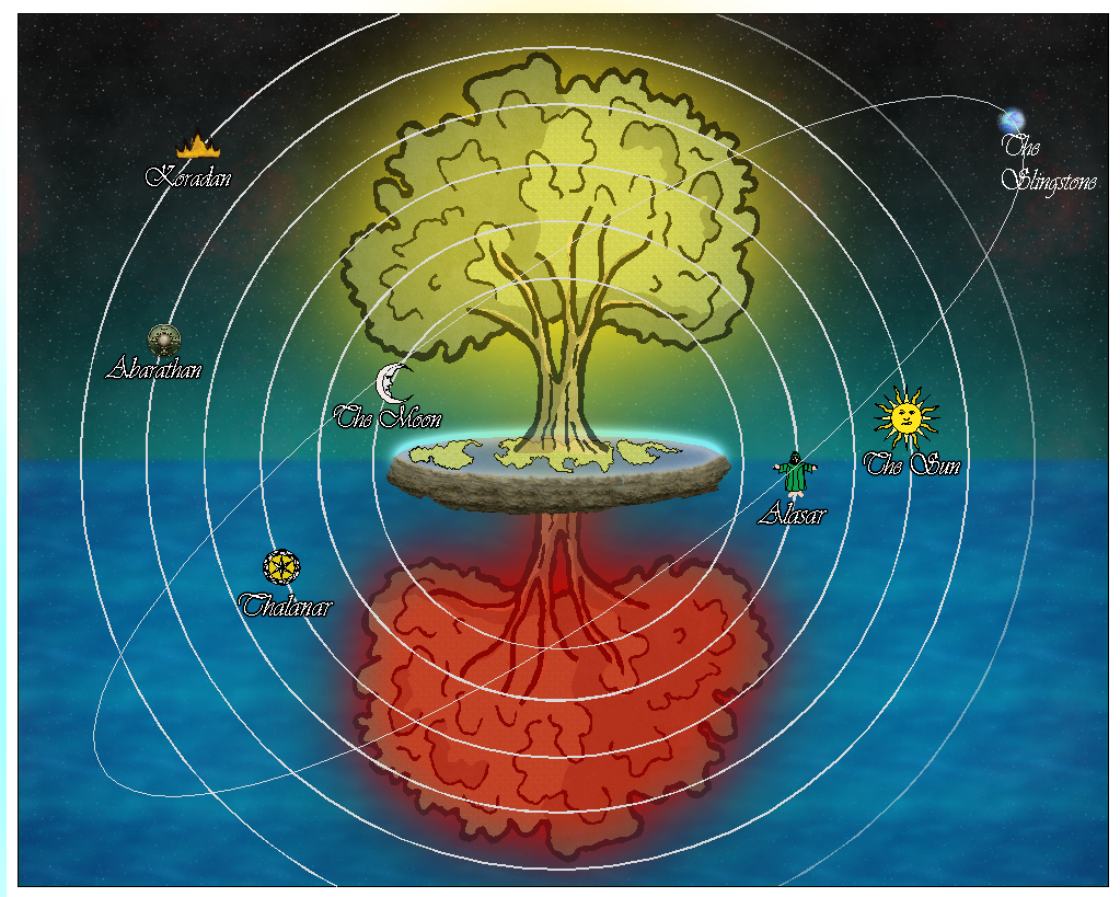
Ok, so the dragon didn't work the way I thought it would, but learning to explode symbols and play with them was a game-changer. I was able to replace the trees (I wasn't thrilled with the originals, but I didn't think there was an option). So here's the cosmological diagram now. Still thinking about symbols for the Wanderers (planets) and have some more labelling to do, but I'm more enthused about how it's currently looking. Thanks everyone for your advice!
It looks fantastic!
Thanks! It's been fun (and very educational) to try and make a non-map image in this software. I've got some more ideas now also, that I've learned about Explode!
Yeah, I’m going to have to learn more about using Explode. I’ve only used it for a few things so far.