WIP: Bleakmoor Harrow - Continent of Estonisch
 Calibre
🖼️ 39 images Mapmaker
Hey all,
Working on a revision of current adventure map. My previous thread on this map revealed my refusal to allow the fractal draw tools to do their job. This results, usually, in causing me problems with export and slow redraw/refresh times, etc and so on. This all stems from my PS/Illustrator days when I could pretty much stick a node wherever I wanted 😁 CC3+, after I defy it's provided tools, merely does this in response: 🙄. So, from here forwards, I promise to allow the prog to do what it's supposed to do. Anytime I find a tool that's a smooth poly, I'm gonna make a new tool frac version. So, on to the map:
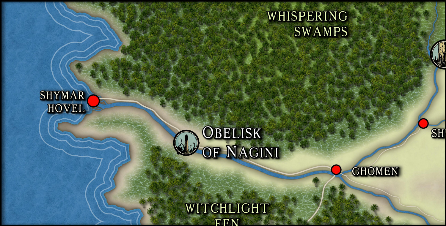
So, I'm a huge fan of mixing styles. Here, I'm mixing JRrevised + Darklands + Spectrum + Ancient Realms. I dislike anything 'cartoonish', such as Mike Schley style. For the latter, I am in despair because as you know, Ralf, Dak, Ricko and others have made master maps using this style. I'll never give up, but for now, it's tabled.
What I dislike about this map: the trees are much more realistic than the other elements, which are much more 'painterly' (meaning, art that is more of a painted, rather than realistic style). This is my constant conflict with CC3+: too many cartoonish styles or, a dichotomy between these and a too realistic style). Don't mistake me: I love this program and, for the most part, I can easily do maps with the ease of PS or Illustrator. But I could wish for a more 'painterly' regional/overland style less cartoonish than Mike Schley's style (which I in no way mean to disparage). For these reasons, Ms. Sue's upcoming Bird's Eye style I await with all eagerness.
Please tell me how you would do the trees on the map you see above.
Cal


Comments
Could you, or have you tried to "texturize" or "blur" The trees. Also one of my favs is a bit of transparency.
That will give them less detail, matching the maps estetic.
Thanks @Don Anderson Jr. for reminding me of this technique, I haven't used it in a long time and had it stored far away in my brain database. 😘
Depending on how it is used, even with Alycia Faden's clouds, it gives a very dreamlike tone to the draw.
I didn't realize those effects worked on symbols. I will have to experiment! Love Ricko's idea of using them on Alyssa Faden's clouds.
Symbols. The trees are symbols and are not affected by such means without going into Symbol Manager and altering them. Yes, could be done, but who has the time for that? If I had nothing else to do in my life, yes, sure, it would be possible.
Make my own symbols---see above.
But, thanks 😏
Cal
Did you use a tree tool? If so copy that object, Change properties. Change the sheet, change the fill. Then add effects and there you go.
Don't need to mess with the symbols at all. Transparency is the best sheet in my opinion hands down.
Make sure it is above the symbols.
Take you about 2 minutes. Me maybe 5 but I suck lol.
@Don Anderson Jr. sir, what you suggest is beyond the parameters of what I am asking:
How would you do the trees on the map above.
You cannot alter symbols in the manner you suggest. Though I'll admit your ideas are creative.
Should I provide you the FCW?
Cal
Here is what I thought you were asking.
First image sharp trees
Second image muted down trees
Second image
If I mistook what you are saying, my apologies.
Conversely, I think the trees work rather well with the watery swamp texture currently, though those don't work quite so nicely with the other textures involved. This can be a problem when trying to mix styles, of course.
Hey Calibre my brother, if it's any use, I really like the map exactly as it is. 😎
The swamp/marsh fill works for me without the trees. I will blend and blur colors to make the transition 'not so harsh'. But the choice of trees.....
I ask you: how would YOU do the trees given the background I suggest?
thanks,
Cal
Ricko, my great friend! Thanks. But I don't heh heh heh.
What would YOU do differently? Well, supposing you felt you had to?
By the Gods, I could use some coffee.
Cal
Can you upload the full map?
I'll just throw out the FCW for you.
I welcome any and all revisions heh.
Cal
Brewin Coffee...can wait no longer.
Cal
Would this map be printed or would you play on it using a digital file and a screen?
I ask this because if you are going to zoom in on the region and print or screen that small piece, the trees may not look as you want. But, if you happen to use the map in its entirety on a relatively large print (an A3, A2+) perhaps this won't really make much difference, because the trees will be so small that they will be like little "broccoli".
Mornin! Thanks all for all suggestions.
Ricko, used on Fantasy Grounds VTT. Or will be heh.
thanks
Cal
In fact, I was wrong above, on the contrary. If you print on smaller sheets like A4 or A3 it won't make any difference. But if you print on a larger size, then the trees will show their shape more (a2, a1, a0). If it's via screen, the same will happen if you zoom in on the screen. In any case, I like the vegetation in this flooded area. Herwin Wielink has good trees - although few icons - and a multicolor option if you want to give a darker tone.
I actually think the trees work really well with the water texture right now. To my eye, the problem is the abstract nature of the land and settlement markers outside the marshes (the dots, NOT the Ancient Realms circular symbols, which are fine), and especially the coastal edge and sea lines with the water texture there. Those really jar to me, as compared with the near-photo-realism of the marsh water and trees.
As Ricko wrote though, it really depends what the viewing level will be for the final map.
I can't usefully advise you what I'd do, because I don't design maps the same way as this, so the situation doesn't arise. I tend to pick a style I like for what I'm intending to map (or sometimes several matching styles, or complementary ones that are sufficiently similar to work together), and draw accordingly. I might add a few symbols or fills from elsewhere that aren't in the original(s), or repurpose some that are to be different from what their labels indicate. That's not the same as what you're trying to create here though.
Either you keep the swamp + trees = which are very good and adapt the rest to this visual line. Or you adjust the swamp and trees to look like the rest.
For Ricko, the swamp with the trees is beautiful. I personally believe that this area could yield a beautiful Zoom in map of this region, something more or less similar to the Herwin Wielink ones I have been doing lately.
More Calibre dilemmas, please ☕️
I'll take a look at Darklands and HW and see if they will click for me.
As for the zoom levels, it depends on the situation: whether I'm just doing overland description of an area or we are in combat heh.
Again, thanks everyone for the advice. I really appreciate it.
I know there will eventually be an overland style that works 100% for me all the time.
Cal
Hi Calibre,
Excellent map again, it reminds me of a Cthulu story map, especially the Obelisk of Nagini
Dak
Hey all!
Thanks, Dak. Latest version:
Finally found trees I could appreciate heh.
Cal
PS: ignore trees in the ocean....was checking styles. 😁
That's an awful lot of trees!
Aye! Now the job is remove what is unnecessary or blocking the various fills heh. Symbols in AREA rules.
Cal
PS: ignore tress in the ocean....was checking styles. 😁
I just assumed some ents were going swimming. 😉
I've been working on punching out holes in the jungle on the bottom, but have a lot more to go. I like the option of having a 'tree mass' to choose.
Cal
Hey all,
Still plodding along. I am, too, wondering if there are too many trees. Maybe break them up a bit with different terrains ala Ralf's Mirkwood?
What do you think?
Cal
If it is meant to be dense forest eg Congo or Amazon, then I think what you have done is fine. I really like the style you have used - an amalgam of various styles, I see.
Thanks, Quenten
Yes, like a chunk of the Amazon heh. And, also, yes, various styles. Doing that gives me more 'freedom' to produce what I see in my head.
😁
Cal