Color matching in CA128?
Hello! Rare post here, but I've been mapping with this thing since the previous sale on Humble - very powerful software that I've been able to use a ton! My favorite map template and style is CA128's Parchment, which is exactly the kind of map style that I had tried to create in Photoshop and Gimp in the past without much success, but using CC3+ made it a breeze. So far, so good!
Thing is, I'm trying to learn how to map a bit more efficiently: by not using an absolutely gargantuan number of symbols but instead using fills to take off some of the burden without losing the visual look of the map, I'm hoping that I can sort out some of the lagginess of my bigger maps, plus actually improve the visuals. I checked out the .pdf that comes with CA128's parchment map, and it has these beautiful forests that are made using the Terrain Forest fill. They look great, are resource efficient, and can give my big forests a better look than just plopping down tons of trees.
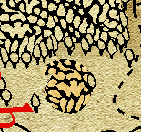
Problem is, I'm having a bit of an issue with, well, this:
Their forest is on the top (I loaded the OG map itself for comparison), but whenever and wherever I use the forest fill for myself, mine comes out like the bottom - the color of the parchment part is off, and whereas the other forest blends in pretty well with the trees, especially at a high zoom, this one sticks out like a sore thumb. I'm generally familiar with the innards of CC3 at this point, but tinkering with the raw settings of fills and the like is something a bit beyond me; does anyone know how to correct this so that they match in appearance?
Best Answer
-
Hang on! I had a feeling I made a post about this in the past, and I had!
https://forum.profantasy.com/discussion/12998/weird-looking-forest-fill#latest
Hilariously enough, it was for the exact same thing - performance - but it didn't actually work then, meaning it probably won't work now. Hahaha, what a way to find out. Thanks for the help...again! 😅
EDIT: Who knows, though - it's been two years since then. If anyone has a better solution that doesn't destroy performance, hit me up!


Answers
I'm finding it a bit difficult working out what is what there. Please can you upload the FCW file so I can look at any sheet effects that might be affecting the colour, and check if the same fill is being used and what the scaling for it is? That darker blob of forest is highly pixelated, which suggests a scale difference somewhere at least.
It's all the default settings from the .fcw that comes with the issue, so here you go!
Seems like that fill is set up with a darker fill than those used in the map.
There are a couple of ways to fix it:
1- Fixing it in-map:
(Edit. Forget the second way I just typed for now. Seems like there is something else happening when the tool is used. Investigating.)
Note that the fills here are all hatch styles, meaning they are vector entities, so map performance will not be much better compared to just using symbols, but it will certainly be easier to map larger regions.
Thanks for sharing the FCW :)
Hang on! I had a feeling I made a post about this in the past, and I had!
https://forum.profantasy.com/discussion/12998/weird-looking-forest-fill#latest
Hilariously enough, it was for the exact same thing - performance - but it didn't actually work then, meaning it probably won't work now. Hahaha, what a way to find out. Thanks for the help...again! 😅
EDIT: Who knows, though - it's been two years since then. If anyone has a better solution that doesn't destroy performance, hit me up!
Okay, actually, that solution doesn't seem to work; I've redid the steps I did back then but nada, it doesn't actually fix the fill itself. I'd like to just have the tool make the perfect working versions since the lag wouldn't be so bad (better PC now than I had back then + better workflow for managing this = woo, I can be decadent with vectors and fills), but alas, that needs editing the OG fill in someway and I don't even know what the problem is.
Hmmm. Time for some tinkering!