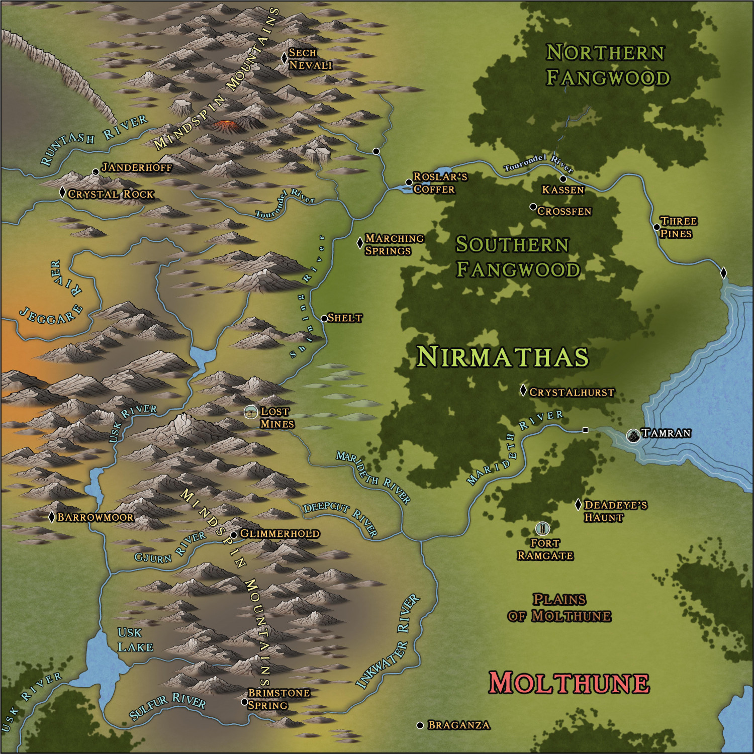
WIP: Nirmathas on Golarion
 Calibre
🖼️ 39 images Mapmaker
Greets, fellow artists and mapmakers
Well, here is by-far the hardest map I've worked on, to-date. A new GM ahem, DM, has come to our gaming group and he chose to run Pathfinder in Golarion, specifically on Avistan continent. This map has been fighting me every step of the way! I never new blur and blend would hassle the program so much. Anyway, this is the first pass at text:
Critique/Advice welcome!
Cal



Comments
Oh, forgot:
No scalebar yet as the scalebar on the map wasn't included in the cutout I got to recreate. Coming up!
Cal
Land features color transitions are AMAZING!
Contemplating the painted ceiling of a famous chapel...As Rafael said to Michel: "you sent us back to school".
Thank you, my friend!
Cal
Greets!
I do not know if the following information is wanted; but I will reveal how I did this map.
First: I opened the map in Darklands overland. I inserted Spectrum Overland and Watabou Cities. These provided me with the Fills I knew I would need.
Then, draw your Land.
Then, once I had the Land to my liking, I went to the drawing tools on the right side of the screen, chose the various tools there to draw blobs of various colors. I put these on individual sheets, each color to a specific sheet. Now, add effects: blur, blend and edge fade till they 'look right to you'. WARNING: this will slow down everything. Turn off effects to help you draw out what you need.
Again: turn off effects to draw what you need. 😁
I draw what I know what I need or want. Sometimes, it takes many times to draw 'what looks right'. I can't describe this process any clearer than to say this: think outside the box.
Think outside the box.
Cal
PS: I hasten to add: You can do this with any style you have in CC3+. You don't have to have the ones I have listed here.
Wow! I really appreciate you sharing these techniques. I never would have thought about approaching it this way. Absolutely no pressure, but if you are fine with it, would you share the FCW? I’d love to study your approach.
Greets...
Of course! When I finish it, I'll post it here for anyone who wants.
Cal
please yes XD
Only thing that occurs would be to make those little illustrative symbol discs for Tamran, Fort Ramgate and Lost Mines larger. It seems a shame not to better highlight those little pieces of artwork. And of course to maybe add more for other places too.
That might mean adding dot-markers for the places, and a line, or two lines, linking to the enlarged "art" view for the places, however, so you're still showing their precise locations, as well as illustrating them, though that may be more map-clutter than you'd prefer.
Greets, Wyvern
I wondered if they should be larger. I'll consult with the DM heh.
Cal
Anytime, my friend.
Cal
Greets!
Well, as promised, here is the FCW. It's not completely finished but that's all the DM wants at this point (apparently there is a strict size limit on roll20 he is using for the game.)
I don't mind sharing FCWs, just never figured anyone would want them heh.
Cal
Thank you! I learn a lot by studying other people's approaches. Ralf once did a tutorial (for Marine Dungeons 2) where he hid every sheet and then unhid each one, one by one, to show what was on the sheet and how the effects on that sheet worked. It was very helpful and I now do the same thing from time to time when I can if I'm trying to learn from someone's new approach.
Greets
I think the primary approach I have is to not limit myself to a specific fill in a given style. So, I insert other styles to give me more variety. The use of blend, blur and edge fade is essential though, as I said, this can slow down your processing/redraw. So keep that in mind.
I also use a lot of glows. I could not live without these. I use every type, depending on what I feel works best.
Just be patient with your artwork. Be patient with this program and process. If you find yourself frustrated, take a break: go water your tomato garden, cook a quiche, or a spaghetti dinner for your family---then come back when your mind is clear. 😁
Oh, also, an old technique my art instructors had me do: if you are unsure of layout, overall effect etc, take a small hand mirror and look at your art in that. This can reveal many flaws your conscious brain isn't aware of, but your subconscious is. So, try different perspectives.
And finally, take a look at your map. Notice machine-like patterning? That really dulls a piece of art badly. Ralf has videos on how to deal with this issue. Check em out!
My main problem, still, is using toooooo many nodes. I have some really convoluted coastlines. After I draw them, I use SIMPLIFY and REMOVE NODES, etc; but I still find my freehand drawing style is too much for CC3 LOL. It's annoying. So, well, keep that in mind, as well.
okie dokie
Cal
Oh, I forgot to upload newest version. My bad.
Mate, that is a sensational map!
The transitions between fill styles, manifique!
This is one of the best overland maps I've seen in CC3+. Well done!