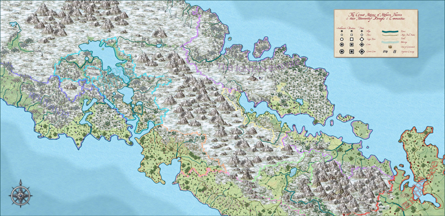
[WIP] Continent Map using CC3+ MS Overland and other resources
So, this is my first proper attempt at a continent-level map using CC. I used a procedurally generated map of biome cells and sundries, then customised that, then ported it into CC as a tracing layer. Made far more use of land feature layers than I have before, and I'm fairly happy with how the terrain turned out and the overall feel of the result.
Not sure how I feel about the individual country labels - I couldn't really think of a good way to include them, because the map itself is too busy to really spare them any real-estate. Also, I haven't put down labels for any of the towns/cities/etc for the same reason (though since my friends and I generally use a VTT, that's not an issue, because I can add tooltip tags to each town to convey its important data.
All feedback gratefully received, as always


Comments
It's a little small for me to see all the details, but it looks like a lovely map :)
The level of detail you can have on a map is always dictated by its finished size, and for the same piece of land it varies depending on how large you export it or how closely you zoom into it when you are using it. If the size of the map you use is limited by the VTT in a way that means the map looks too crowded even at maximum zoom, I recommend splitting the detailed map into a series of regional maps in a two-tiered system and drawing a more simplified version to show the full continent with the country names and so on. Think of how little detail a map of the world really contains compared to a map of the county, state or region where you live.
Really nice map mate. :)
I think what Sue has said above is correct. A continental map generally does not have that much "detail" and that is likely why you are not finding any space for the country names. That is also why you likely find it difficult to put down the capital / city names. I am also not sure but cannot see a scale so difficult to visualise a little.
Still really lovely map and love the detail, but for me probably a little too much for continental. 👍️
I had a bit of an epiphany following what Sue said, and started breaking the map down into regional chunks - and, in so labelling, realised the solution for the continent labels was to colour code them to the national borders. I also managed to label the capitals, and to optimise the output for VTT such that the important details (locations of settlements and shapes of icons) were clear. I’m embedding the town names and key info in hover-over tooltips for each settlement (but, as Sue advised, doing so in batches and in regional/national sections. Thanks!
Here's my first attempt at a regional map based on the above Continent. It depicts a tiny (35mi x 27.5mi) region in northernmost Cimmetra (where the yellow country meets the purple country at its northern tip).
A couple of issues I found. First off, the road tools bugged quite a bit, so I wound up just replacing them with splines assigned to the relevant sheets - I think the result works, though. Second, and more of an issue, I couldn't think of any way to indicate on the map that The Falamur is a shield-wall of cliffs - there's no cliff symbol, etc. - so I wound up just using the same technique I've used to indicate elevation in maps before. Does it convey the intent well enough, do you think? Or is there a better way to get this across?
(It's important to the plot - it makes Nordpont the Peerless the only way to move cannon and heavy troops north to south)
Local Area maps is one of my favourite styles - just wish there were more symbols.
Tried something new for the cliffs - a few fractal lines with various blurs and drop shadows, and a blurred beach region to emphasise the difference in terrain. I think it looks a little more like a cliffside now?
Looks good
Tried two different approaches to creating the cliffs - not sure which suits the style better, but I think they both get across the notion of cliffs
I think I like the one on the left better. The right one seems a too strong to me.
To me, the ones on the left look like worn cliffs. The ones on the right look like the sudden drop off of the Cliffs of Dover.
maybe they need a bit of vertical detail in the fill to make them look more like cliffs - to me they look more like beaches at the moment
eg (10 secs with the snip tool so not a final product!!)
Not sure if I'm interpreting what you're intending here correctly, but if the paler, sandy coloured coastal strip is meant to represent an extensive, low-lying beach, and the fractal lines are the actual high vertical cliffs, it might be useful to use the cliff lines as the coast, and make the seaward edge of the beach have a less strong outer effects line. If it's a beach, after all, it must be submerged by the tide in part at least some of the time, whereas the cliffs would form the actual coastal barrier.
That’s exactly what I was trying to convey - thanks! I’ll give that a try :)
So I took Sue’s advice and revisited the huge Continent-sized map with an eye for not including all detail, just enough detail for players, and breaking it down into regions. That also got me thinking about the notion of maps as unreliable narrators - if players are made aware that maps might not be GPS-accurate in their fantasy world, the act of discovering something which wasn’t on their map can be a feature, not a bug, etc.
Anyway, here’s a portion of the map (and a little south of it) with reduced detail, and making use of the 13th Age Revisited style.
This looks good.
Not sure about the labels crossing one another though; I'd be inclined to redraft those so they can all be read clearly.
The coastline also seems a bit too harsh and linear currently. Maybe change the land to a smooth-edged polygon, or add some more nodes to the existing coastline, to make it look less jarring - all the other lines flow nicely, after all.
I agree with you about the jarring coastline. Is there a straightforward way to convert the fractal to a smooth-edged poly? Or is it a case of manually redrawing it?
If you right click the fractalize button there's an option to convert Straight to Smooth. You can go back and forth with it. You might want to fractalise it just a bit more right now before going smooth as that will give it a more wiggly appearance. Don't go overboard, though. No more than 3 hits with the fractalize tool at it's default setting. Then go smooth and see what you think.
Save a copy first ;)
So, here's the finished set of maps. I couldn't really think of a better way to include the nation names than the transparent text, but I've tried to make it less intrusive - though it's still slightly 'busy' on the Stansterian League map. And the fractalisation definitely helped the overall look! Thanks so much for the advice, and feedback gratefully received
Map labelling's always tricky. There's an inevitable trade-off between clarity, precision and how much information you need to/want to present. Colour-coding the settlement names, as you've done here, is a useful trick, and maybe just using that with a map legend to say which colour means what realm might be sufficient at this smaller scale. The larger-scale text labels still seem a little too distracting, for all their faded transparency, to me, but the important thing is that you're happy with the end result, of course! And the maps DO look good!