

[WIP] Project-A
 Jeff B
Betatester 🖼️ 43 images Surveyor
Jeff B
Betatester 🖼️ 43 images Surveyor
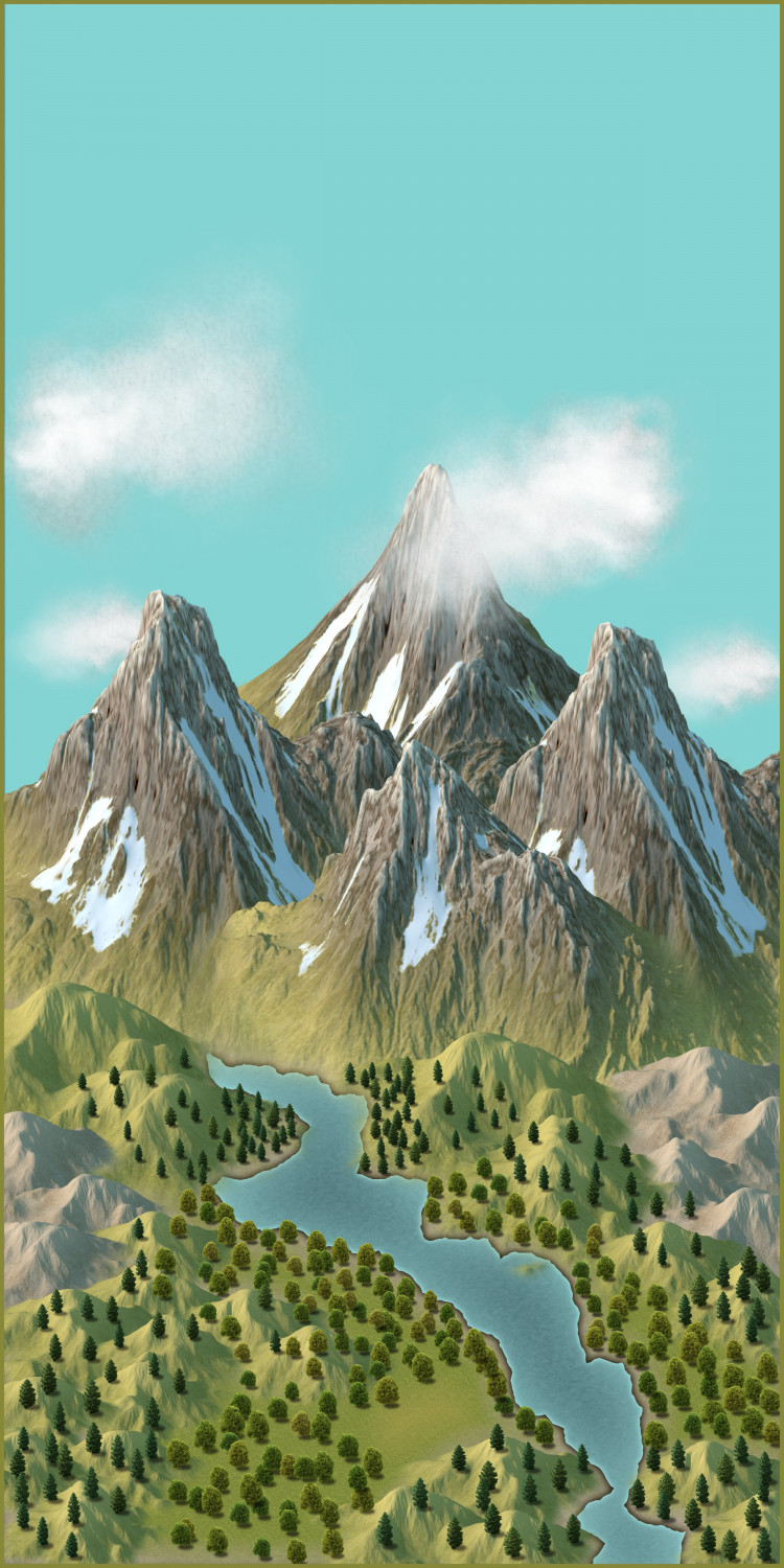
I'm working on a personal project and I would like some input into the design. The map I'm posting is just a test map and not the final vision that I have for this project.
For the phase 1 map I'm looking for the following input.
1) Does the background behind the mountains give the overall impression of sky?
(I know it needs more work to really look like a sky but does it give the impression of the sky)
2) Does the scaling in the foreground of the trees give the proper scaling to show the distance from the front to the middle of the image? Also how could I better scale the hills?
3) Does the image give the general overall impression of what you would see looking at a photo or in real life looking at a river valley?
Thank You in advance for your comments and suggestions.


![[Deleted User]](https://secure.gravatar.com/avatar/c75d9a245b74d9c59be0999ea81ca541/?default=https%3A%2F%2Fvanillicon.com%2F92add7f8c954488718110edc4896ad39_200.png&rating=g&size=200)


Comments
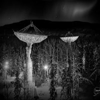
Phase 2 of the project is the night version. Again this is a work in progress and I have a large amount of work to get the sky the way I want it to be.
1) Does the image give the over impression of what I'm trying to showcase in this project?
2) Does the lighting of the mountain range work?
3) Does the lighting in the sky represent the Aurora? (Yes it still needs a lot of work but again this is my first attempt at doing something this intense) (if interested there are 330 lights in the aurora)
I have really learned a lot about lights and how a color background effects the lights differently from a bitmap background.
This will be an on going project until I get the lighting the way I want it and it works for the subject then I will start work on the actual project.
Thank You in advance for your comments and suggestions.
reflex glow on river please <3
@Ricko Hasche
Ok here is a quick stab at what I think your asking for. One more thing I need to learn how to do better, yes it needs to added to the final image. Let me know if this is the right track for your suggestion.
Think I found the limit of lights you can have in a map. Think I need a smaller scale map to work with for the next test map. Having issues rendering the map as the last two attempts turned off the lights during the rendering. Got it to render. (Light count 750)
Remember work in progress, learning as I go and a quick stab at the reflection in the water.
How long does it take the software to refresh the screen with that image?
Awhile but later today I’ll time it for you. It got a lot longer after adding the quick water reflection. Pretty sure I’m pushing limits or close to it. My next test map will be a smaller area size wise so that should help I hope.
@jslayton
CC3+ Closed - double click on .FCW file 16 seconds to open. (Effects are on when file opens)
Click on toggle show light symbol buttons (Thank you Remy for that great tutorial) 15 seconds
Toggle global sun off = 1 second
toggle global sun back on = 15 seconds
toggling effects on is also about 15 seconds
The above testes were for the default size on screen if I zoom in to fill the window with the image it takes 18 seconds to redraw.
rendering effects always triggers laptop fan to turn on
rendering to jpg
setting 5000 5000 300 ai 35% (exportsetmppp = 40000000) = 6 minutes 40 seconds it takes about a minute to get to the LIGHTS GLOBAL Sheet. It look like it is taking 5 minutes for the lights to render after the LIGHTS Global appears and then the message about writing the file to a jpg appears.
setting 5000 5000 300 ai 35% (exportsetmppp = 80000000) = 7 minutes and 20 seconds
Hope this helps
Phase 1 thoughts, based on the idea this is intended as an image showing a real-world view.
1) Does the background behind the mountains give the overall impression of sky? (I know it needs more work to really look like a sky but does it give the impression of the sky)
Yes, the blue is a reasonable choice. You might want to consider having a blended gradation of colour, subtly darker towards the top (especially the top corners) and paler towards the horizon (because atmospheric haze always makes the nearer-surface sky seem paler, often more or less white). The darker top corners are a painting trick to get the eye focusing more on the centre of the image.
2) Does the scaling in the foreground of the trees give the proper scaling to show the distance from the front to the middle of the image? Also how could I better scale the hills?
This is tricky. The tree scaling isn't the same as that of the mountains and hills. For mapping, this isn't an issue, because we need clarity to show forests, and in a pictorial style, there's no other useful option. For a realistic picture, the trees should be tiny - the smallest bare rock patches seen amid the mountain snow would be probably up to two or three times taller than typical trees at that distance, for instance. So distant forests would be basically blocks of colour, with a softer top edge (because of the variable tree-top heights), and these should begin on the greener lower mountain slopes.
The hill scaling should probably be varied (and increased further "back" in the view) so there isn't quite such an obvious separation between the mountains and the hills. The paler hills to either side of the valley don't look quite right surrounded by greener ones. Again from a painting perspective, objects closer to the viewer - such as the hills - would tend to be shown darker, since things further away tend to be faded a little by haze, and are less distinct.
3) Does the image give the general overall impression of what you would see looking at a photo or in real life looking at a river valley?
Not really, for reasons party outlined already. The lake has the same uniform colouring across it too, whereas it should be showing reflections of the surrounding land - especially the mountains - in places. Those could be shown as quite misty patches of appropriate colours, say.
A better way to approach this might be to step away from the idea of a photographic image, and instead create a representation of what you want to show. That's what the mapping assets are meant to be used for, after all! As such a representation, what you have now looks good, certainly.
For the Phase 2 night scene, most especially the aurora, and whether that looks like the real aurora, is it based on an actual image of the aurora? If not, I'd recommend that as a starting-point.
In general (as a long-time mid-latitude auroral observer), I'd expect the brighter areas of an auroral display at least to show some distinct colouring, commonly green or red, sometimes yellow, rarely blue or purple, although the fainter areas, and sometimes even the brighter ones, can simply look white or yellow-white. The lower parts are usually the more distinct, forming arcs or undulating bands, with structures like curtains or searchlight rays stretching up from those, fading gradually towards their tops. Other forms do occur, but these are the commoner sorts.
The polar aurora (seen only from places nearer the magnetic poles than the mid-latitudes) has a much greater range of forms, and tends to be a lot more active, than the mid-latitude type, though the overall structures and colouring are similar. What you have currently looks much more like the polar aurora than the mid-latitude type to my eye.
Again though, if something representational, rather than photo-realistic, is preferred, what you have now would be fine.
@Wyvern
Thank You for your input. The aurora from my location is most of the Green or white coloring with some red when it is really active (65 degrees North) So my representation is based on that. With that said the color and type of background has a huge effect on the color of the lights more than what I expected. I still have a long way to go to get things to look the way I want them to and to get some reflections in the water during the day. Your suggestion are always welcome and helpful. I will continue to work on the project and refine I hope the lighting as that is the biggest issue right now. The other problem I have with the aurora is the upper edge is too soft but I do not know if I can fix that as there is very little control on lighting so to help with that I placed a color band under the upper lights which does help but not with sharpness.
I'm not trying to make a photo realistic image in CC3 but more a map that is more like a photo than a map if that makes sense. I guess that is part of my mapping problem I don't see thing is a fantasy setting I see things in a more realistic setting which is a draw back for mapping in some regards.
Here is an example of how much the background effects the lights.