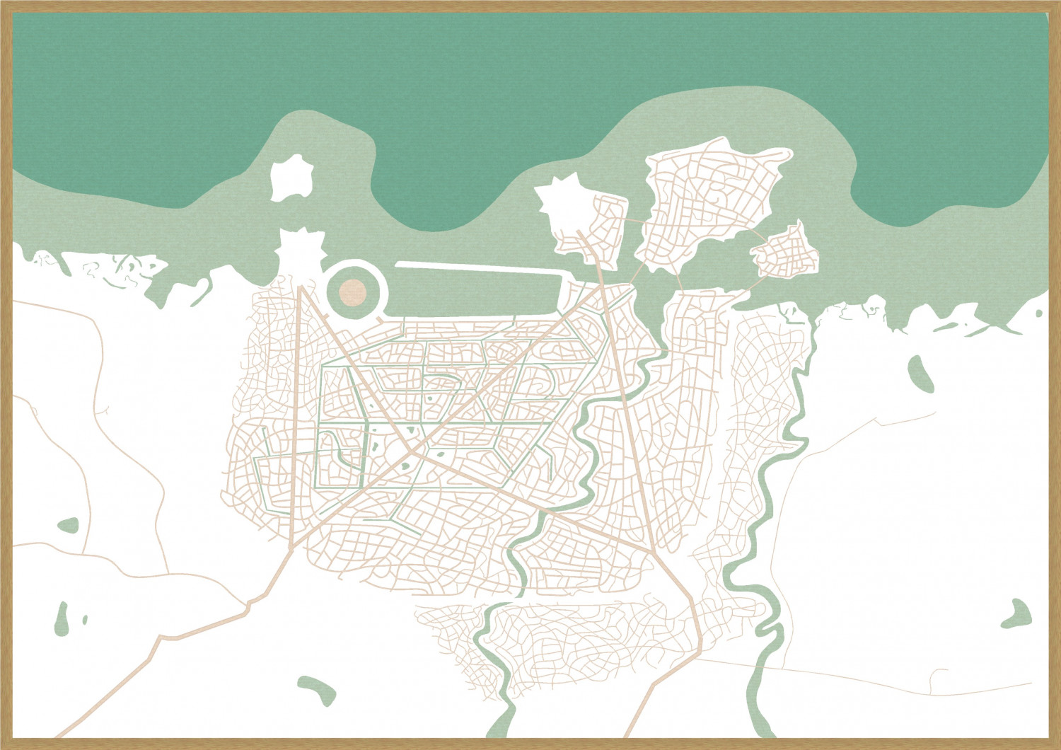
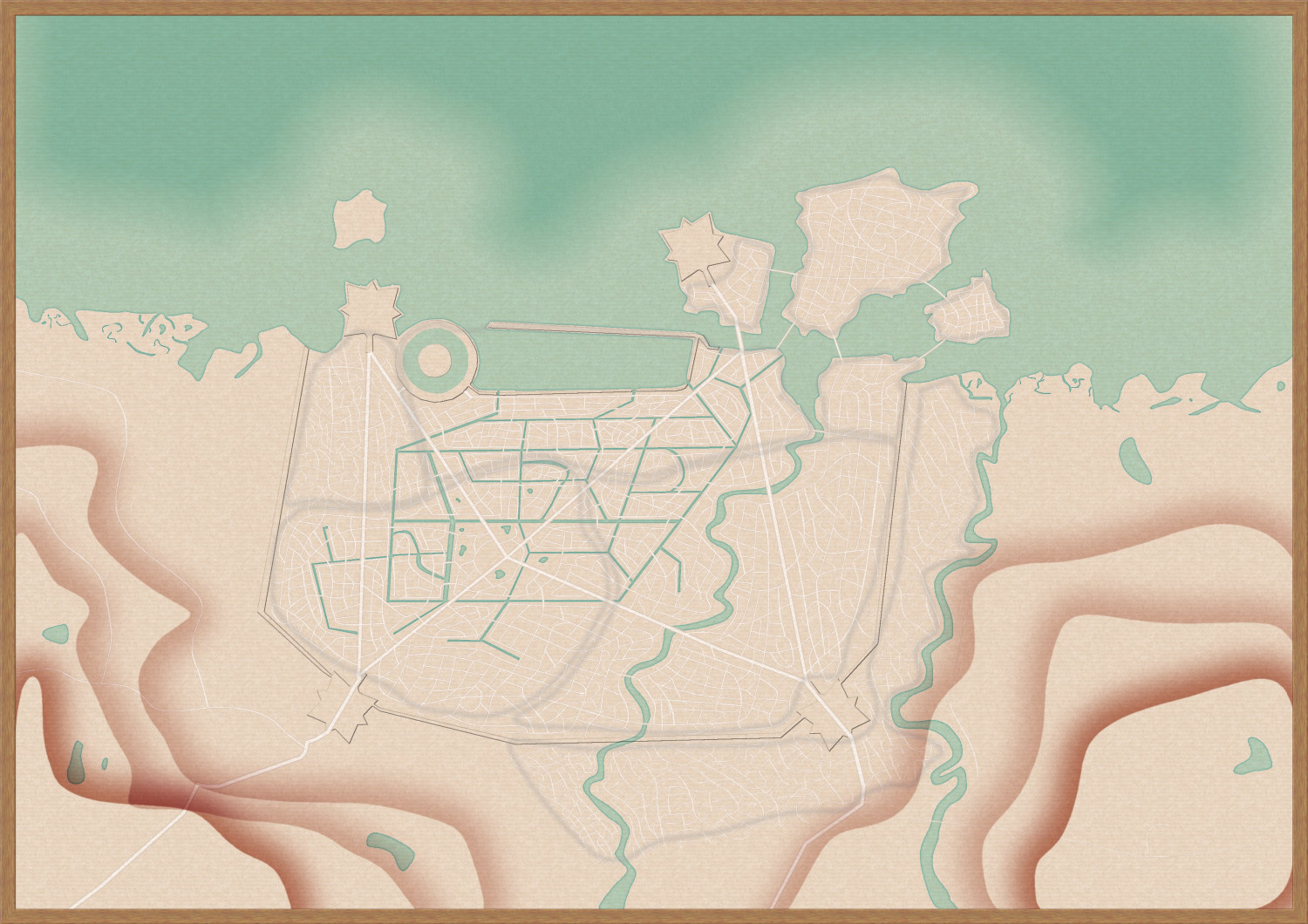
[WIP] City of Accordo (Ferraris Style)
I'm currently working on a fantasy city for our Dungeon World campaign that started last week.
A baroque, mediterranean inspired sprawling city. Lots of roads, a bit of hills in the countryside, and the major districts marked.
Next will be hundreds of fields, followed by terrain and then come the houses.
That will take some time.
I might change the orientation of the map after being done with most of the details except the text. Because it's not orientated in the classical, normed way. Well, we'll see.
Tagged:


Comments
Making some progress, and decided to change the orientation to make it easier to use for my gaming group.
Still no terrain and houses.
And I will need to see the map when it's done to decide if I'm happy with the fields as they are now.
It may be easier for your gaming group, but I like the orientation the other way better.
It's coming along really well! :D
Me too, but I know we all will make some terrible errors with "oh, we're going to the eastern part of the city" while meaning the opposite.
Just way too used to the normed maps with North on the upper map side.
Thank you 😊
I quite like the orientation as is, and I agree with your reasoning. I am excited to see this map grow.
Looking at your city it seems to me that it is big enough that I don't think I would put in all the buildings. I would put in the important ones but not all. Then make closeup maps of the areas that need it. So if your party goes to the "Inn of the Old Sign" but there is no combat in the area just put a dot on the map with a label. Does that all make sense?
In other games, this would indeed make sense, aye. Like I tried to avoid showing every building in my Achtung!Cthulhu maps, because that wouldn't be needed anyway.
But Dungeon World is largely player driven and improvised, so there is no way to know in which areas the group might encounter combat in the city. There are different areas that might be more dangerous than others. But Dungeon World doesn't use encounter maps anyway, so the map is mostly to have some rough orientation in the city (before venturing outwards into other regions of the continent).
And I think that map style needs to be overly detailed to properly shine, at least when compared to the original Ferraris maps. 😁
I would feel bad if I didn't do it justice.
But most buildings won't get any description or stuff. The important ones will get a number, so the GM can write a list what it is. I'll leave that to him 😁
After having lots of ambition (overambition is my second name), I gotta surrender. Having used hundreds of tiny houses for the slums, making maybe 20% of it, without touching the city itself.
Since I need the map this weekend, I surrender and make it in a regular manner, focusing on larger blocks and only using the buildings for the most important ones.
Reality and tight schedules caught up to me 😁😉
The city blocks aren't added, and the effects aren't final (same as text colours etc), but it's coming together slowly, and at least the different city quarters are in, so even the WIP version will help at the table tomorrow.
It's looking great as it is :)
Thank you very much 😊
Making great progress with this one, and I gotta admit - I adore the style.
Thank you! :)
Although I always feel rather guilty taking credit for the style, since it is faithfully based on the orginal Ferraris map.
And I can spend countless hours with the original map, getting lost in all the tiny details. ❤️
I had to stop going there. Too many hours spent gazing already.
Changed the font (even though I liked the old one, but since my GM uses the Dungeon World font for the materials he's creating, I switched to that too)
Looks like you've nearly finished it :)
Yup, I'm nearly there. The last city blocks, a few more garden details, and numbers for special buildings. Then it's finally done 😁
Finally done.
The GM is happy with it and tomorrow we can play in this sprawling maincity of the trade empire. 😁
(But...I'll need 1-2 other major regions as well... and we want to keep it in the same style. Oh boy...the next challenges await!)
Is there any chance you would want to put this magnificent map in the Community Atlas. i can help you find a place
@Lizzy_Maracuja it is wonderful!
Sure, I would happily add this to the Atlas. 😊
Thank you!
I will find a spot for you if you like.
A good spot might be the City of Lanka on the Lanka regional map of Kumarikandam. You would only have to change the name from Accordo to Lanka City.
Where is the original Ferraris map, if you don't mind, please?
@Bidmaron - This is the spot where I started looking, and the search for all the possible textures and symbols took me 8 weeks. There's no guarantee that I got them all, either.
https://maps.arcanum.com/en/map/belgium-1777/?layers=37&bbox=527930.4200425778%2C6537602.115436598%2C537499.3805210282%2C6541285.424737089
Thank you for sharing the Link Sue, I was too slow.
This map is so time consuming and detailed, I really get lost in it. 😁
Wonderful, then I'll change the text. Should I keep the city quarters or turn them off?
And I forgot to thank you as well, Sue.
Keep the city quarters - just change the name of the city, that's all.