Panzer sample thread
 Lillhans
🖼️ 7 images Surveyor
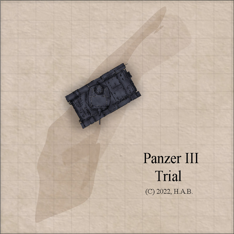
So, because reasons, I whipped together two symbols - a chassi and turret of a Panzer III.
I presume to have created files where the bits are to scale according to Tome standard (i.e. the 18 ft chassi was drawn at 100 pxl/ft). Did not turn them into a fully operational symbol package, obviously, so I had to scale it to the map manually.
Enjoy!


Comments
You know what, one of the original suggestions on the back of the CC3 DVD case was "A historical battlefield littered with burnt-out tanks". While a great image, this has never been possible with CC3(+) unless you found and imported images yourself or happened to be incredibly much better at drawing than me.
So, now you have a change to correct this (We obviously need both burnt-out and non-burned-out tanks). This should be an annual.
I agree with Remy - this would make a really great annual.
I maintain that I can't paint for **** - but between tracing and stealing everything that isn't bolted down from the mini/kit painting video scene it's not entirely out of reach.
With contours sorted out it's just a matter of finding an execution of paint schemes that fits equally well/bad with large enough number of outdoorsy map styles.
Well, I believe you already made a style for the annual a few years ago, perhaps the tanks would best fit with that one, or an adapted version of it could follow the tanks...
I see your point. The highly detailed sample map above is probably where I would prefer to take things with regards to ground textures. 😂
Anyway! So that'd be umpty-nine iterations of the Pz.Kpfw. III - times three for theatres of operation/season paint jobs - with enhanced cammo solutions.
And, most importantly: eldritch elements.And then the same for the I, II, IV, V, VI and also the Sd.Kfz. 11 and 251, oh...almost forgot the Stug. and self-proppelled flak/artillery and also stationary systems and....jerry cans.
Oh, and then destruction dressings of course.
So, British funny tanks some time around 2034?
Kind of checks out with pre-existing styles/assets that everyone get out of the box.
Oh yes - that definitely works! :D
+1 from me for the tanks/AFV annual!
If you're seriously thinking of a full range of vehicles, maybe choose a specific theatre and time to reduce the options somewhat. Colour schemes and camouflage will easily swap over, but the modifications to vehicles, and the different types involved, end up as the real problems (speaking as a long-time model-maker and WWII wargamer).
Aircraft to follow? 😉
This needs to happen!
Yeah, configurations are almost as bad as markings...
When I first started working on my NPC generator for CoC, I entertained the idea of keeping separate templates for different time periods - also tracking parent formation battle orders.
I eventually had to accept that 99% of my players would not be keeping track to the point where they'd pull me aside and go "what's going on here? This seems like a 1939 rifle company but we are playing 1944. And 4th bn Green Howards? In Normandy?!"
Not that I would have them tag along with that particular battalion in a Normandy setting. But I reckon a Panzer III is going to make a good enough proxy for any III's - focusing more on paint schemes for time and place.
Paint jobs and contours are somewhat streamlined now, so the real time-sink is destruction dressings, really. When not parked on some base they work best as wreckages for maps, after all. Other than that - a plentiful range should be feasible.
Aircraft? Hmm...I guess one will want to make one's own Sidi Haneish maps....
You're doing some beautiful work, Hans. Keep it up! :)
Needs webbings and tools and markings all the other stuff you'd expect from their model kit counterparts. Also, destruction dressings. Also, commander hatch open as a separate symbol.
But other than that (and the fact that the no-paint pattern is perhaps a bit too dark) I am satisfied that I will actually enjoy this process 100%: it's both quicker and cheaper than minis, and the learning curve was hilariously flat. It's almost as if pouring over mini painting videos has paid off!
Doing away with pre-painted turret shades and relying entirely on CC3 sheet effects appears to have paid off too.
They are wonderful!
And I agree, having this as an annual would be lovely! 🤩
@Lillhans Great stuff! Just to be clear -- you've done these in CC using your trademark sketchy style?
And do you play CoC using tokens rather than minis?
Thank you! The line-works could be done in CC and - to some extent - the paint schemes. But these are all raster symbols. Extremely sacrilegious! 😂
I play VTT exclusively.
Edit: to clarify - a raster symbol is a .png file, so they are done entirely in an image editor (GIMP).
Also, the above are clearly not from 2020. Obivously.
Not really sure why I would want to go back to the very beginning of the pandemics. Seems terrible, to be honest...
Next up: Panzer 38.
Is thethree paint schemessufficient?seems like a perfect number.@Lillhans wrote:
Is the three paint schemes sufficient?
Don't you know what happens to people asking such questions? (If not, ask Sue)
Three paint schemes seems FAR too few 😁
Here, @Wyvern , have some half-tracks.
Great work! Thanks!!!!!!!!
Excellent! And now without the canvas roof? 😁 And then with the anti-aircraft guns mounted on the rear. And...
You know Forum folks - we ALWAYS want more symbols!
Yes more symbols! A uncovered half-track, then one with the 3 American soldiers shooting from it. (a "The Dirty Dozen" reference)
All work, no play of late. But the catalogue is growing! Seen here is the SdKfz 222 in a sort of derelict state of existence.
I have done a simliar chassi double (right hand side) for the base, desert, and cammo patterns too.
Thoughts?
The sample seems too dark to me. Especially after looking at the 3 schemes for the P III.
Very nice work!
I agree the Sd 222 looks too dark. Rusting and damaged is fine, but it still needs to be seen when used on a map.
Classic problem when painting miniatures for tabletop wargaming too; too realistically camouflaged and you can't find them among the vegetation, etc. Always a degree of compromise involved.
Don't know quite what it is, but the Sd 222 always looks like a "Doctor Who" Dalek to me...
Brighter, but lost it's red-tone in favour of full gingerbread. The quest for the right tone continues!
Agreed, @Wyvern: it has that certain design quality to it....which also kind of begs for it to be parked next to a Sd.kfz. 231, 6-wheeler.
I think they are still too dark. If you were to put them in a street scene I think they would be dark blobs. I think you hit it right with the PIIIs above posted on Feb 28th. Always a compromise.
Oh! The derelict pattern is, indeed, intended to be less distinctive - a terrain feature first.