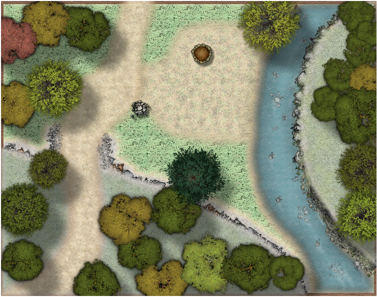
WIP A wayside camp on a high road
Playing with different height levels for the first time on a battle map. I was watching the live mapping video entitled Sheets in Action and wanted to try a few things that were discussed. I'm still not very satisfied with the fills on the ground and I want to learn how to make the ground more realistic if anyone has any tips or thoughts.
Cheers
Tagged:


Comments
I think it's a great map! :)
What aren't you happy about?
Hi Sue, thanks for the encouragement. I would like to get the grass to have a similar texture / consistency that is in MS Forlorn Cottage maps. The ground cover on the right hand side and in the lower portion of the map, ie the areas I am trying to depict as raised, is more like AstroTurf than real grass. Real grass just isn't that consistent.... Does that make sense?
If you mean the same as the grass on the left then this shouldn't be too difficult to sort out because the texture you want is already available in the map.
Use the Change Properties tool to change the fill.
If there is a fill that you want to use that isn't already in the map we can do that too, but I won't clutter up your thread unnecessarily.
I am using a different fill to try and suggest the two areas a different but I understand your suggestion. I'll play around with it and see what I can pull out of it. Thanks for the help.
Don't forget that if you want something like the grass on the left but not the same, maybe a slightly different colour, I think there are a couple of other similar fills in the same style as that one. Or you can use that same fill and use sheet effects to change it's colour, maybe.
You can also try to use slightly different scale levels for different grass areas. Then it would look different as well.
To do that you would need to duplicate the existing grass fill by opening the Fill Style Properties dialog, selecting the grass fill, clicking new, and giving it a slightly different name. Then you can change the scale settings for the second grass fill without affecting the original one.
Toook another run at this with SS2A with an assist from Dark Cities. I think I like this approach more.
Good - but I think the trees could do with some shadows?
Forgot to turn those on... oops
Shadows for the camp fire are funky but otherwise ok
Thank you for the ideas DaltonS. The Lord of this area is a Ranger, she does look out for her woodsmen and Rangers. Travellers on the high road gain the benefit of her generosity. A toll wouldn't be consistent with her views on hospitality.
You really do a good job in showing the subtle changes in elevation.
Thank you Seycyrus. Credit to a few tutorials by Shassar on contours and wisdom from LoopySue