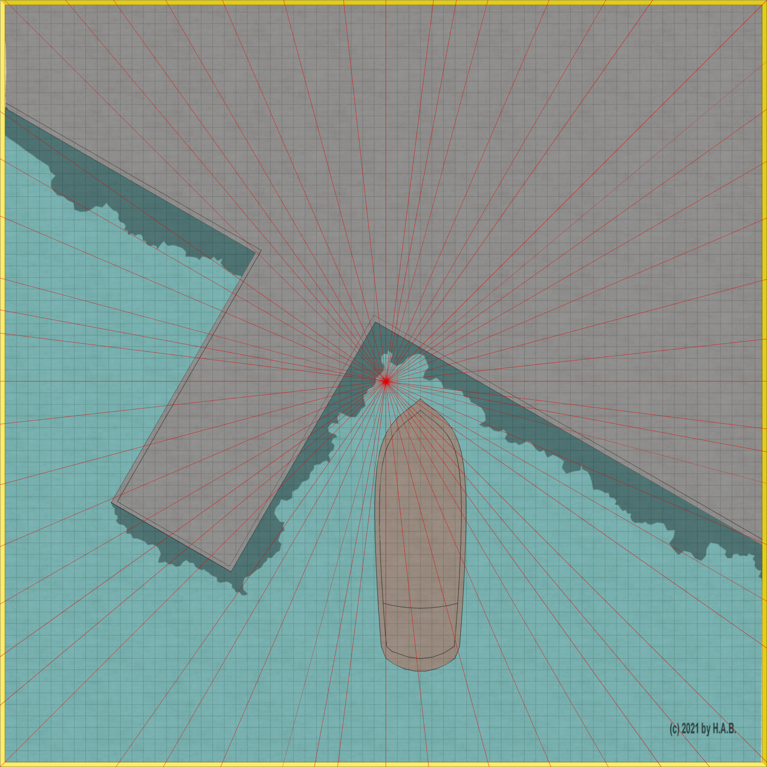
WIP - Quay thing
 Lillhans
🖼️ 7 images Surveyor
Very confident the vessel will end upp looking like crap, but I wouldn't have it any other way!
(100 x 100 m encounter map w. 5 ft squares grid)


Comments
Looks good so far.
It was, of course, a mistake to flip the vessel over before getting all lines/boards done but I am very pleased with where it's going - for a first cog ever it could certinaly be worse at this point.
Will probably swap the background texture: it repeats a bit too much at 4k by 4 k.
It's looking really good, Hans :)
Weehee!
I would like to include some looming hansaic warehouses, but I fear perspectives are going to be tricky to execute. Shadows are a great way to get heights though, so that just might do the trick - with a different angle of incoming light of course.
And it occurs to me only just now that the concept as a whole is the direct result of watching Empire Strikes Back the other day.
HATCHING fill styles are a great way to be consistent with where shadows go I think. Not necessarily doing that statement justice with this particular screenshot, but I also would need some houses (or similar) to showcase it and :D
The aft shadow needs to shrink a little but other than that...!
In other news: swapping background texture was a good move I think. Getting some degree of repetition, still, but less blatantly so.
Also, it's turning out a great change of pace not doing polygons for lines! Who would have thunk it.... Cleaner lines isn't necessarily a bad thing and it stylistically is where I want it to be also. So..there it is. :D
Two thirds of the crenellations are missing out on sweet sweet accentuation-by-shade, but it was that or the gable roof not really coming off as such. Beam/lift needs shadow too I reckon but there is lunch to be had!
Coming along pretty nicely there. Always interesting to see how these drawings of yours evolve.
So this is a bit of a setback: using the Gres Symbol fill style and editing the angle to accomodate that of the pier (in this case) gets a rather peculiar result. Rotation being a no-joy, then, I turn to other methods for tiles.
I'd like to think it's less cumbersome than copy-pasting the single stone/rectangle and allows for better precision at a quicker pace. In theory, this will also make fancy-ass patterned cobblestone sections a breeze!
I think it's going places!
If you aren't doing it already, remember that relative coordinates are your friend when pasting with regular intervals. Since the next paste is relative to the previous one, one can mass paste by using the exact same relative coordinates multiple times in a row.
could the pattern could applied and rotated on the foreground of the stone texture? I could be misunderstanding how the foreground is used.
It's beyond me how you do these things.
The Symbol Fill style patterns are constant relative to set perimeters, so the fill style will be aligned the same regardess of the polygon.
On the right, below, a slightly rotated polygon: the Gres pattern plays to its tune.
There is a rotation setting which can be adjusted, but it will essentially not do the trick (as per the previous post).
Not so, I would argue!
It's lines over a total of 3 sheets, for enabling layering and various "pen" settings...
....superimposed on slabs of colour over like three sheets - tops - for the same reason as the lines.
.....which essentially comes down to the cunning use of sheet effects.
It would of course be quite possible to get all the juicy texture from using one of those colour sheets: see the crenellations and waves, specifically. But that would take forever - therefore; backdrop.
Now I get it! Brain was working against me there for a while: yeah, the interval pasting is right up there with sliced bread.
Just don't get them mixed up. Only one of the two are any good for spreading jam on.
Floating wooden docks coming up, methinks! Smaller vessels, too. And then it's the streets!
Change of plans! Streets first....
Flipping over a cutout with snap turned on means I can draw at a straight angle rather than trying my luck with diagonals. The latter of which is not my forte.
With that cutout I can then move on to working out the pattern for the cobble stones.
So I started out with just the one array of stones and I am now patching these together and sorting out the boundaries of the cell/cluster for copypasting. Reason I want to do this is because it would otherwise be a bit cumbersome selecting and otherwise manipulating a bunch of individual shapes.
I miiiight stretch as far as to patch (line to path) all the individual clusters together, for one big thingie, but I will most certainly resort to Colour Key for the bits spilling over the boundaries of the cutout. As much as I enjoy node-editing....
My goodness! Isn't there an easier way to do this?
Have you ever used Krita? It's one of the many free bitmap editors, but the main reason I have it is to work on hand drawn textures. It has this really useful feature where if you press W the image is tiled on an endless plane of repeats, and you can draw anything you like on it - it will automatically tile seamlessly.
Yup, have worked with it some. But this wasn't too much of a headache, really. Once the first unit is done paving goes brrrr.
So, the question is - of course - was the cobble stone exercise worth it seeing as you can only just make out the pattern there?
Unquestionably probably!
It is a bit difficult to see the end result. Could you make it a bit more visible to be closer to the visibility of the paving on the pier?
At the intended zoom level. Makes one question if the contours shouldn't be toned down a little too!
Not great, not terrible!
That's quite enough getting sidetracked by paving, I think. On to docks and then - should the current time allowance permit it - possibly a wrap by new year's eve!
Bloody Fantabulous!
It's a start! Embelishments certainly need sorting out here by I think the colouring works.
I am mainly using the blur-operated "toning" sheet (same as for the roof-top crenellation) for the surface. It's quite hard getting the darker nuances out of the main colouring sheet - what with all the transparency going on there and...well, the main colour sheet isn't blur-operated so the contrast between the brown and green would be too sharp.