Zombie Attack: A Modern's Map Exercise
 Mateus090985
Traveler
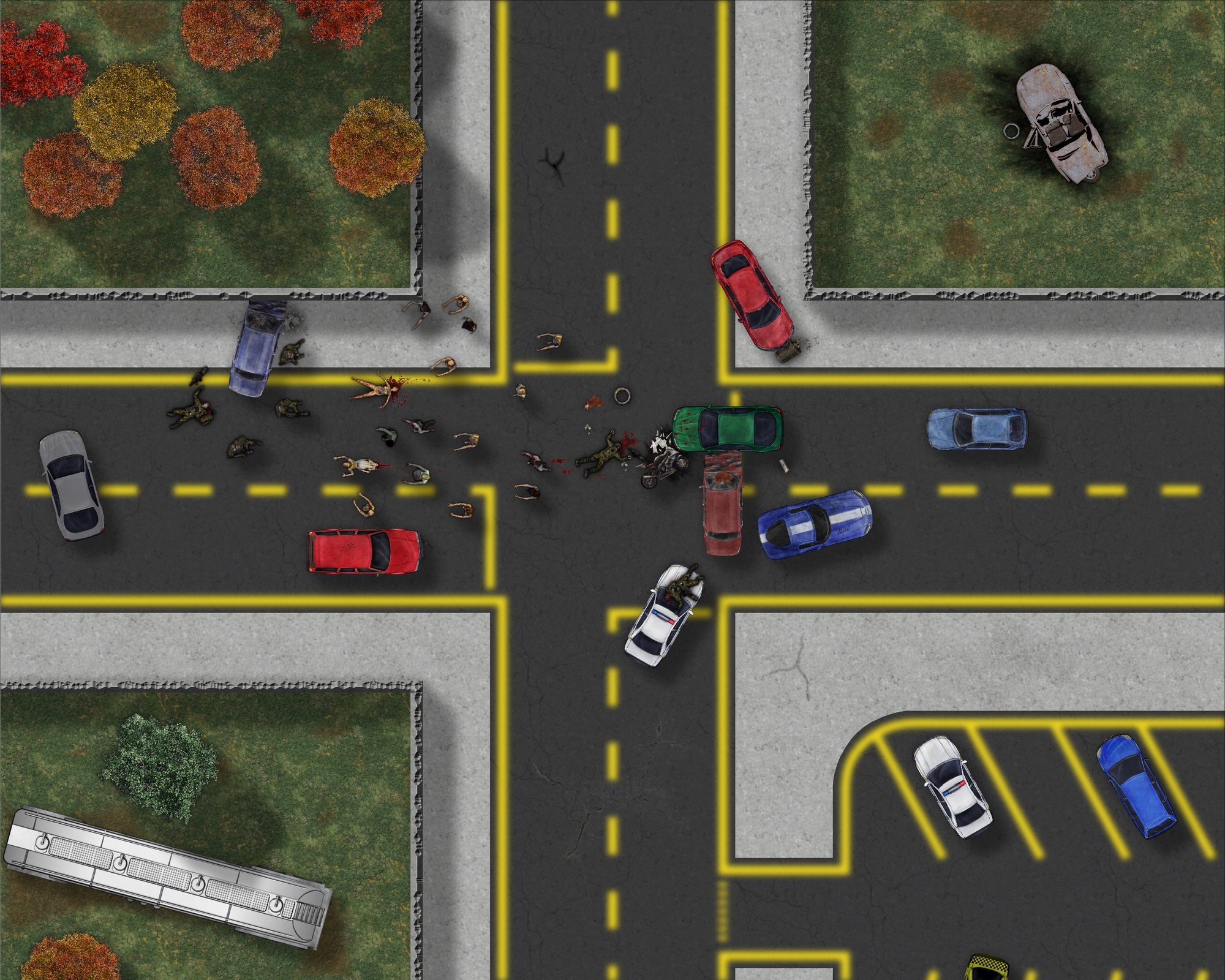
Here is a VERY fast map that I made just to see if I could handle a modern style. I did not put effort in the details, effects, sheets or even the terrain itself. It took me something like 2h to put this togheter.


Comments
For an example, look at my map from Shessar's battlemap competition a few years back.
Was that the Caps Lock key you hit by accident?
Just to add to the proliferation of paint on our tarmac, and to general confusion, in London the lines are red, and if you even just pause on them for a few seconds you are heavily fined.
The yellow lines are a bit of a problem, aren't they. You could try a very, very narrow Edge Fade Inner instead of a blur?
How about just a tad of transparency so they aren't quite so bright? Even when its fresh the yellow paint on our roads never looks that bright.