

No Glow
 mike robel
🖼️ 15 images Surveyor
mike robel
🖼️ 15 images Surveyor
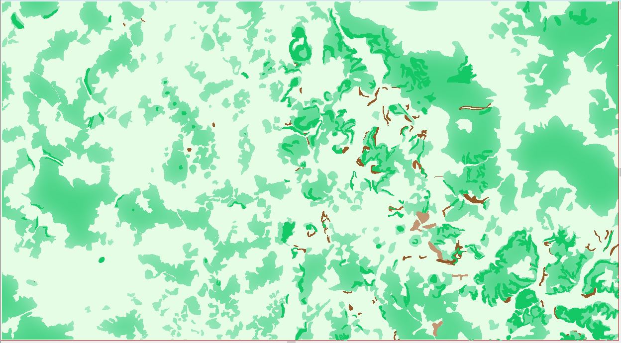
Moving from the LIttle Bighorn back to Central Germany, I am working on the map covering V (US) Corps sector in Germany in the 1970s and 1980s. The area is very forested which can impact mobility and visibility.
I didn't use contours on this map because it is very large and the terrain varies widley, so I have tried to convey elevation with the use of clear terrain (light green), light woods (medium green), and dense woods (dark green) as well as clear ground that has "rolling" terrain (light brown) and steep terrain (dark brown). Slope also impacts mobilty even if the woods are "light" so there are patches where dense woods may look a little out of place.
With dense woods, it is difficult to see into them, but light woods (and probably most vegetation) has, in my experience, a "fringe" area into which you can see into it for a short distance with optics and/or thermal sights.
I am trying to convey that with the glow effect on the map, the lighter glow indicates where you have a better chance of seeing a unit, but it is not significantly easier to get through while moving. (Except for pesky infantrymen moving dismounted.)
Clear Terrain is 111, light is 89, Dense is 87, and the fringe I defined as 91 (124,224,168).
I'm partially color blind, but I think this looks ok. My wife's vision is not as good as it used to be, so she doesn't really have an opinion (although she quilts and knits up a storm still). I am a little worried that the effect is too subtle, especially for wargamers.
The first two show the effect with only the background, forest, and terrain colors showing and the last two show all the map layers.
Each hex is 3km across and are individually coded (in the full map with a green dot (indicating GO terrain), and amber dot (SLOW-GO Terrain), and a red dot (Restrictive/NO-GO) Terrain. Otherwise you have to provide ways for the player to interpret the mobility and it causes too many arguments.")
I'd like some feedback if visually (not necessarily from a gaming experience background, but that is okay, too) if you all think I should (1) don't try for the glow effect, (2) leave the glow effect as is, or (3) adjust it somehow to show more contrast. Suggestions on colors would be helpful due to my color vision. (I had to get the RGB values in order to get the effect I wanted to see and apply it). Before I got some really garish contrasts by just trying to vary the numbers.
Thanks for any comments.
I didn't use contours on this map because it is very large and the terrain varies widley, so I have tried to convey elevation with the use of clear terrain (light green), light woods (medium green), and dense woods (dark green) as well as clear ground that has "rolling" terrain (light brown) and steep terrain (dark brown). Slope also impacts mobilty even if the woods are "light" so there are patches where dense woods may look a little out of place.
With dense woods, it is difficult to see into them, but light woods (and probably most vegetation) has, in my experience, a "fringe" area into which you can see into it for a short distance with optics and/or thermal sights.
I am trying to convey that with the glow effect on the map, the lighter glow indicates where you have a better chance of seeing a unit, but it is not significantly easier to get through while moving. (Except for pesky infantrymen moving dismounted.)
Clear Terrain is 111, light is 89, Dense is 87, and the fringe I defined as 91 (124,224,168).
I'm partially color blind, but I think this looks ok. My wife's vision is not as good as it used to be, so she doesn't really have an opinion (although she quilts and knits up a storm still). I am a little worried that the effect is too subtle, especially for wargamers.
The first two show the effect with only the background, forest, and terrain colors showing and the last two show all the map layers.
Each hex is 3km across and are individually coded (in the full map with a green dot (indicating GO terrain), and amber dot (SLOW-GO Terrain), and a red dot (Restrictive/NO-GO) Terrain. Otherwise you have to provide ways for the player to interpret the mobility and it causes too many arguments.
I'd like some feedback if visually (not necessarily from a gaming experience background, but that is okay, too) if you all think I should (1) don't try for the glow effect, (2) leave the glow effect as is, or (3) adjust it somehow to show more contrast. Suggestions on colors would be helpful due to my color vision. (I had to get the RGB values in order to get the effect I wanted to see and apply it). Before I got some really garish contrasts by just trying to vary the numbers.
Thanks for any comments.

Comments
I can see what you are trying to do with the glow, but I'm not convinced it is the way to go with expressing relief. Unfortunately I think contours will work a lot better. Since the terrain is much more complicated this time around, you could do it in larger intervals so that you only have maybe 3-4 contours over the whole map? Don't try to get every wiggle and dent in them either. Make them relatively smooth compared to the actual ground detail. Its only an indication of relative altitudes across the map, is that right?
I think it might also help if the hexes were not so dominant. They are the first thing that hits the eye, and they break up the map a little too much so that you are looking at colourful hexes rather than a map that just happens to have a hex grid on it. Possible transparency effect?
Contours. ARGH! The second map shows the same region as the first, but with the topographic map. You can see the density of contour lines. The contour interval is 20 meters, but I tried every 100 or even 200 meters. They snake all over the map and frequently "disappear". The printed game map is 50 x 50 inches but covers much more area than the similarly sized Little Big Horn Map. This map is also 1:100000 scale as compared to the LBH map of 1:24000. This is the area my squadron would have fought in. You can see how close we were to the Border.
I actually started to draw them, but the map came up with the big red X of shame and getting it in the same place is probably impossible. Still, I might give it a go.
It's funny, but I've been playing this game called Less than 60 Miles (https://www.boardgamegeek.com/boardgame/259121/less-60-miles) and it makes me want to simplify my game. I also want to have room to handle the counters easily. We spend a lot of time dice rolling and combat - even on unit to one unit - is taking 10 - 15 minutes right now as we work through the modifiers. So after reading this, the first things to go are the light duty roads and trails, which takes a lot out. Don't really need the railways out either. That by itself cleans up a lot of the business of the map and I confess, I wouldn't have thought about it if you had suggested it. Minor rivers may be able to come out as well. Fortunately all the types of roads and the railroad are on their own sheets, so its easy to pull them out. Rivers are on their own sheet too, but I don't know if I can bear to take them out, but they are factored into the terrain, so it won't be like I'm not accounting for it.
LOS will still be important, but I can probably delete very small pieces of forest.
Less than 60 miles used 5km hexes and has US Battalions vs Soviet Regiments. But the hexes are only about 1 inch wide and we find the terrain very hard to resolve, so I think your suggestion is spot on. It's based on a 1:500000 scale map and he has only one contour line in the game. But many of his features are very small and we had difficulty deciding what some are.
The game originally had 1500 km hexes, but in my view that did not properly reflect the ability of a cavalry troop do defend 3000 meters and screen 3000 - 9000. Nor did it easily model a Soviet Regimental main attack which could be on a front of 3-5000 meters. So I switched to 3000m hexes. With that, it needs to have less detail. The other concept is the player needs to assume the unit is doing things the right way in terms of positioning.
I don't think I can bring myself to just color hexes one color, but I may be able to simplify it more. We played hex based games on top of standard maps when I was in the Army and there is a game the army uses that uses 10km hexes on top of 1:100000 scale maps, so the players have to read the map. The designer/developers used the large hexes though to jar the players outside their comfort level and their detail thinking of the terrain.
Here's a picture with the small roads and the RR removed. Much less busy.
Edit: added a zoomed out view showing the map is indeed less busy. I can probably eliminate redundant secondary (yellow) roads after some analysis. This link takes you to the less than 60 miles map: https://www.boardgamegeek.com/image/5001744/less-60-miles and covers about the same ground my map does. (His map shows the whole Corps Sector from the border to the Rhine).
Glad I'd helped a little!
I went through and pruned the light blue rivers. I think the map looks to vacant without some. As I get closer to publishing the map I go through it several times, mostly looking at the road network to see if I have too many superfluous routes. Since I generalized the terrain, there are potentially a lot of things that can come out, but I still want the map to look like its based on a contour map and portrays the terrain to my soldiers eye, something the SPI maps don't do.
If it's hill shading you are after you might want to have a look at the way the hills are done in SS5, with transparent polys (the transparent fill is "Solid 20") drawn on a sheet with a very large and very smooth lighted bevel. Done on your map it would have to be on top of everything else, or the forests would cancel the relief by obliterating it.
Then I figure, why not try and reinput the BMP file with the map? To my amazement, it came out quite close to the original.
Then, throwing caution to the winds, I said, why not try the contours again. I selected the 500m contour line and you see the original work. It looks quite nice underneath the forest layer which is faded 50%.
The difficulty heres are:
Since the map is a 1:100000 map it is about 4 times smaller than the 1:50000 ones we used which gave somewhat better terrain resolution, so the contour lines can really get packed tightly, as you can see to the upper right. I have to think about this more and try some other heights. Elevation is lower in the north west part, somewhat higher in the northeast to almost 1,000m in a few places, 400 - 700m in the center, and then bounces around some in the south. 500 m might be a good compromise and just use that one. But the dang line is still hard to follow.
I suppose another course of action is get the four points of the map in military grid reference system coordinates, convert them to LAT LONG, then use FT3 to show only the 500 (or maybe 200, 400, 600, and 800) and then somehow impose the grids on the BMP map and match it up as best I can (the map is constructed from multiple digital map sheets and it doesn't always line up well.) and then bring it in to CC3.
I am afraid that would cause me to have to redo the whole map.