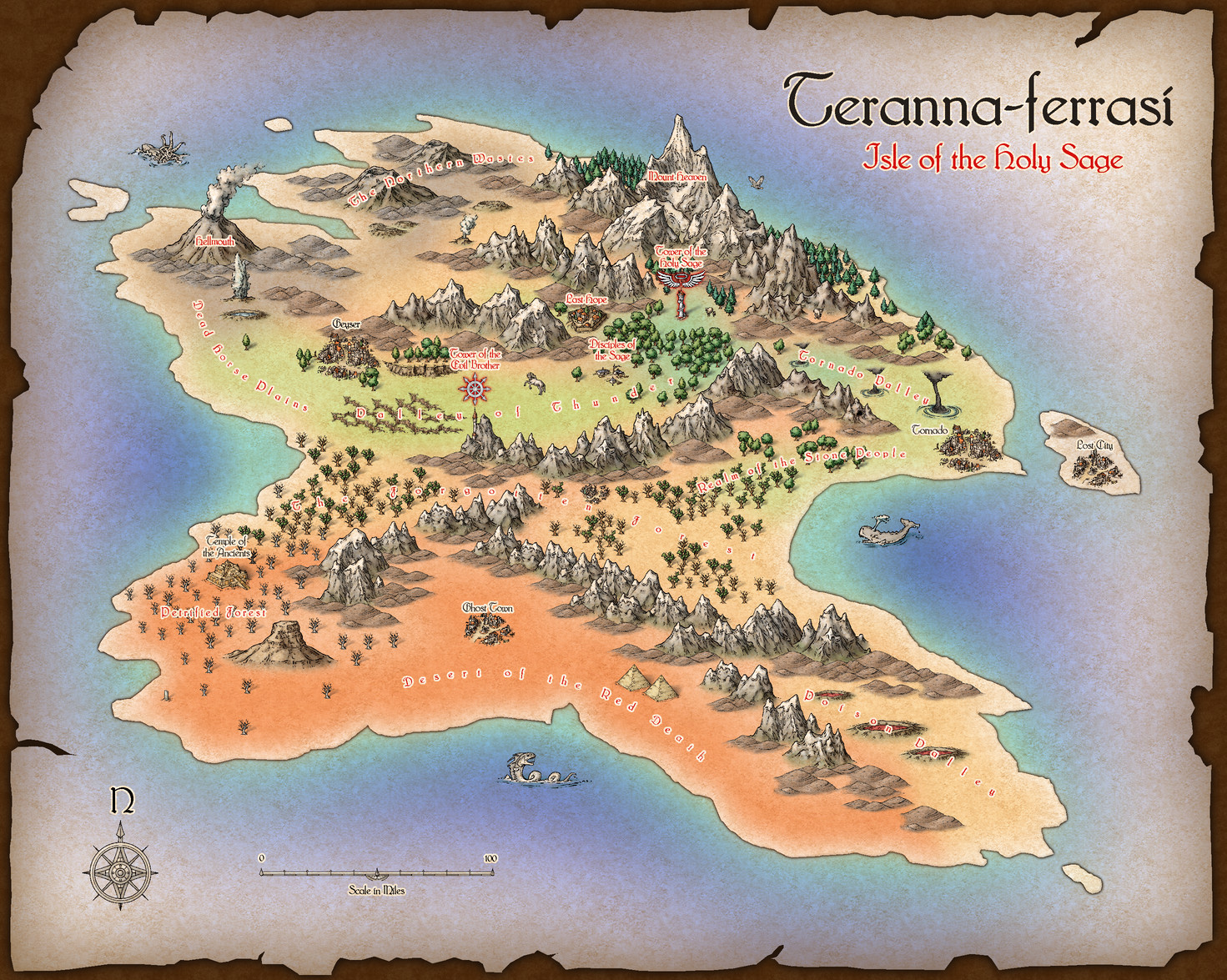
Teranna-ferrasi
 Loopysue
ProFantasy 🖼️ 41 images Cartographer
The 2007 annual has a nice Parchment Background issue (issue 06, June), so I decided to give it a bit of a go myself. This one isn't quite finished yet. Apart from the fact that the island doesn't have any roads there's something else I completely forgot to draw!


Comments
Exported directly from CC3 as a jpg, using the Save as... options to control size (1500 on the longest side), antialiasing (67%), and trimming.
That's one of my 'dulled down' palettes. If I could name it I would call it "Bright watercolour"
EDIT: The palette used in this map is on the left, while the default palette is on the right. I have purposefully left the same colour selected so you can see that I have moved the red down a row to make room for a second shade of orange. The aim of the palette was to create a full range of colours that could realistically be reproduced using watercolour paint on paper. Real paint being a lot more dull than most people realise my palette might look quite grey in comparison, but it is this lowered saturation that allows easier mixing of the colours without them looking too garish right next to each other.
[Image_13074]
In addition to this muted palette the colours are dulled even further by the texture of the 'canvas' (actually Mike Schley's Hill Background fill), which has been turned to warm pale grey and multiplied over the whole map using a Blend Mode.
In reality the template is relatively simple and contained all the sheets I needed. It's one of those issues that provides the setting - the basic sheets and the jaggy frame with effects. You just import your own map and make it into a map on a piece of parchment by doing so. I didn't have a spare map lying around, so I drew one in situ.
I wanted to make the parchment as visible as possible (that being the whole point of the exercise) so for a change I decided not to add any of the usual terrain sheets and lots of other textures, but just to add one more sheet called LAND FORMS (which I've seen used the same way in other pre-bitmap annuals), and used this one to colour the entire map in Solid polygons. Add an EFI and a blur to that sheet, and hey presto - parchment textured colours. Looks a lot like colour wash.
I should probably add that I moved the BACKGROUND sheet nearly to the front of the map and used a Blend Mode set to Multiply and 100% opacity to impose the texture of the parchment over the entire map in one go. It's not so noticeable on the symbols because the symbols have their own texture, but over the large areas of otherwise plain colours it works a treat.
The texture I used in the end wasn't one of the several parchment textures provided in the annual, but the Mike Schley Hills Background texture. It had a bit more 'bite' to it than the others, and I've always had a pet hate of those ones with horizontal lines in them. I find them way too distracting - probably my autism playing me up again!