House tool colors
 clithgow
Traveler
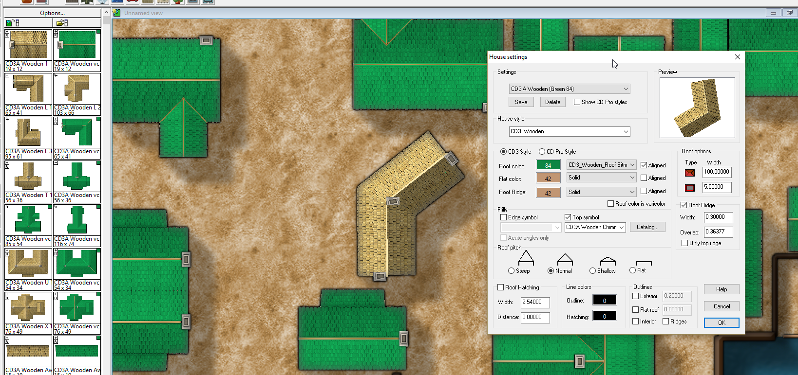
How can I go about adding color to the house tool so that I can get custom houses to match the current color versions placed from the tool palette?
I tried creating a custom setting and changing the roof color but it seems the bitmap overwrites that. I tried the varicolor checkbox but later learned through the Tome that removes the bitmap.
Any help or direction would be appreciated!
I tried creating a custom setting and changing the roof color but it seems the bitmap overwrites that. I tried the varicolor checkbox but later learned through the Tome that removes the bitmap.
Any help or direction would be appreciated!


Comments
I must admit to never having tried doing this myself. That's a bit of a problem. I'm not sure if there is a way around it.
I was hoping that someone else more knowledgeable than me would come along and tell us both how its done.
Its a bit confusing to look at one of these effects, but what they do in essence is change the hue of anything on that sheet to just the one particular hue while leaving the tone (black and white) and chroma (amount of grey) alone. In a way it would look very much like the varicolour buildings, only the whole thing would be green - including the roof ridges and the chimneys.
The major disadvantage of doing it that way would be the shadows could be quite awkward. Maybe put everything you want to be green on that same sheet - varicolour buildings and all?
To explain a few technical details.
CC3+ only support varicolor for image entities (those used in symbols), and not for raster fills, which is what the houses you draw yourself are made up from. This is why varicolor on these doesn't work when you use a raster fill.
As for the numbers in the RGB Matrix dialog, they just say how the color mix is going to work.
For example, the last line reads
B = 0.2 * R + 0.2 * G + 0.25 * B + 0
This basically mean that the blue component of all pixels (all pixels have red, green and blue (RGB) components) are calculates as =.2 multiplied with the red value of the current pixel + .2 multiplied by the green value of the current pixel + 0.25 multiplied by the current blue value of the current pixel. Red and green components are calculated the same way (Notice that the first line in the dialog is all zeros, effectively removing red altogether)
This calculation is applied to every pixel in the image individually.
And thanks for the tech description, Monsen. I briefly considered doing a save-as to the original raster fill to get a green version I could use for the custom houses - I do believe the matrix solution will get me moving quicker. Still probably not quick enough to get Lake-town mapped for next Sunday's session especially since I still have some story to write. Que será, será
Don't worry about trying to explain it all over again. It never seems to work out in my head. But despite not having a clue about what's going on with this effect it seems to work out ok if I just keep fiddling with it till it looks 'sort of right'
Scott used it in one of his recent Drow village maps, and I used it in one of my Guild Challenge maps.
Here are a few examples:
[Image_12344]
A straight multiply of a purple rectangle (you can see the colour of the rectangle from the colour of the varicolour building bottom left)
[Image_12345]
A straight overlay
[Image_12346]
The same overlay with the brilliance of the light bits taken down a peg or two by an additional HS/L effect. You could also desaturate it a bit if you didn't like the bright colours.
If you used a pale colour you could make it foggy, or if you used a polygon filled with a cloudy texture you could make it quite spooky!
NB. If you want to make it paler, as with fog, the multiply blend mode wouldn't work. Overlay would be better. There are lots of other options - just play till you get one you like.
Things you have to watch if you want to make use of the blend mode to change the mood like that include how bright the ridges are on the buildings generated using the House command. As you can see I used the default House and the ridge is rather a lot more pale than the symbol ridge. It might be as well to adjust the setting so that the ridges on the House buildings don't glare quite so much when you add the blend mode sheet. It will give you more flexibility with what you choose to do with the blend mode.
There are lots of tricks to make maps do interesting things. Maybe combine several sheets like this into an animated map like the one Monsen made not long ago?