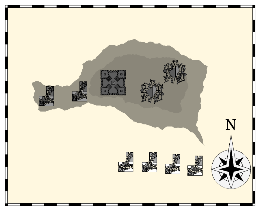
Interactive Atlas, Destitue village near Basher Bay
 JimP
🖼️ 280 images Departed Legend - Rest in Peace
The L-shaped buildings are 30' wide and 40 feet long. The tower/keep is 52' x 52'.
LIkely use different of the same solid bitmap fill to show the pond. Needs dead trees, pond, paths.
Png at 75% of my usual 1200 pixel wide map.
LIkely use different of the same solid bitmap fill to show the pond. Needs dead trees, pond, paths.
Png at 75% of my usual 1200 pixel wide map.


Comments
What sheet effect is causing that rather nice sketchy looking hill shading effect?
Both are on sheet contours. Edge fade: distance 5.3 units. zero % opacity. effect units on view width. I used the default.
They are bottom: solid 40 bmp, and the top one is solid 10 bmp. And fractalized multipler times.
Where did you get the compass rose. I like it.
And make the roads more broken up.
Destitute. 75% of 1200 pixels.
Some trees are now in the roads. Should I still break up the roads ?
Instead of using a dashed line for the worn-out road, or using these too-obvious dirt patches, try using small, white, rounded-irregular polygons on a sheet above the roads to hide little areas of the roads instead. You'll likely need to give them a touch of Blur and/or Transparency in the effects to get them to look right. The idea's to make it look like vegetation is starting to encroach on the pathways, as well as forming potholes in places.
The other thing is - and this may be just me - but the building shadows seem to be making the structures hover above the surface, as if they aren't attached to it. Maybe softening the shadows more might help.
edit: And I shortened the wall shadows by half.
With the white patches, I'd suggest trying some along the edges of the path, just as if nibbling away at the edges, rather than hiding parts completely. If the roads were seen closer, so wider, I'd suggest running a patchy strip down the centre in places, where the wheels don't run so plants can take hold easier.
The blurrier edges for the Attack of the Killer Giant Frogspawn patches certainly make those look more interesting.
[EDIT: And how is it so many of us are online just now for once? Are we all downloading and installing CC3+ Update 18? I know I just have - and now you can read the name of all those mysterious "what is it?" bitmap fills!]
Put the one on the top of the hill on its own sheet.