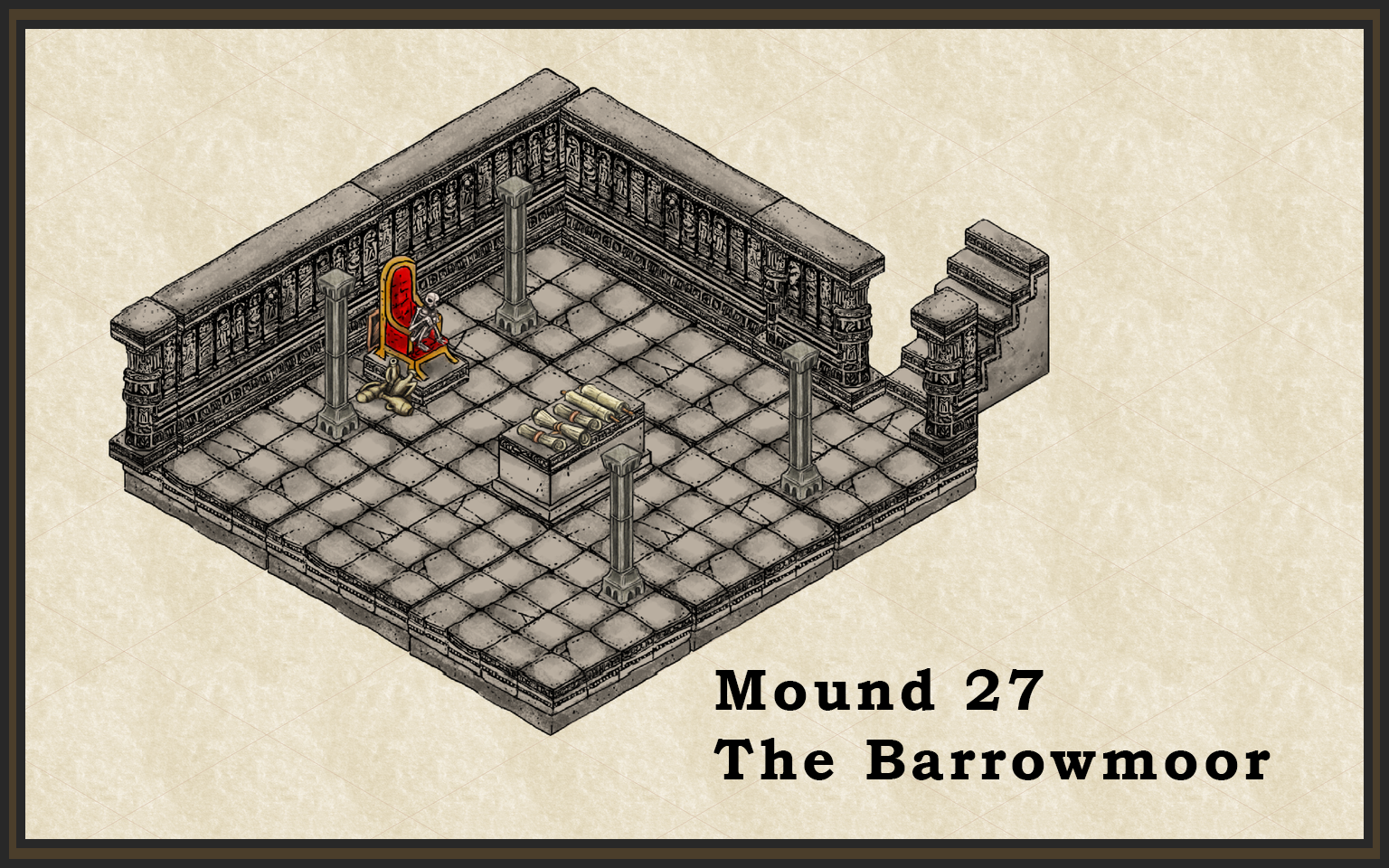
Mound 27
I'm running the Barrowmaze right now, and so I'm starting a project of generating maps for some of the more interesting barrow mounds that don't have maps already drawn for them. Here's my first one -- the description is of a 30 x 30 tomb with a warrior-priest slumped on a throne. There's a secret lever behind the throne that PCs can find, and so I put a hidden lever in the map that you can /just see/ if you look carefully at it!


Comments
If I may point something out? It looks like the symbols for the back wall (on the left) are slightly shifted to the left (well, left relative to the wall). If you move them a little to the right, you can fix the slight overhang on the left-hand side and the uneven corner on the right. Also, the map is nice, clean, and simple, but that doesn't mean the title font needs to be so plain. It's perfectly fine and usable as it is, but maybe consider changing the font to something more complementary to the map, as a nice finishing touch.
I really like the columns in the room and the scrolls on the sarcophagus. The jugs piled near the throne make it seem almost like the skeleton sat there getting drunk.
You've been making some really good first maps! I hope you'll keep sharing them. Welcome to CC3+ and the ProFantasy forums, by the way. Sorry, I meant to post that in one of your other threads but I've been busy elsewhere IRL this past week.
I look forward to seeing more of your work.
Cheers,
~Dogtag
Looking forward to more of your work!