Community Atlas - Ethra - Blackfall

So I caved and bought one of the annuals, the one with black & white cities... and oh boy have I been having fun!!

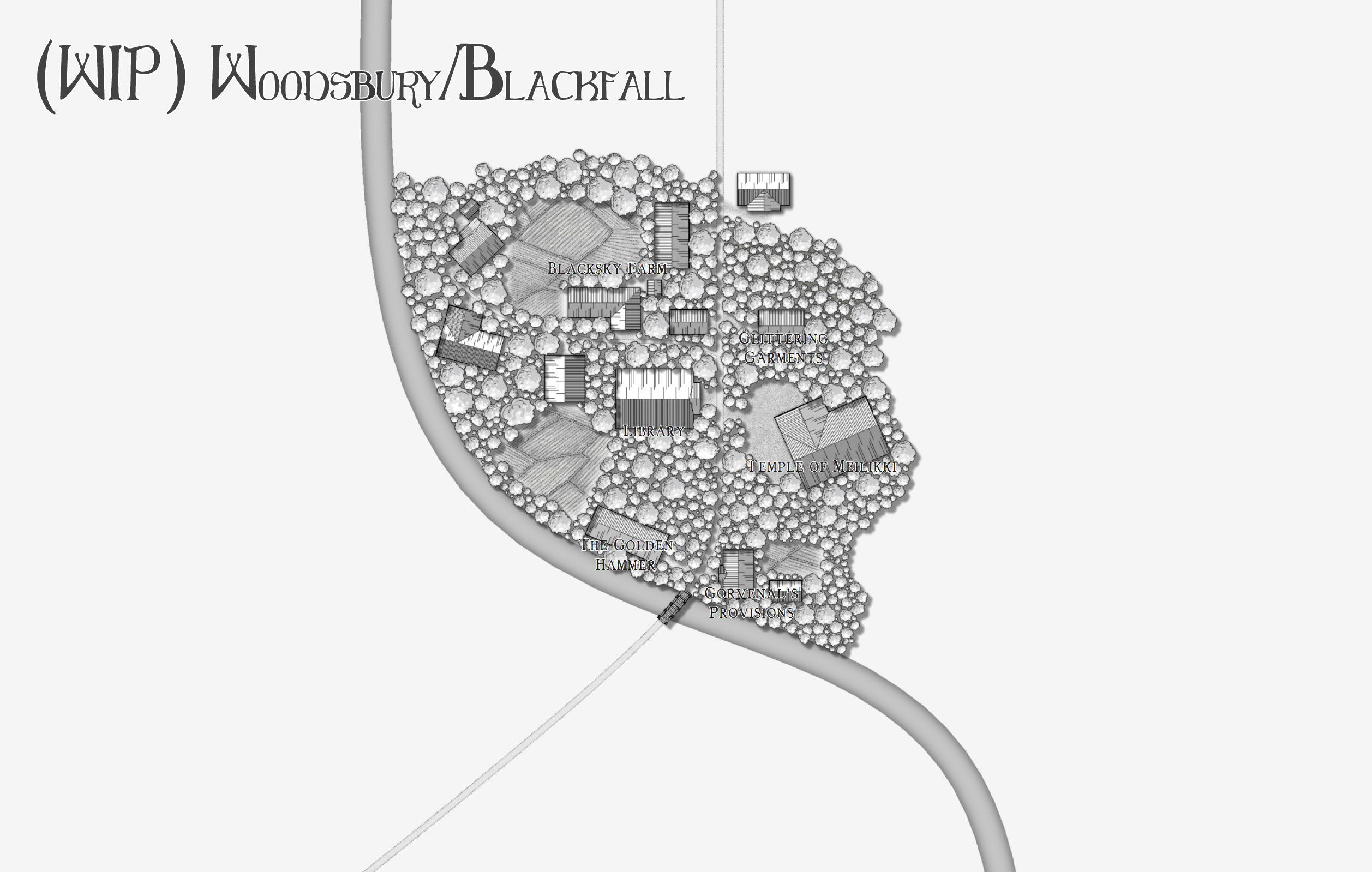
The first town I have been making for my campaign is called Woodsbury, it's more of a village than a town really... but it's in the middle of a huge forest. Looking at the map of Ethra, I can see that the settlement of Blackfall lines up pretty well with Woodsbury... So I've decided to use this map for both towns!

There's not much on the map yet and it will be an ever changing WIP until I am happy with it but I am really, really in love with this city map style. It's simple, elegant, and perfect for a small town in the woods.

I hope you enjoy this (very small) preview! :)
«1

Comments

  • Posted By: QuentenBushfire hazard! :D Love it so far
    Oh my gosh I giggled! Thanks Quenten :) It truly is a HUGE bushfire hazard isn't it? But I imagine it's also stunningly beautiful to live amongst so many trees.
  • Can I suggest at least SS1 (overland), SS2 (dungeon, Ss4 (Mike Schley dungeon) and The Tome of Ultimate Mapping - the last one is an absolute must
  • pixelkittehpixelkitteh Traveler
    edited May 2017
    Slowly doing a bit more, it's starting to look like a village now.
  • Posted By: QuentenLooking good, and I love the names
    Thank you, this website saves my life when it comes to names! http://www.fantasynamegenerators.com/ I also make a lot up myself (like the tavern name and the knights), but this website is magic. It has randomised names for everything you can imagine.
  • I've had a look at it - it's pretty impressive. I have my own name generator, much of which I made myself in TableSmith, but this is really great. Not sure about the Greek names though.
  • Yes some of the generators are questionable haha! But there is more than enough to keep me satisfied, I haven't come up stumped yet. If there's nothing I particularly love I can still take two parts and put them together. That's pretty cool you have your own though!
  • HadrianVIHadrianVI Surveyor
    This is very beautiful. Good job.
  • Posted By: HadrianVIThis is very beautiful. Good job.
    Thank you ^_^ this village is my pride and joy at the moment, it's the first village for my own personal campaign, but I am also using it as the village of Blackfall on the Ethra island for the atlas. I really love this black and white style, the more I do the more in love with it I am! :)
  • JMunsonIIJMunsonII Traveler
    This is really great - love the black & white/pencil/graphite kinda feel. :)

    My only suggestion is to break up that river bank a bit - maybe fractalize it some - it seems a little too "planned." But that's just my two cents...
  • Beautiful! I just got CD3 and am starting the process of familiarization with it. Your artwork is inspiring. I can see there's a lot more to the program than I thought after viewing this map. Thanks for showing the process :)

    Cal
  • Posted By: JMunsonIIThis is really great - love the black & white/pencil/graphite kinda feel. :)

    My only suggestion is to break up that river bank a bit - maybe fractalize it some - it seems a little too "planned." But that's just my two cents...
    Isn't this style beautiful? It's the B&W cities style from Annual 4. I agree about the river, but as I built more I'm putting trees out over the sides and hoping that it kinda breaks it up a bit! If that doesn't work fractalizing sounds great.

    Hi Cal and welcome to the world of CD3!! I've only had this program a week, but boy is there a lot you can do with it! Thank you for the comment and I am looking forward to what you make :)
  • I usually draw rivers as a polygon, allowing me to alter the width easily, allowing for fords/bridges at the narrowest and rapids etc. That is, when close up like this.
  • Really good. 2 suggestions - can you make the houses a bit more obvious - they seem to get lost in all the trees. And the text need to be darker, or sharper - not bigger. It also is getting lost among the trees
  • i agree with Q, above. It's hard to make out what's what. I would remove some of the trees. Most homes/shops didn't have that much tree cover.....they needed the wood, and it was a fire hazard from the embers coming from all the chimneys used to heat the buildings. Maybe if you thinned them out a bit the buildings would be a bit more visible. Text and roadways, as well.

    That being said, i love they layout of the town!!
  • Posted By: QuentenReally good. 2 suggestions - can you make the houses a bit more obvious - they seem to get lost in all the trees. And the text need to be darker, or sharper - not bigger. It also is getting lost among the trees
    Posted By: Loreleii agree with Q, above. It's hard to make out what's what. I would remove some of the trees. Most homes/shops didn't have that much tree cover.....they needed the wood, and it was a fire hazard from the embers coming from all the chimneys used to heat the buildings. Maybe if you thinned them out a bit the buildings would be a bit more visible. Text and roadways, as well.

    That being said, i love they layout of the town!!
    Yeah I agree with you both, I do so love the trees though haha! I'll work on it :) Thank you both.
  • The Victorian Fire Brigade is investigating this town as we speak! :D
  • Hahaha! I was a volunteer with the CFA for 10 years, I wouldn't live here but hey, it's pretty!
  • pixelkittehpixelkitteh Traveler
    edited May 2017
    Feels a little bare... but no fire hazard! (excuse the crapness, just look at that bit in the top middle :) )
  • I think this is much improved. Some houses still surrounded closely by trees, but then Aussies are known for doing similarly stupid things, as is evidenced every year in bushfire season. Fire could be a great story hook for the village anyway - perhaps due to a serial arsonist (and don't they exist in real life! ) The houses and text are MUCH better.
  • edited May 2017
    Oh, yes, now this i can SEE :) You know, once i turned 45 my eyes, just get worse and worse. I really just need to suck it up and get them checked out. But in the meantime, a map like this is a treat for my old eye. This is a nice style....and has piqued my interest in trying it out myself. I have all the annuals and know that i haven't even scratched the surface as far as trying different styles. I tend to stick with the photorealistic style, myself.

    Although now that i CAN see....The text for the Golden Hammer is overlapping the river text - which looks to have a previous name of a river behind the current Harmony Brook ;)

    Excellent work on this!
  • DogtagDogtag Moderator, Betatester Traveler
    edited May 2017
    This is another very pretty map that looks like something I'd see in a published module or an issue of Dungeon magazine. I get a nostalgic gaming vibe just looking at it. Great use of the annual!

    But, just so I'm clear on this, the tavern in this idyllic, heavily wooded town is named The Shattered Lantern? Yikes!  :-SS  ;-)

    Thanks for sharing!

    Cheers,
    ~Dogtag
  • Posted By: QuentenI think this is much improved. Some houses still surrounded closely by trees, but then Aussies are known for doing similarly stupid things, as is evidenced every year in bushfire season. Fire could be a great story hook for the village anyway - perhaps due to a serial arsonist (and don't they exist in real life! ) The houses and text are MUCH better.
    Haha the story in my setting is actually that this forest grows three times as fast as normal and the trees also grow three times as large. No arsonist could ever keep them down!
    Posted By: LoreleiOh, yes, now this i can SEE :) You know, once i turned 45 my eyes, just get worse and worse. I really just need to suck it up and get them checked out. But in the meantime, a map like this is a treat for my old eye. This is a nice style....and has piqued my interest in trying it out myself. I have all the annuals and know that i haven't even scratched the surface as far as trying different styles. I tend to stick with the photorealistic style, myself.

    Although now that i CAN see....The text for the Golden Hammer is overlapping the river text - which looks to have a previous name of a river behind the current Harmony Brook ;)

    Excellent work on this!
    Thank you :) don't worry I'm only 30 and I'm already blind >_< get yourself some glasses, it's worth it! And ahhh yes I'm using this town for my own campaign and for the Atlas but they have different names and I forgot to turn off the second text layer hence the overlapping >_< my bad. But yes you can zoom in really far and it's clear as on my map, but I can't upload a high quality picture here. Here is a link to a properly sized map though if you'd like to check it out :) - https://1drv.ms/i/s!ApcsRlCXJSPUfJCH-zrd8bF-4aU (download it... don't view it online the quality is terrible >_<) - the town for my campaign will have the bajillion trees because they are part of the story but I'll tone it down for the Atlas... Also isn't this style GORGEOUS! It's the B&W cities from the annual 4. It has to be my favourite style at the moment. I really love the simplicity. The ground coverings you see are from the Schley overland, I added them, change the saturation to nothing, and scaled them to fit in. I thought it looked nice having dirt and grass and field textures seeing as this is predominantly a farming and foresting community :) the rest is all the B&W cities set.
  • pixelkittehpixelkitteh Traveler
    edited May 2017
    Posted By: DogtagThis is another very pretty map that looks like something I'd see in a published module or an issue of Dungeon magazine. I get a nostalgic gaming vibe just looking at it. Great use of the annual!

    But, just so I'm clear on this, the tavern in this idyllic, heavily wooded town is named The Shattered Lantern? Yikes!  :-SS  ;-)

    Thanks for sharing!

    Cheers,
    ~Dogtag
    OH MY GOSH I'M SO GLAD SOMEONE PICKED UP ON THE TAVERN NAME! :P you win forever!

    Thank you so much, you flatter me :) I'll have to check this 'Dungeon' magazine out, I do so love the good ol' D&D style maps!
  • DogtagDogtag Moderator, Betatester Traveler
    edited May 2017
    pixelkitteh told Dogtag:you win forever!
    Woot!  \:)/  \m/
  • Dogtag, those gif icons are fabulous - where do you get them? I especially love your cheesy grin
Sign In or Register to comment.