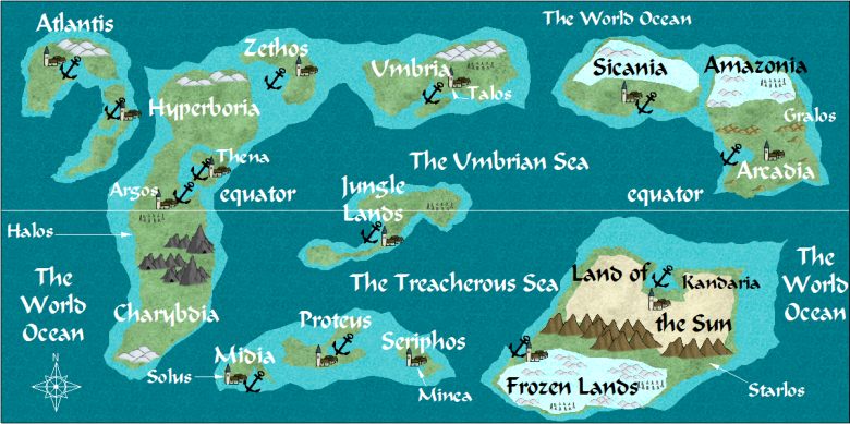
my Mazes and Minotaurs world
 JimP
🖼️ 280 images Departed Legend - Rest in Peace
Another game, links to the pdfs on my site, they are free. A Greek city-state game. It has a Viking conversion to. Well, Norse who went a Viking. There are no people named Viking.
I'll just say I had some bad indigestion, and decided to make more maps.
I'll just say I had some bad indigestion, and decided to make more maps.


Comments
Do you think it would be improved any if you faded the line between the shallows and the deep?
oh, gee. I forgot the site link:
Mazes and Minotaurs site
update: Since my main domain wasn't being used, I moved this site to my main domain. Yes, now the url is silly, but it would take me a month to change all of the urls and navigation menus.
There will be more maps to the right and below, 3 more total.
I like to go to my maps when I am trying to feel better as well. :-)
When I do the local maps, I'll map shallows and use several blue bitmaps to show different water depths.
I look forward to seeing the next few maps, then
Maybe I'm being lazy and not using effects. :-)
Anyway, this is part of the Helos Continent, country of Hyperboria. Nearby islands, and the ice section of this continent.
Several problems. I used a city template instead of an overland template.
Probably due to that, when I went to use another water bitmap fill, it looked too regular.
This map uses CD3B_Water1. I tried to add CD3B_Water2 and got just a bland blue area. Not 'rough' like the frst one. I used the same scale.
I'll add a map showing the CD3B_Water2 addition.
As usual, I'm blown away by the sheer quantity of mapping you do, Jim. It's inspirational.
Cheers,
~Dogtag
The updated statement also looks fine, but might I suggest making it just a tiny bit smaller? Its a bit easy to confuse it with the text of the map the way it is - the same colour and the same size. I know I shouldn't really post my maps on your thread, but I need to show you what I mean by that.
This is a gross enlargement screen shot segment of the Merelan City map showing what I have done with my own copyright message and mark. Its probably equivalent in size and area to the bottom left 4x2 grid squares of the map above (if both maps were shown in full at a similar physical size). Its not very large, but removing it would damage the much larger title and take a substantial slice off both the right side and bottom side of the map - rendering it practically useless.
[Image_7014]
By making this suggestion I am thinking of your players, and their enjoyment of your maps.
Odd name 'Shorn City', but its has barbers who like cutting hair. If your character doesn't have any hair, they will gladly supply a wig, so they can trim it, excuse me, cut it for you.
Twin Lighthouses of Poseidon and Monestary to Hermes are self-expalanatory.
Sure you wouldn't want a hair cut ?
:-)
Also what ocean fill are you using in the latest? It really makes your maps pop.
I agree with Jay. I love your maps. The style is simple and clean making it very easy to follow. You have great place names too.
Here ya go: http://forum.profantasy.com/comments.php?DiscussionID=6357&page=1#Item_7
I might post the fcw files in here. I started doing for these like I did for my Traveller maps... its hard to come up with thousands of planet names. So, I took basic syllables, and changed one letter.
Zar, Zir, Zer, Zur, Zyr. And tried not to place them in the same sector, unless its a small empire.