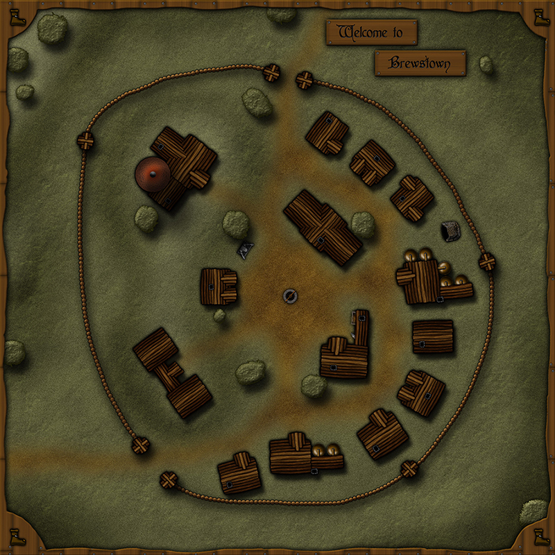
Brewstown
Hi there!
I've been using ProFantasy Products since the release of CC3 and use them if I need to make quick and good-looking maps for the sporadic DnD-Sessions I host. Actually, the ProFantasy products spurred me to try and make maps as individual as I could and even to start and try to make my own symbols (some kind of creative kickstart, if you will).
Not only because I got some great inspirations from this forum and its users, I thought I might share the one or other map (or maybe self-created symbol) with you guys. The following map was not created with CC3/DD3, but with Photoshop CS6 (that's what I'm using when I've got time). I'm quite pleased with it myself, but I think it's still too "clean", for example lacking in detail like debris, tools of daily trade, etc. Input would be greatly appreciated.
So thanks for reading/beholding and - yaaay - my first post in these forums.


Comments
The wooden towers and simple palisade are real nice and fits with a small village.
The nice blend between the grassy areas and the worn paths.
And finally, the use of shadow to create high ground within the village.
The only thing that creates an unease are the trees.
They just are not reading as trees to me.
More like floating green sponges.
I cannot put my finger on it specifically but maybe it is the texture, or maybe it is the fact that they look sort of flat on top.
They are also the exact same color as the grass.
They just don't read "Tree" to me.
Great job though - it is a lot better than what I can do! Ha, ha!
This is a great map overall. It definitely serves its purpose. I don't know that you should clutter it with a lot of tools and debris; that might be gilding the lily.
I agree with the others about the trees perhaps needing to be a darker color, but, overall, the map seems a bit dark to me. Could just be me though.
I like the border, too!
PS: if you want I can share the self-created Building-Symbols (as .png) - I just don't really know how
It is amazing what just a few changes can do.
Great job!
I'd love to go drinking in that inn
The walls are supposed to be made of logs, but i'm not really happy with the result (too big in relation, too not-loglike looking, etc.). A barrel-wall is an interesting idea though ...
Great Tip with the shadows. The tree is actually meant to be somewhat higher than the house (since the latter only has one floor), but i'd still have to model the shadow matching to the rooftop, I guess.
Other than the walls, this looks great!
Yeah, I'll probably try to change the wall sometimes to resemble horizontal logs ... but don't know yet how - other to draw them one by one, but I'm quite too lazy for that at the moment ;-)
Personally, I would go with the vertical logs precisely because they're less common in the real world. It makes the whole thing feel more fantastical. Just my opinion!