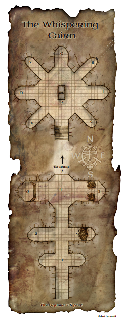
First CC3+ Dungeon Map - The Whispering Cairn (Age of Worms) [WIP]
 Raiko
🖼️ 32 images Surveyor
I've not actually done any mapping since my Tomb of the Witch King map for the competition back in April.
This is due to various real-life stuff, as well as Elite: Dangerous.
However I've just bought the D&D 5th Edition Player's Handbook, and downloaded the freebie DM book for now, and I plan to run the Age of Worms campaign for my daughter.
The Age of Worms was published in the old paper version of Dungeon magazine, back when Paizo produced magazines for Wizards of the Coast. Age of Worms was the second "adventure path" campaign written by Paizo, about two years before the birth of Pathfinder.
The first part of the Age of Worms campaign mostly takes part in an awesome low-level dungeon called The Whispering Cairn, located near to the town of Diamond Lake in the World of Greyhawk setting.
Here is the original map of the entrance area taken from the free web supplement for Dungeon Magazine Issue 124. This image is copyright of Wizards of the Coast - however it is freely available in a pdf from Paizo's website.


Comments
This was mostly a choice between Mike Schley's awesome SS4 style, or my own style that I used for the competition and an earlier Pathfinder dungeon.
Since I kind of owe an explanation of my own style, and the symbols are a little limiting sometimes with the built in styles I decided to do the map in my style, and to give the new CC3+ a whirl at the same time. So I've downloaded and installed CC3+ this evening and got to work.
Note that CC3+ currently isn't compatible with DD3, etc. However as I tend to draw my dungeons in a more CAD like way (like Joachim de Ravenbel) I mostly use the basic tools and shapes anyway, so it seemed to be worth a go.
As this is a work in progress, and full exports used to take a while in CC3 (I've not tried in CC3+ yet), I'm going to post screen captures until the map is more complete.
Each is rescaled to 800px width for the forum, and I'll give a link to the original 1366x768 screenshot from my laptop.
Firstly the layout:
I almost always begin with a solid black background sheet and a construction sheet which I use colour 6 (magenta) to draw the layout.
These construction lines get copied several times to different sheets, but are never deleted.
I usually draw everything as simple shapes at first - ie boxes, polygons, cirles, elipses, etc.
Then I explode all the polygons and trim everything to make a simple outline.
Full screenshot
I've just been working on the basic wall / floor layout so far so these are all wall related.
Many of these new sheets aren't used yet, so each new sheet has a single colour 1 (green) point draw at 0,0 in the frozen map border layer. This is because unfortunately CC3 automatically deletes empty sheets when it saves.
I'll summarise my sheet effects later.
Later I'll add additional sheets for grunge, etc.
Full Screenshot.
The floor tile is by the awesome Neyjour (from the dunjinni forums and deviant art). I used this floor tile
I use GIMP to slightly manipulate the tiles, including RobA's excellent "tile shuffle" filter. It's available from the Cartographer's Guild forums for free and is well worth using.
I created a 4000px square image in GIMP that contained tiles for a 100x100 foot area with shuffled / rotated tiles. This was then imported into CC3+ using tools/import bitmap fill styles.
I don't use textures for walls. The dungeon wall is solid fill colour 246.
Full screenshot
All VTTs have a built in grid, and most have some method of automatically or manually revealing "fog of war." Regardless of the software used, this is almost always easier if the fog revealed aligns with the grid.
This means that on a VTT it's almost alway preferable if the dungeon walls overlap the gridlines by up to 1ft.
I'd normally make this overlap half a foot, but when I first used this style I found that 1ft thick "dividing" walls between rooms and corridors looked rubbish. So now my thinnest walls are 1.5ft thick and all my walls overhang the grid by 0.75ft.
To do this I create two paths/lines/walls. The first is line-width 1.5ft on the wall sheet. The second is line-width 1ft on the walls-top sheet.
Again no textures are used it's all colour 246 with bevels (and inner glows for the walls-top sheet).
Full screenshot
Full screenshot
This uses a texture from volume 24 of the annual, which I copied to the same folder in CC3+
Full screenshot
As a final comment from me tonight, I just wanted to say what a pleasure CC3+ is to use. So far (touch wood) I have had zero crashes, I hope it's still so reliable when symbols are added (I use loads and loads of grunge and debris).
It's really fast, even on a laptop. And it's great to be able to move the map around quickly with all sheets active and effects enabled.
Full Screenshot
Note that for the "pink construction line" part of the mapping I'd normally map use of your castle wall tools, but I'm not sure what works in CC3+ yet.
I'll be working on my map some more tonight, and I'll post updates.
I've had a go at exporting the map in it's current state and the exports seem to work much faster than before - and the "in progress" messages are much better.
The 800px wide forum image below links to a 100px per square 4000x8000 image on photobucket.
I tried exports at various resolutions (50, 100 and 200px per 5ft square) and found that the rendering engine crashed immediately at 200px (an 8000x16000 image) or with 50% antialiasing at 100px (same 8000x16000 true image size), but worked flawlessly at the lower sizes.
100px per square is ideal for VTT use, and even though the process will be slower with additional sheets, it looks really promising so far.
As an experiment I also tried to export the top half of the map as an 8000x8000px png, as this size would be suitable for a 400ft x 400ft square dungeon at 100px per 5ft. This seems to be the "standard" size of larger dungeon maps in Paizo products. The 8000x8000 export was successful and only took about 5 minutes on my laptop which is great news.
I've not tried printing to pdf yet, but I always struggled with that in CC3 (I'm planning to ask Ralf for some tips when this map is finished).
To add the buttons you'll have to edit the C:\ProgramData\Profantasy\CC3Plus\FCW32.MNU file (see attached) as no Dungeon.mnu file exists yet. If you take that route, make a copy of the original file first. You also need to copy the CC3\bitmaps\icons folder to the C:\ProgramData\Profantasy\CC3Plus\Bitmaps folder...
Note that I work with Windows 8.1. I don't know how it translates to other operating systems.
The safe way is of course to wait for the official compatibility but I couldn't
I'm eternally indebted to those who's tutorials I've read over the years, especially Ralf, Joachim, Clercon and Jonathon Roberts / Torsten. Not to mention countless others on the cartographers guild forums.
I'll try my very best to make a better step-by-step tutorial when I've finished the map. I'm aware that currently this is more useful to those who can already use CC3.
I've taken some screenshots as I did the collapsed areas and the stairs, so I can write up the tutorial properly.
Here's the first level almost completed, just a few more interior details to add, plus the exterior area.
It's always good to see how other people translate those old modules.
Great work!