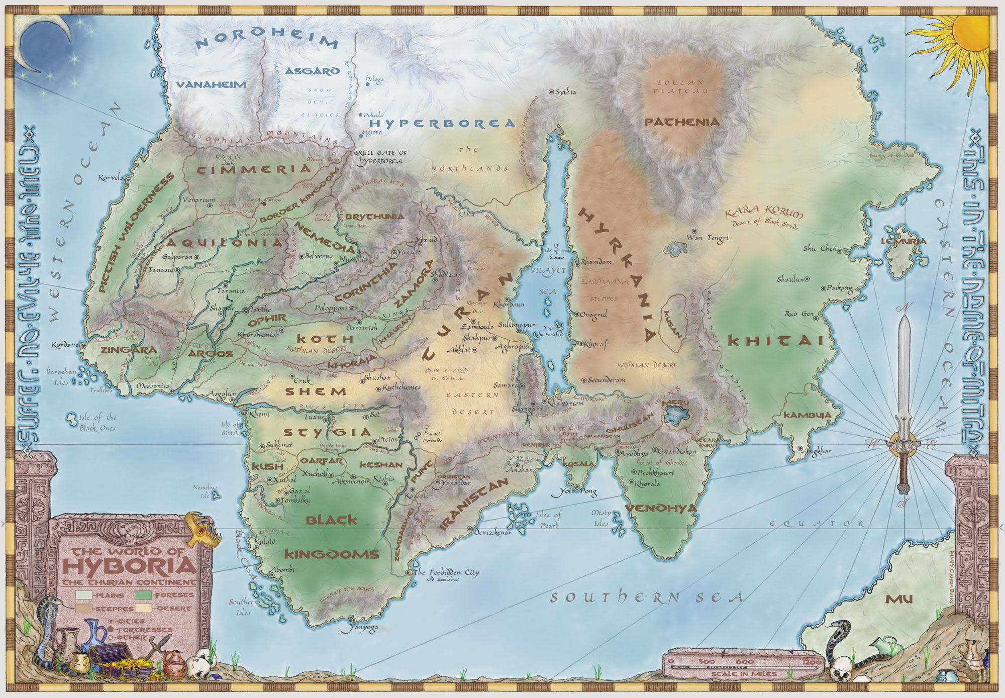
Age of Conan Style Map? How to do it? Or Annual Suggestion?

Hey everybody! I'm looking for ideas on how to create an "Age of Conan" style map from Mongoose Publishing. Basically need a good template or "how to" to create a large area with minimal detailing with loosely defined regions. I have find drawing large maps beyond the 1000x800 very difficult with the current CC3 templates (but that's just me!!!). Any ideas, suggestions, or instructions would be appreciated!!

Comments

  • I agree that is a lovely style - something like this in an Annual issue would be cool!!

    If you're just looking for existing Annual issues that are designed for large-scale overland maps, I would recommend either 'Fantasy Worlds' from April 2009, or '13th Age Overland' from September 2012. I'm currently working (slowly) on a full continent map of my world in the 13th Age style.
  • Thx for your comment Tolrendor... Where do we nag these Profantasy guys about this going into an annual! Lol. The style doesn't seem like to much of a stretch for an annual... except the mountains maybe... mountains are always hard for me, despite CC3 making it so easy!!
    Anyway, I have played around a lot with the 'Fantasy Worlds' annual... probably to much. I could never really make my maps look like how I wanted. I would like to see an example of your large scale '13th Age' Map if you are willing to share.
  • pdjpdj Traveler
    "except the mountains maybe" is right - what makes that map work is the shaded relief effect.

    Shaded relief seems to be a big problem in CC3 - though you can get sometimes get mileage out
    of texture effects and "buried" semi-transparencies.
  • edited January 2014
    It seems that doing the colored relief areas are possible with all the various sheet effects on CC3. The mountains are a stumper. Any ideas on how to tackle something like that??
  • Would something like this work for the mountains? This is just a quick example. It's not exactly like the map...but it is as close as I can get in a short time. I don't want to invest too much time into it if you don't think it's what you want.
  • Are you kidding me? That's exactly what I'm looking for! How did you do it? Those look really really good! I am impressed.
  • DogtagDogtag Moderator, Betatester Traveler
    Posted By: fiolnirAre you kidding me? That's exactly what I'm looking for! How did you do it? Those look really really good! I am impressed.
    +1 Those look amazing, Shessar!

    Cheers,
    ~Dogtag
  • I'm always impressed with this forum. It is truly incredible the amount of extremely creative and friendly people that post here.
  • Glad you like! :)

    It is a PNG Fill Style that I created by cutting bits from the original map. Right now it is just a small png, so I need to work with it to expand the size (I have this scaled to 400x400 in CC3 so it is quite small). I'll post it here when I have it ready.
  • Okay! So I've been playing around with trying to "blend" various colors to create to something similar to the above map. I suck. I cant make it look nice. Coastal areas I can make look pretty good, but the fading from the greens to yellow or greens to white is something awful. Any ideas?
  • edited February 2014
    I've got the mountain bitmap figured a bit better. Here it is, along with the settings needed to achieve this look.

    Add the png fill to your map in the standard fashion. For a map that is 1000 x 800 set the fill style scale to 150 x 150.

    Draw your mountain ranges on their own sheet using a straight or fractal poly and add the following effects to that sheet:
    Edge Fade Inner: Set the edge width somewhere between 25 - 45 depending on how big your map is. Don't be afraid to play with this number until you get the look you want.

    Spacial Matrix Process: Load the Emboss settings. There is no need to change any settings.

    Adjust Hue/Saturation; Change the saturation to -5. (That is negative 5) This deepens the colors a little.

    For the snowy mountains, use the same bitmap but use a separate sheet.
    Edge Fade Inner and Spacial Matrix Process: Settings will be the same as above.
    Adjust Hue/Saturation: Change the Saturation to 40. You can increase or decrease this number by small amounts depending on how white you want the mountains to be.

    If you have any questions, just ask. This could take a bit of tweaking depending on the size of your map.

    ** NOTE: Since this bitmap is created using another artists work, it should probably be considered Non-Commercial/Personal Use Only
  • Every time I come to the forums I learn something new - you folks are pretty awesome :)
  • Posted By: fiolnirOkay! So I've been playing around with trying to "blend" various colors to create to something similar to the above map. I suck. I cant make it look nice. Coastal areas I can make look pretty good, but the fading from the greens to yellow or greens to white is something awful. Any ideas?
    Understanding how Sheet effects are applied will be key to blending. I'll do this over a few posts since it's easier for clarity.

    Lets stat with a landmass on the LAND sheet and a few blocks of color on a sheet called COLOR. No effects are applied here.
  • Now note that CC3 sees all touching objects on the same sheet as one entity.

    Here you can see this demonstrated with the Edge Fade Inner effect applied to the COLORS sheet.
  • If we put each color on its own sheet the effect is applied to each object.
  • Now, If we add Transparency and Blur to each of the COLOR sheets we'll see a bit of blending.
  • Overlapping our three colors gives more variation of shading between colors.

    I hope this helps at least a little with how to handle shading your colored regions.
  • Shessar! All of your help has been amazing. Truly. I cant imagine the time that you have spent on this post itself. Your knowledge is only surpassed by your kindness. I really did not think that I would find anywhere near the depth of help that you have provided. Again, thank you for spending so much time on this. You are very much appreciated.
  • You are quite welcome fiolnir! I had never seen the Hyboria map before and the style really appealed to me. I think I've played around with it as much for my own interest as for yours. :-D

    If you decide to continue playing with this feel free to ask any questions that might come up. I don't often have time to make many maps these days, but I still love playing around with sheet effects to see what interesting things can be accomplished in CC3.

    Happy Mapping!
  • KenGKenG Traveler
    Shessar this is really a great post!

    As an alternative what about the Myer annual? I always thought it could make a great Conan map.
  • Playing around with the mountains...
  • More or less experimenting with everything I have learned from this post!
  • Great Post - thanks all, especially Shessar.

    Does anybody recognize the font used in the original Conan map for things like "The Western Ocean" and "The Forbidden City"?

    Thanks,
    Miri
  • ClerconClercon Betatester Traveler
    I don't know the name of the font, but you can download a homemade Conan font that is very similar to that one here http://www.alphacompanyonline.org/Misc/FontPack.html
  • Posted By: fiolnirMore or less experimenting with everything I have learned from this post!
    This is looking great fiolnir! The mountain bitmap isn't as crisp as I would like for this size of map. I wonder if increasing the fill style scale from 150x150 to maybe double that, would look better? What size template are you using? I might be able to fine tune this a bit since I was originally testing on a smaller scaled map.
  • The entire map is 5000x4000.. and the pic is a zoomed in area. I changed the mountain scale to 750x750 (5x what you suggested for a 1000x800 map). This is just a test run to hammer out all the details and get everything right. The mountains don't look as sharp as yours, but I'm sure that in the end they will look good!
  • 11 days later
  • edited February 2014
    fiolnir, I'm sorry it took me a bit to get back to this. Life...grrrr.

    I've created a couple variations on the mountain bitmap. I'm not sure which will work best for your map, but you are welcome to play around with them to see what looks best.

    Again, these are non-commercial/personal use only.
Sign In or Register to comment.