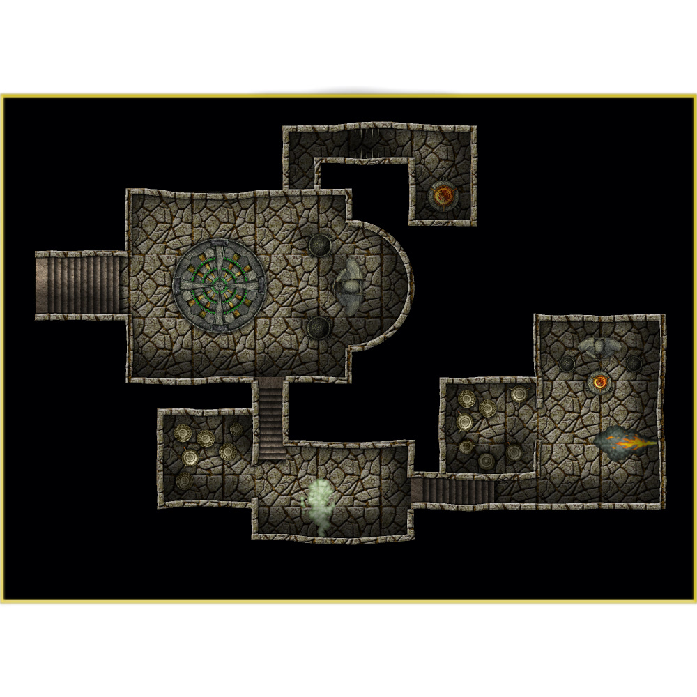
The Knight's Crypt

This is a quick dungeon (55'x 40') using elements from a custom made PNG symbol set I put together from free content off the internet and Dunnjinni. Joe Sweeney's Youtube tutorials were a big help. Feedback welcome.

Comments

  • This looks pretty nice. I like the way the walls aren't straight. I also like where the one smaller staircase extends beyond the wall slightly. I'll have to remember that. I like the light\shadows as well. It's dark and spooky without hiding all of the detail. One question though. What's the big circle with the green circles within it? Is that a fire pit or something similar?
  • The green-circular object is supposed to be a mosaic. I need to play with the setting.
  • ClerconClercon Betatester Traveler
    Very nice. How did you get the walls to be slightly curved?
  • DogtagDogtag Moderator, Betatester Traveler
    edited December 2013
    I really like the non-straight look of the walls. Also, your choice of wall and floor textures is fantastic. Are they the same texture?

    One thing to keep an eye on are the "unconnected" corners. If you haven't seen or used the CORNER command, I highly recommend it. It's a little gem that doesn't seem to get a lot of press for some reason. Basically, type CORNER in the command line (I don't know where it is in the menus, if anywhere), click one wall, click the one making a corner with it and then Do it.

    Voila! Magic. Usually. I've had some trouble with arcs, but straight walls nearly always work wonderfully.

    Anyhow, absolutely beautiful little gem of a dungeon you made there. It really is a work of art.

    Cheers,
    ~Dogtag
  • Thanks Dogtag for the tip on the corners function!
Sign In or Register to comment.