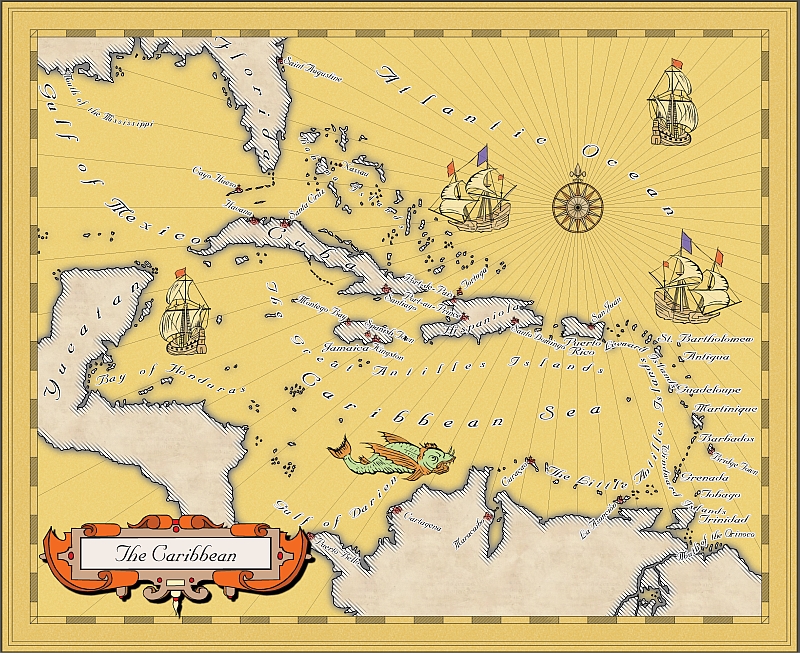
Mercator-Style Map of the Caribbean
 BlindMapmaker
Newcomer
I went back to the very beginning of the Cartographer's Annual for this map. It's made using the Mercator style and very few adjustments. It is based on a 1720 map by Emmanuel Bowen I found on Wikipedia with some reworking of coastlines where things got just too weird for modern eyes (e.g. the Bahamas and the Keys).
You can download a large (take care, it's 21 MB and a slow dropbox) pdf here and a middling size jpg (1.35 MB) here. These show my only problem with this map much more clearly: the hatching at the coastline are extremely low resolution, basically only single very huge pixels instead of lines.
I made the hatching by copying the land masses onto another layer, changing their fill style to Narrow Left Hatch and applying an Edge Fade, Inner with zero inner opacity and 100 outer opacity. It looks perfectly fine in Campaign Cartographer, but no matter how I print and export it I always get the blocky pixels. I heard that there are some problems with using some effects on bitmap fillstyles, but is there any way to improve the export quality? It's not a big problem, but it would be nice to get at least double the current resolution for the hatching.
Feedback of any kind is always welcome. Thank you for your time.


Comments
Perhaps you could instead use a bitmap fill style based on a picture file such as this one .
Plus you can make the bitmap white transparent...
I'm probably going to fake it out just by using a similar colour to my land mass fille, but it would be neat to know why just using transparency doesn't work in this case.
~Dogtag
The effect is based on what you see, not on the entities themselves. When you make the white stripes transparent, it's like you just drew black lines. If you make the size of the effect very small, you'll notice that the edges of the black stripes fade away.
The solution is to make the white stripes not 100% transparent. To do that, I used The Gimp to fill the white stripes with a very light gray, then applied a color to alpha filter, keeping the white as reference. Because the light stripes are not pure white now, the transparency is not full. With this the effect works fine.
Love it.
Thanks everybody for the nice comments.