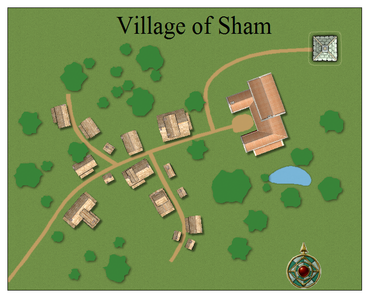
The Village of Sham
Many years ago there was a live action role playing club in the Midlands of England, by the name of The Portly Pixie. The adventures from that club have been published now that it has closed and I'm using the adventures for table top games with friends who never had a chance to go.

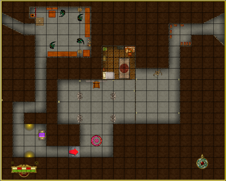
And the map to the indoor section of the first adventure most people did, Mandrake is Missing (Or Basic as it was known to those of us who helped out many times)

More to follow as I start working my way through them all. Any suggestions on what I can add to improve them greatly appreciated.
And the map to the indoor section of the first adventure most people did, Mandrake is Missing (Or Basic as it was known to those of us who helped out many times)
More to follow as I start working my way through them all. Any suggestions on what I can add to improve them greatly appreciated.


Comments
~Dogtag
I'm not satisfied with the village map at the moment. The trees need a bit more variation to their textures. I've seen some good examples of what I think are bitmap symbols but it's a complaint I have with CC3 is that it can be a real pain to figure out which set or annual it came from.
In the mean time here's the overland map of the surrounding areas.
I added some alternate contours to break the background up a little with a fade effect, would be nice if there were a way to take what I drew and make it extend out and fade away but edge fade didn't appear to do anything. So I had to get a little creative with extra contour layers in the top left to stop it fading out from the edge of the map.
On a similar line, can anyone vouch for the contents of the fantasy floor plans symbol set 2? I'd love to know what kind of symbols are in it. All I can find is a reference to 150 monsters.
I am far far happier with the general look though not completely satisfied with my trees.
I have to say I wouldn't have got anywhere near this far through my plans if not for the videos of Joe Sweeney. He does a wonderful job of explaining where all the simple tools are for me.
best way to test it is to set the parameters at some ridiculous setting just to see if its working (i.e. shadow at 100 and opacity at 0).
try tooling around with the different parameters. I normally try to keep my blur radius at around half of the shadow length and opacity at around 50.
Great software but it does have a learning curve like the north facer of the Eiger