

Making You Guys Some Font's - Read On...
 Terraformer_Author
Newcomer
Terraformer_Author
Newcomer
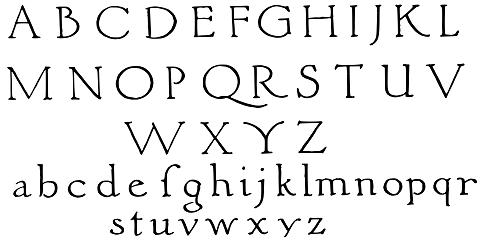
Ok, so - I've BASICALLY finished hand drawing two fonts that I HOPE will look good on your maps - and I've adapted two others from two public domain samples that I found. One sample that I particularly like is an old one (REALLY old) called Italian M.S. (NO - That doesn't stand for "Microsoft" - unless they started out making abacacuses back before underwear was invented), that I harvested from a Public Domain clip art site. It's the sample on the graphic below - except the one that I'm using is much bigger and in bitmap form. The sample came basically as you see it in the forum post - except it was on a really old yellowed up book page in the image - with only the upper and lower case letters and only a single period for a punctuation symbol. I have already "improvised" additional punctuation and key board symbols to make it complete - based upon the letter styling - for basic english operations, but when I get it into the font editor, I am hoping to cut here and paste there, and create foreign letters and pronunciation dialectrics (maybe - if I don't end up getting too fidgety,lol).
I have already scaled, vectorized, rescaled, and revectorized these letters until my CPU started smoking, lol")
I like this particular letter style - and I am excited about making it into a True Type computer font, because it's going to look great on maps. It's gonna be really nice for place names because it's simple and extremely legible, but still has that "Tolkienish" flavor that will really make it stand out nicely.It's got a really cozy and moody "old book" feel to it that really appeals to me - definite eye candy. It's not too bland - and it's not too "over the top" - it's just right. Goldilocks would be proud. Maybe you guys could come up with a name for it (can't call it "Goldilocks" - that one's already taken)?
I would LOVE it if you guys knew where I can snag some more decent sized images from old (REAL OLD) type set books and the like (preferable entire standard 26 character alphabets) - so that I could "fontify" those to. Public Domain please. Anyway - just thought that I would let you know what I was up to.
The symbols project is also active - I am taking a short break from that because my Attention Deficit Disorder was killing me, lol.
Also - if anybody has software that can convert these fonts into Open Type and Mac versions when I get them done for me - that would be awsome. I'll keep you guys updated.
P.S. - I've fixed the lower case "f" so that the flanger goes all the way through the letter stem - and isn't sitting off to the side like it is in the graphic. I hope that doesn't ruin the "ancienty" feel to the whole thing.
I have already scaled, vectorized, rescaled, and revectorized these letters until my CPU started smoking, lol
I like this particular letter style - and I am excited about making it into a True Type computer font, because it's going to look great on maps. It's gonna be really nice for place names because it's simple and extremely legible, but still has that "Tolkienish" flavor that will really make it stand out nicely.It's got a really cozy and moody "old book" feel to it that really appeals to me - definite eye candy. It's not too bland - and it's not too "over the top" - it's just right. Goldilocks would be proud. Maybe you guys could come up with a name for it (can't call it "Goldilocks" - that one's already taken)?
I would LOVE it if you guys knew where I can snag some more decent sized images from old (REAL OLD) type set books and the like (preferable entire standard 26 character alphabets) - so that I could "fontify" those to. Public Domain please. Anyway - just thought that I would let you know what I was up to.
The symbols project is also active - I am taking a short break from that because my Attention Deficit Disorder was killing me, lol.
Also - if anybody has software that can convert these fonts into Open Type and Mac versions when I get them done for me - that would be awsome. I'll keep you guys updated.
P.S. - I've fixed the lower case "f" so that the flanger goes all the way through the letter stem - and isn't sitting off to the side like it is in the graphic. I hope that doesn't ruin the "ancienty" feel to the whole thing.
Comments
Sven
[Looking good, T_A!]
Sven - I'm just putting in standard everyday british / american keyboard characters for this first generation of formal fonts, but later on I will put out expanded versions. I have already drawn up a crap load of letter sheets - and they cover only the stuff that you see on the keyboard, so I wanna kill off as many styles as I can before I start expanding them beyond what folks typically use on an everyday basis. I am - however - working on it (MAN I have a lot of hobbies dude, I've GOT to get me a girlfriend! Lol
To jaerdaph:
AHHHH HA HA HAAAAAARRRRRRGGGGA HAAARRR HAAARRRRR :P
Ok guys, now for some bad news. I will be going off the net shortly until LATE OCTOBER!!! Sucks - I know :< - BUT - I will be back! I have to change net services because of the red tape involved with moving to a different town - on account of the cable providers turning into what the power & light companies have been for years, lol.
I'll have plenty to keep me busy offline with my projects and all - until AT&T, Time Warner, Direct TV, Verizon, or whoever it's going to be running the show over there get's me back on the super information freeway amigos.
Good luck with your move.