

Making a Risk map
Hello,
I'm making a new boardgame with the CC software. I want it to look like the Lord of the Rings Risk game.
Here is the map of Lord of the Rings Risk:
http://gallery.burrowowl.net/index.php?q=/image/12866.jpg
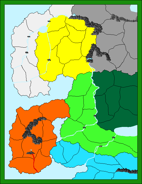
I already have made a sketch, which can be found in the attachment.
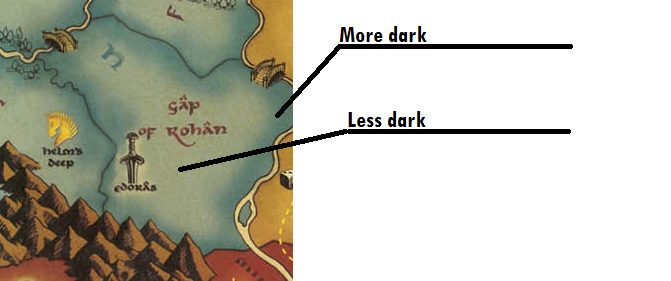
All of the area's in Risk have a more dark edge. For example: Each of the small area's in the big blue area are light blue
in the center and dark blue at the edges. I want to make my boardgame look like that.
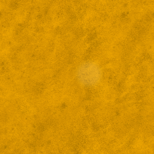
In the attachment you can find the bitmap I made for the Yellow area. I allready have made a bitmap in which the edges
allready are darker, but when I load it in CC I won't get the dark edges, because the image isn't forced to fit, so you will
only see the light part at the center. So how can I make the edges of each of the small areas become darker?
I allready thougth that you could force to fit the bitmaps in such area, so the dark edges of the bitmap itself will be seen
on the map, but I've tried to do this allready without succes.
So in short, I want to have my areas like in the last attachment.
So is there anyone who can help me please?
Kind regards,
Sauron
I'm making a new boardgame with the CC software. I want it to look like the Lord of the Rings Risk game.
Here is the map of Lord of the Rings Risk:
http://gallery.burrowowl.net/index.php?q=/image/12866.jpg
I already have made a sketch, which can be found in the attachment.
All of the area's in Risk have a more dark edge. For example: Each of the small area's in the big blue area are light blue
in the center and dark blue at the edges. I want to make my boardgame look like that.
In the attachment you can find the bitmap I made for the Yellow area. I allready have made a bitmap in which the edges
allready are darker, but when I load it in CC I won't get the dark edges, because the image isn't forced to fit, so you will
only see the light part at the center. So how can I make the edges of each of the small areas become darker?
I allready thougth that you could force to fit the bitmaps in such area, so the dark edges of the bitmap itself will be seen
on the map, but I've tried to do this allready without succes.
So in short, I want to have my areas like in the last attachment.
So is there anyone who can help me please?
Kind regards,
Sauron
Comments
First, i´m not sure which addons/annuals you have, but i know there is a CC3 style which is quite similar to the mountains symbols the Risk game has. I´d just advice you to make mountain symbols a bit bigger. Also, try to use the varicolor ones, and put them in brown.
For the bitmap, don´t try to get the bitmap fit, rather use Sheets Effects. There is one, called "Edge Fade" -or "Edge Fade, inner"-, which is perfect for doing the "More dark, less dark" effect you want. You will be surprised about it.
Out of the question, if you like exactly the bridge symbol, by the way, you can open the Risk game pic with Photoshop and cut it, and use it as a PNG symbol. Maybe the resolution won´t be the adequated, but CC3 and Internet have plenty of symbols for bridges.
Hope this helps.
Resuming: drawn entities for each province (poligons filled). Put the color you want. Attach those provinces to a sheet (name it "provinces", for example). On the Sheets screen, add effect "Edge Fade". Ajust parameters to your taste. Voila, it´s done!
About the bridges, that won't be necessary, because the game which I'm making just looks like Risk, but isn't 100% the same (When attacking you won't roll dices but you will use attack cards, and much more).
So thanks,
you've been a great help
I´m not sure about how are you placing the provinces, if you want to be sure they stick to each other, just use the TRACE option when you draw them, so they will share the same limits.
The other problem is easier to resolve. You are placing the mountains on a sheet (usually, it´s the SYMBOLS one) that is below the provinces sheet. Did you check the sheet you were using when you placed the provinces? (if not, try to hide them until you find the one where the provinces are; if you put provinces in two or more sheets, just usethe Change Properties button and put them all in the same one). When you find out, move it up in the Sheets menu, so that sheet is "upper" than the symbols sheet, or whatever you have placed the mountains. And that´s all.
Personally, i´d create a new sheet for putting the provinces so i could give them the special effects. The problem is that each new sheet you create, appears in the "bottom" on the sheet list, effectively making it appear in the drawing before others. Just use the "Move Up" button until you have the new sheet in the place where you want, and obviously upper than the Symbols sheet.
Hope this helps, i´m far from being Ralf or Jim, they could explain it faster and better (not talking about English not being my native language
I want to have a dark border for each of the provinces, like in LOTR Risk.
In the attachment you can see what I mean.
You allready said that you're not sure about placing these provinces, so maybe someone else could help too
Also, at the borders, the black line which divides the different provinces, is a bit blurry, how can I make this one don't blur?
Edit: I didn't know what the Whisper thing did, so I thought I could find it out like this, thanks for helping Monsen ^^
What you need to do: Make a couple of sheets with the exact same effects. Move the different provinces to diffent sheets -- you can have multiple on one sheet as long as they don't touch. I think map theory says you need 4 sheets for any topology, but use as many as you need to keep things from touching.
Stee
In the attachment you can see the blue area looking like it should be with the effects.
If anyone has more tips about how to improve the map, please tell me.
I will add these effects now for all the colors.
Steve
The rivers I make do strange things. When I zoom in, blue lines appear around the rivers. I've got a
screenshot of it.
Two questions:
1) How can I solve it?
2) Any suggenstions in improving my current map? (Details haven't been added yet, but they will (Trees, hills, etc.)
Is there a way to erase these blue lines? Because it isn't that pretty.
I want to export my map to a JPEG image with all the effects on. That didn't work, so I exported it as an PNG file.
Now the effects are on but the image doesn't is a good quality at all. How can I make the quality perfect?
I need to know this before tomorrow (I will be on vacation, so I can't edit this map, I need this map ready once I get home..).
I already tried to make screenshots of parts of the map, but then the effects move. So I really need a way to export the file
so I can print it on a A2-sheet for the boardgame I'm making with it.
Could anyone please help me with this?
Kind regards,
Sauron
Thanks Old Guy, for responding that fast ^^
Thank you all for helping, in the attachment you can find the map
I've replaced it, but when I do, you won't see the other inside glow at all, only the lighter part.
So I've been trying to get it better, but when I put the inside glow in with a higher rate of blur radius and then I saw that
the outside glow is going the wrong way. It's more darker to the center and less dark to the edges. When it was an outside glow,
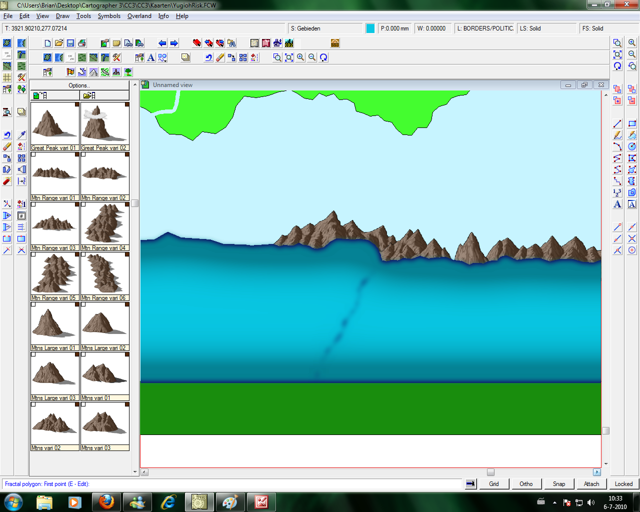
the center was more bright. How can I fix this? I've made an example, the most upper green lands have the new Inside Blur, the others
still have the old one. Like this you can easily see the difference.
The Blur effect which was added, caused the edges to become like this. I've decreased the Blur Radius and didn't
touch the Outside glow. After that I saw that there were some edges next to each border which were light blue. This
was the background color of the map. The lands I made didn't touch the other lands sometimes causing this to appear.
I've used Paint Shop Pro to make this more beautiful.
I've placed the map beneath here. There is still a bit of a black line, but the line is the smallest it could be with these effects and when
I print the map, you can't see them at all ^^.