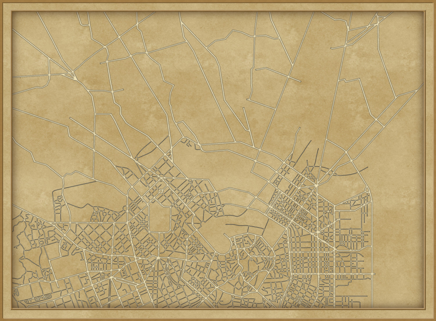
Starting to take shape
Almost
I really enjoy the upper one. The colour tone is really nice. But the lower one the lettering punches a bit better.
Cthulhu City is a great period style, though the final map of the three above seems a little bright and almost sunny for a Vampire City, perhaps? 🧛😎
We are still in the demo. Final version coming soon. 🙈
Really nice map, Ricko! I agree that the more muted colors of the second map appeal more than the brighter ones of the last.
Final versions :)
Beautiful!


Comments
Starting to take shape
Almost
I really enjoy the upper one. The colour tone is really nice. But the lower one the lettering punches a bit better.
Cthulhu City is a great period style, though the final map of the three above seems a little bright and almost sunny for a Vampire City, perhaps? 🧛😎
We are still in the demo. Final version coming soon. 🙈
Really nice map, Ricko! I agree that the more muted colors of the second map appeal more than the brighter ones of the last.
Final versions :)
Beautiful!