

Improving a map imported into FT3+

Hello everyone, please forgive me if I don't have all the technical terms, but I'll try my best to explain.
I imported a map into FT3+ using the method described in this post: https://forum.profantasy.com/discussion/comment/125036#Comment_125036
No problem there, I can transfer my map from one software to another without any issues, but once in FT3+ I find it a bit “flat.” You can see the relief very clearly, etc., but the overall appearance seems really low, especially for a world map.
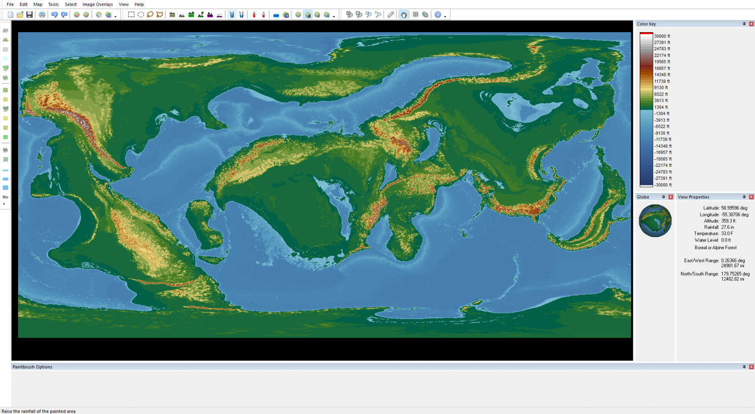
I think the problem stems largely from the original map (created with Rock3, I don't have much leeway with it).
I've experimented a little on my own and poked around here and there, and there seems to be a range of mathematical tools that look interesting for solving my problem, but so far I don't think I'm using them correctly.
So, first of all, if you have any suggestions or solutions to improve the relief, I'm all ears.
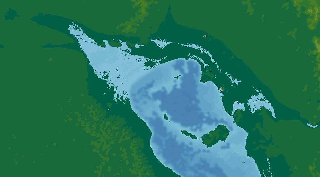
Secondly, I have another issue with this imported map: when I zoom in a little, some parts are a bit “disjointed” (see image 2). Again, I think the problem stems from switching from one software program to another and from the complexity of the map, but you never know, maybe there's an accessible solution here too.
Thank you in advance for your help!
Comments
You can play around with the colour and elevation settings to get a wider varietyof colour and contour to the map.
Even if you cheat some of the elevations to lesser numbers. You don't always have to go by the same increments. I've done some where it's a few hundred feet per elevation, then down to a hundred or so. You just never know what will work.
As for that lake I think it looks cool. the North West really looks like a delta. Add a bunch of small landmasses and it's money.
I'm no expert of FT3 by any means. I am sure others will chime in with some great advice.