

Understanding color and the RGB Matrix effect
 Royal Scribe
🖼️ 388 images Mapmaker
Royal Scribe
🖼️ 388 images Mapmaker
Does anyone know of good web resources where I can learn more about RGB colors that would help me use the RGB Matrix effect better? Things like "subtract some blue to make it more yellow" (which I picked up on a thread here but wouldn't be something I would intuitively know).
After much trial and error, I was able to succeed where medieval alchemists tried and failed: to turn lead into gold. It required the use of the RGB Matrix, the Colorize effect, and massive lightening with the Adjust Hue/Saturation effect. I'm pleased with how it turned out but have very limited knowledge. I'd love to be able to create a copper, maybe even a greenish tarnished copper. But mostly I just want to understand colors, like "to get X, add some Y and subtract some Z." Pretty routine stuff for those of you who've studied art, but I haven't. Anything you can recommend for me to study that's specific to RGB colors (as opposed to CMYK or something else) would be most appreciated. I've read the Tome, of course, but now I need to understand colors.
Here's how it turned out for me. This uses fills that Sue created for the beautiful Beaumaris Castle annual, with an inlay that she created for Marine Dungeons.
Lead Fill
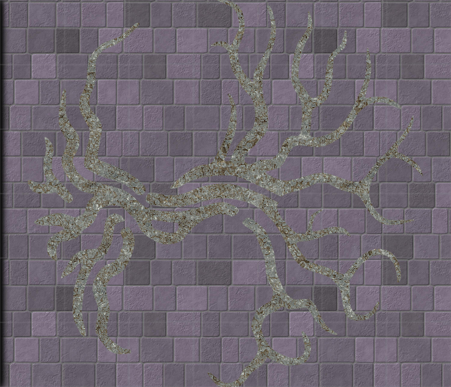
(Looks terrible with that flooring -- not enough contrast! But that's because I needed a floor that would contrast with gold, not lead.)
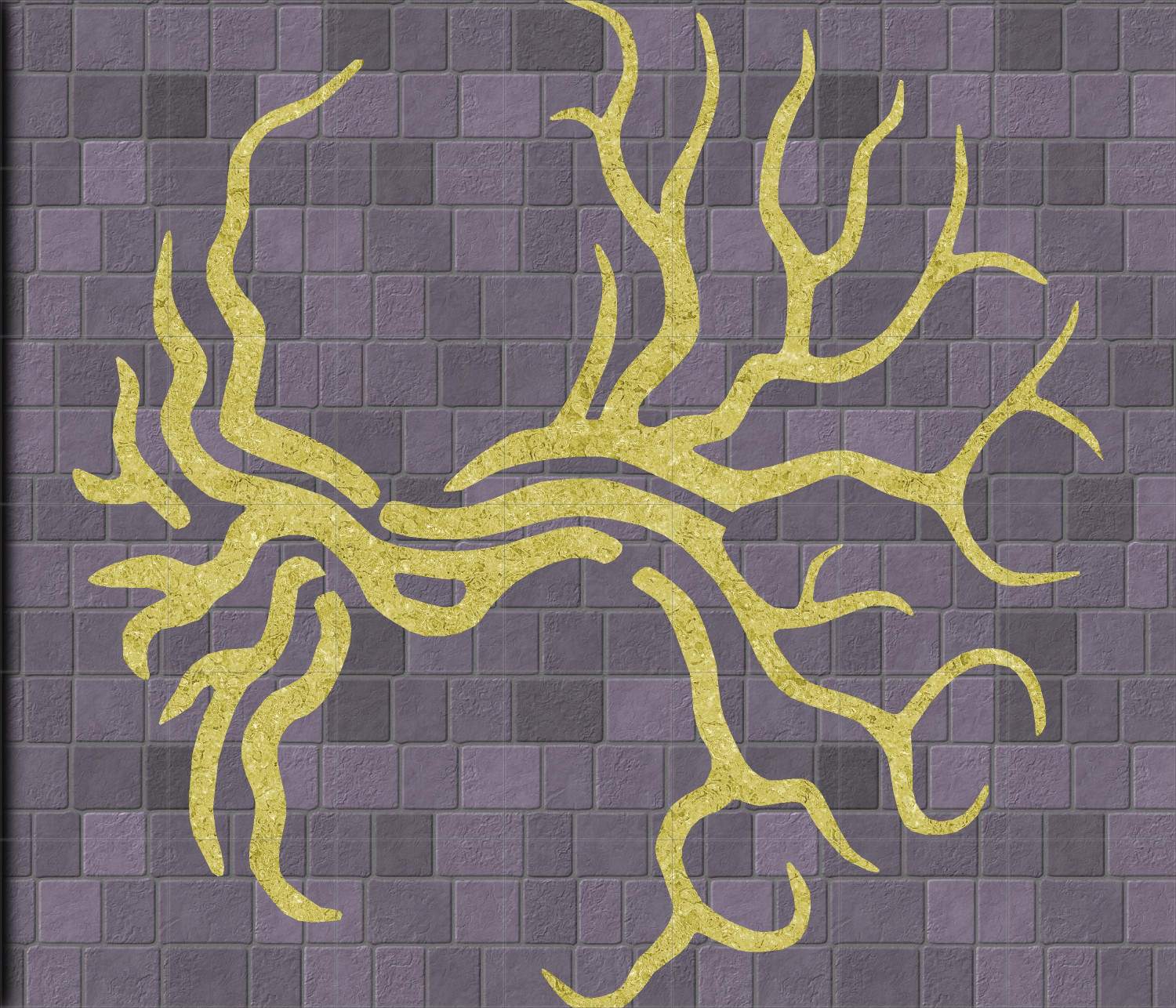
Lead Turned to Gold
This relies on the Colorize effect -- if I knew what I was doing, I could probably do it with just the RGB Color Matrix, but I don't. I mostly used the RGB Matrix to lighten it a bit and turn it light gray, then colorized it, then brightened it a lot with the Adjust Hue/Saturation.
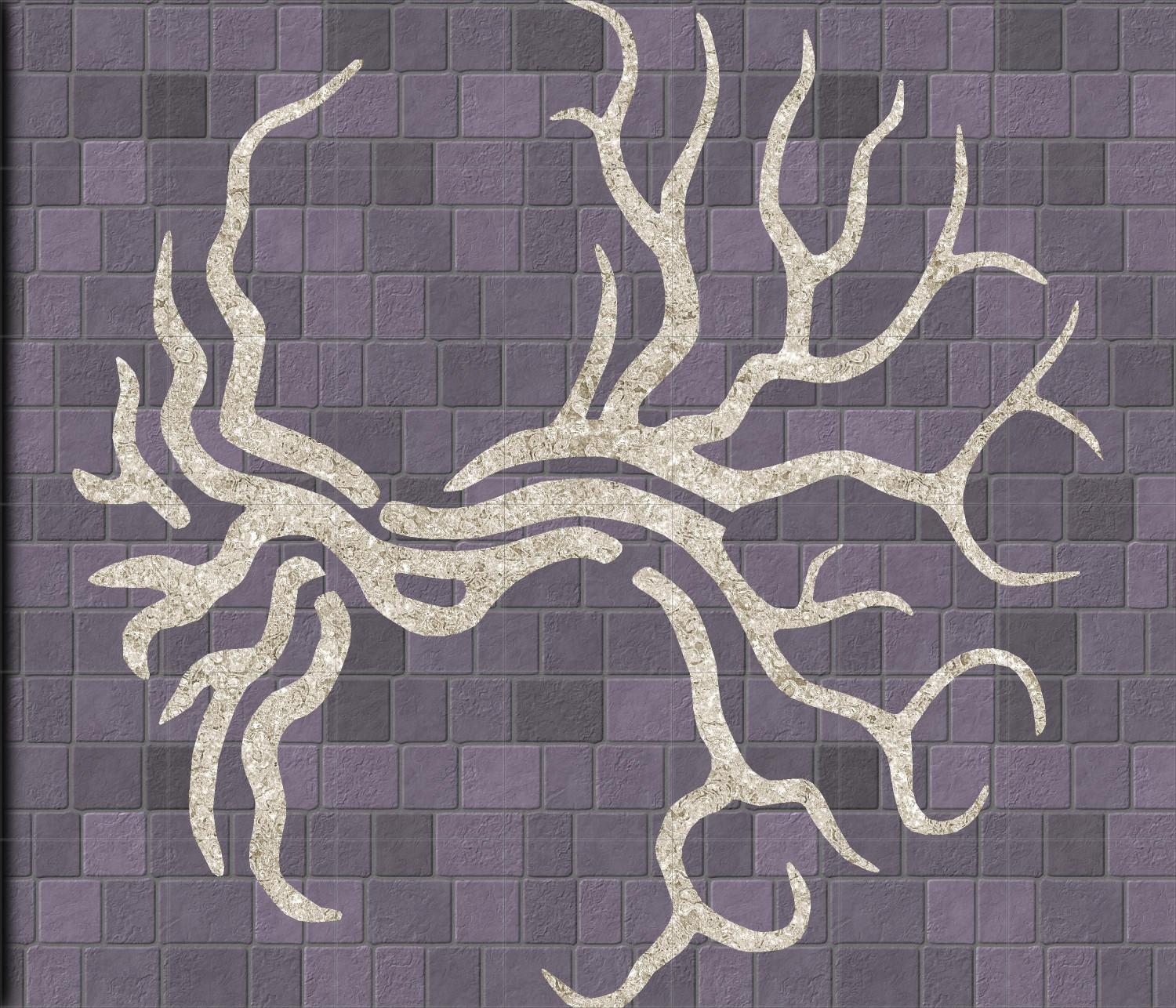
Lead Turned to Silver
This basically turns off the Colorize portion, but with the RGB Matrix and Adjust Hue/Saturation, I think it passes for silver.
Anyway, any recommendations where I can learn more about RGB colors or the RGB Matrix specifically is appreciated.
Comments
Impressive! :)
You could try this blog.
Excellent, thank you!
Revisiting this thread… I read the post that Sue linked to, as well as everything linked to in that post. It was very helpful but also a lot. I will continue to study it and reference it as I experiment.
But something else occurred to me. The RGB Matrix has a few presets that are very helpful — I use the grayscale and sepia presets a lot. But it also has Save and Load functions, where once you’ve achieved the effect you want, you can save it and then load it into future maps. Maybe I’m alone in this, but it would be a quirky and unusual but very useful (for me) future Annual for someone with a lot of experience with this effect to come up with dozens of saved color schemes. Maybe I’m wrong — maybe each has to be customized based on what it’s changing? But that doesn’t seem to be the case with grayscale and sepia.
Also, I should add that if this is made moot by CC4 (maybe it has more presets or something), then ignore this suggestion. And if other subscribers here hate that idea, chime in now. I could easily be alone in wanting something like this.
Saved presets sound like a good community activity. I'm not the keeper of CC3 legalities, but I can do matrix math! I use this effect a lot personally.
Oh, cool, we could have a thread where people share what they’ve done.
I have been playing a lot with this lately as well. Ever since I saw Sue do some nice changes on a map.
A few ticks here and there, then refresh to see how the changes look.
Kind of think this could really do with a re-work. Maybe CC4 will make it more simplistic with a colour wheel.
Although it doesn't do the same thing, or even as many different things, the Colorize sheet effect may be easier to use than the RGB Matrix Process effect in some cases.