

Room for improvement?
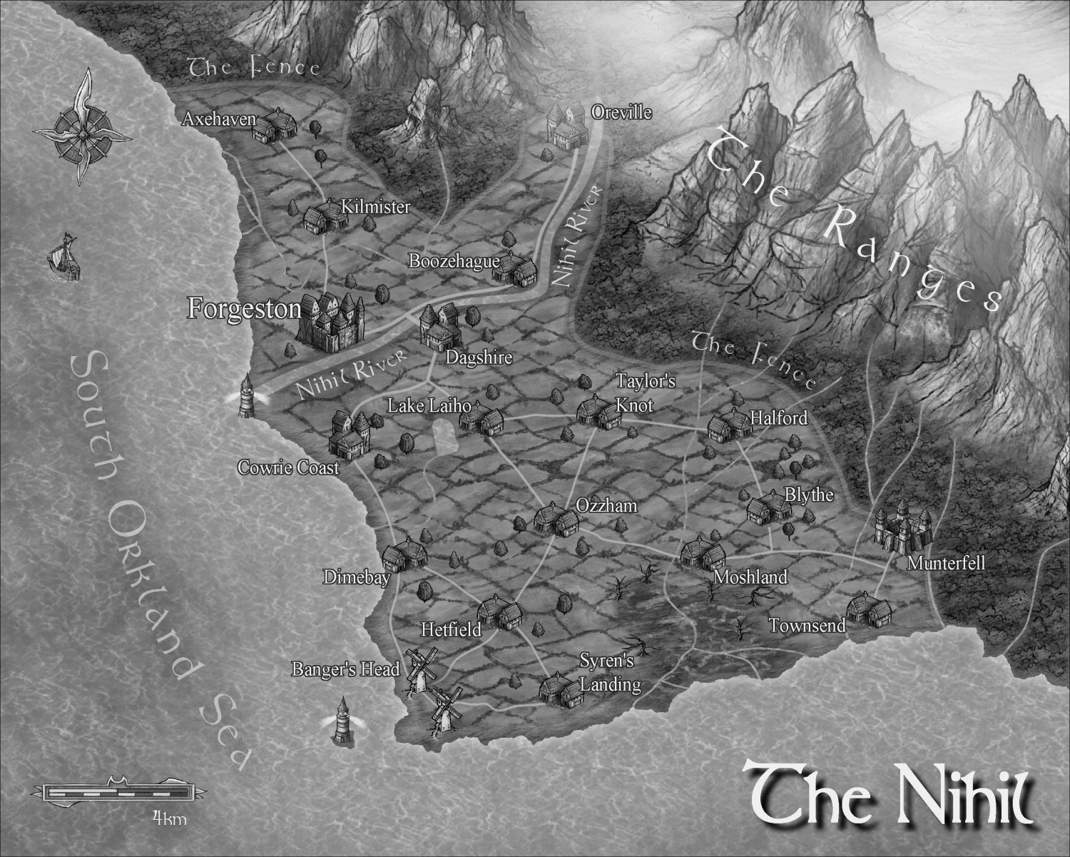
I've created a map for my book that I'm publishing this year. The colour version will be for my website/eBook, while the B&W will be for print.
Suggestions for improvement will be appreciated.
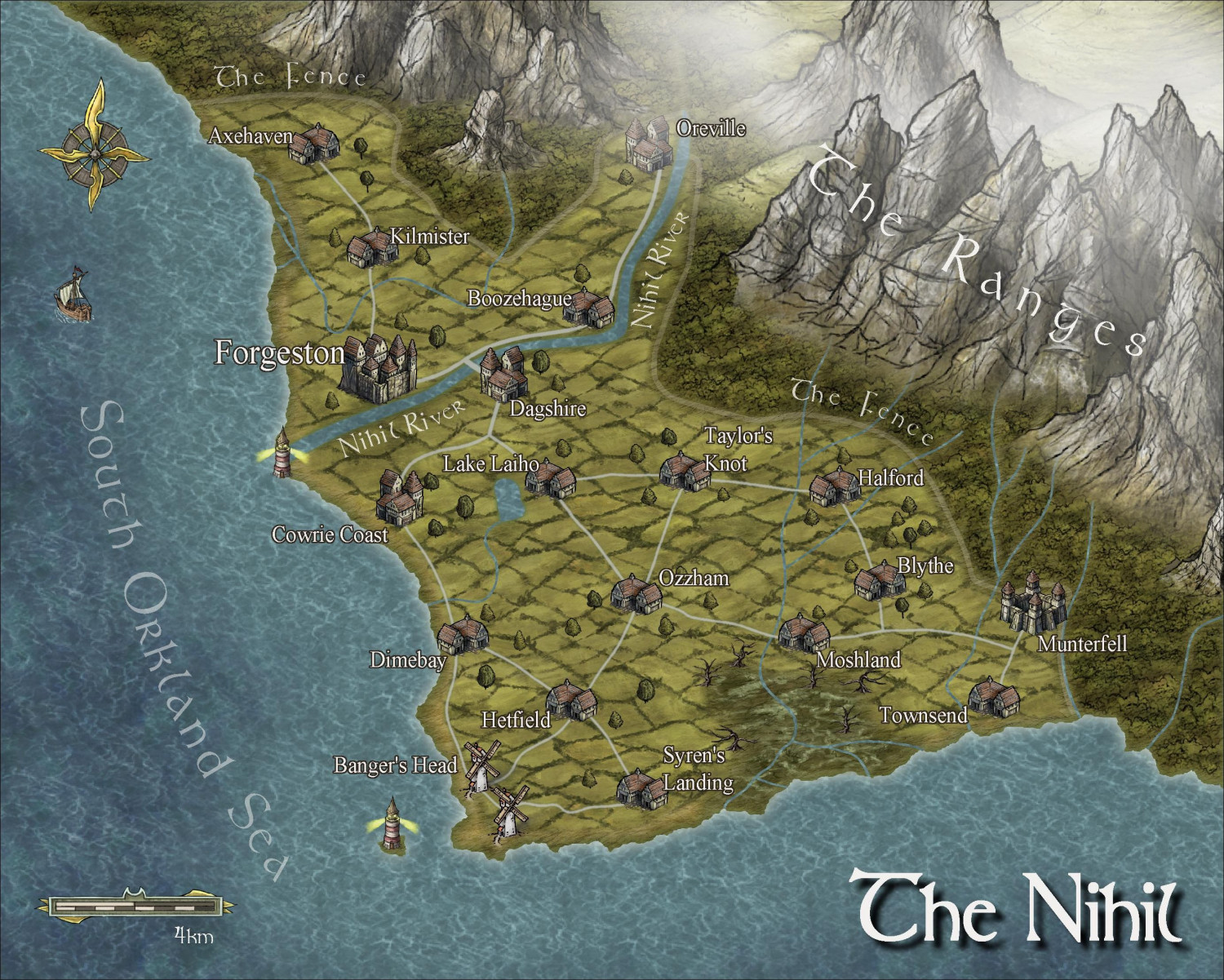


I've created a map for my book that I'm publishing this year. The colour version will be for my website/eBook, while the B&W will be for print.
Suggestions for improvement will be appreciated.
Comments
They look good to me :)
I am a little concerned about the way the grey tone one will turn out in print. This style isn't designed specifically for BW reproduction and may look a little flat unless the printing quality and the paper are both pretty good. Try printing it out on paper of similar quality first. If it looks bad, try increasing the contrast a little, or even using a tone curve on it in a bitmap editor.
These look great! I think they will work out well. I love when authors have maps (and pronunciation guides) in books.
One piece of advice: consult whoever is doing the printing. To me, it never hurts. I'd never be able to do it myself.
I was going to say that the Ocean does look flat in black and white. But didn't want to leave a negative comment. (Didn't know how to word it correctly.)
Maybe try change that Ocean fill or the scale of it, until it hits just right.
Looks good, although I do like the Herwin Wielink style anyway, so may be biased!
I'd be inclined to adjust the visibility for the "Nihil River" and "The Fence" text labels, as they're not quite clear enough currently.
It may be worth adjusting the edge effects on the inland watercourses and lake too, as they're getting rather lost currently, especially on the B&W version. Something a bit darker/sharper may help "sit them down" into the landscape a little more.
I am actually fine with the ocean. However, the lake looks flat both in color and B&W. I also don't think I like the shape of it for some reason.
The land glow is diminished too much in the B&W so you might want to turn that up a bit.
This is my preference, but I like the trees better than the tree fills for this style. So you may consider deleting it and adding in the tree symbols.
Test for print with your monitor gamma set fairly low. I keep mine that way (much easier on the old eyes), but it has a "gaming" mode that is more like what the rest of the world sees (much brighter). However, its low-gamma mode does a pretty good job of emulating print, which doesn't have the inherent lighting of a computer monitor, let alone a phone. Remember that what you print out on 92 albedo paper at home is going to be way more contrasty than the low quality paper and ink of most printed books.
So by what I see, the B/W looks great in bright mode. In low gamma mode there isn't quite enough contrast (anywhere).
Gotta say the psuedo-3D really pops, tho, even in B/W. Nice work.
I agree with Sue and am concerned about what a print version will look like. I've recently been reading the Eldros Legacy and the maps in that book are printed as such a low resolution that the place names are indecipherable. Love the books, but had to go online to look at the maps so I could figure out where places they were referring to were located. i.e. the printed maps were useless.
As for the maps, looks pretty sweet. Thought for some reason right now my brain is trying to tell me that the water is higher than the land. No idea why that is though.
Printers and publishers don't always communicate properly with one another, which is probably where the fault in the published map you described originated.
The land seeming to be higher than the water here is probably because there's a subtle limb-darkening effect on and just inland of the coast, which can sometimes make the land seem lower than the water. Then again, I do this all the time with lunar craters - are they hollows, or domes...? 😉