

WIP: need some help with making text more visible
 Brian Ransom
Traveler
Brian Ransom
Traveler
Hey guys,
I've been gone for a few months, but back at it.
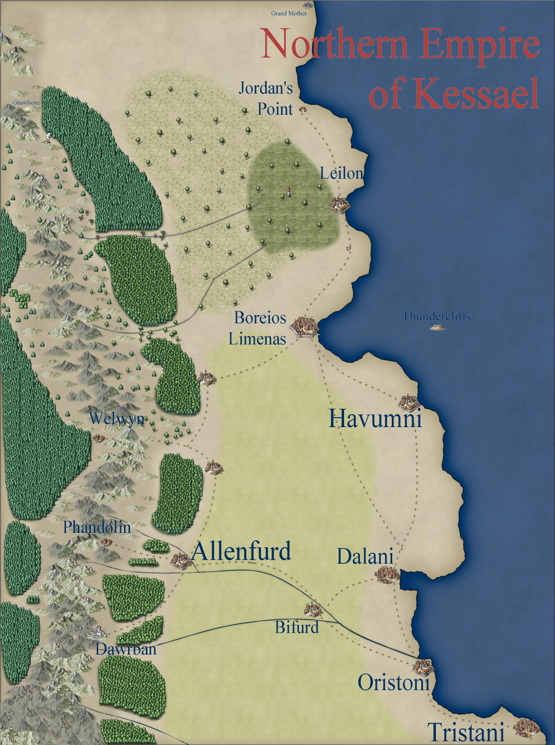
I've got a 'kindom' level map that I'm working on, and would like any thoughts or advice.
My biggest issue right now is that though I've named several towns and such, because of the symbols around them, I'm having a hard time making the names visible.
I'll add the file so you can see what I'm doing, and maybe someone wouldn't mind helping me decide what to do. May be a different color, or a change to glows that help it stand out. I'm not particularly experienced yet, so I'm looking for thoughts.

Comments
Hi Brian! :)
The most important thing to remember with lables is contrast. If you turned your map black and white the map itself would be all shades of grey, ranging from a very dark grey to a very pale one. To make text stand out from it chose either a very pale label colour with a very dark glow, or a very dark colour with a very pale glow. The kill-all solution is to use the palest and darkest shades of grey - one for the text and the other for the glow.
Drop shadows don't generally work very well for readability, but can look good on a title sometimes.
Your labels are pretty much mid-tone, which is the most difficult colour to make stand out, even when you intensify the native white glow.
I recommend picking lighter or darker labels, and maybe using an Outer Glow instead of the slightly less tidy Glow, like this.
Or like this.
You could use both on two TEXT sheets - one way for the title and the other way around for the map labels.
The Herwin Wielink colour palette on your map isn't really helping you, with only a single row of relatively dull blues to use, so here it is again with a more balanced colour palette attached to it - to give you more choice with your labels (and only if you want it with this modification).
Getting text to look right is a perpetual issue with maps, so you're definitely not alone in struggling with it!
Sue's advice is, as always, excellent.
Beyond that, trial and error is what most of us end up with, but knowing what tools are available among the effects, and getting some familiarity with them, is essential, as that expands what you can try quickly.
Only thing I would say is I find I often prefer the Glow effect to the Outer Glow one, although that can be font-dependent. Outer Glow often seems to overwhelm the lettering to me, or becomes too misty for clarity. Sometimes, mistiness looks good too, of course. Just not always!
Thanks Sue. I appreciate all the advice. I hadn't really thought about doing the 'negative' glow and colors for the lettering. That really looked much sharper. I also don't really understand the color pallettes. Is there somewhere you could point me at for how to change the pallettes on my own like you did for me? Are there directions somewhere in one of the manuals?
Thanks Wyvern. The first time I turned on outter glow, it was huge, and it definitely made me think twice. Going back, I figured out how to reduce that mistiness (at least for this map). I appreciate the support and reminder that we all start at the trial and error step.
Thanks again both of you
Here is a really good blog by Remy Monsen that explains everything you need to know about the colour palette.
The palette I attached to your drawing is my default 'Save Custom PAL', which I just reload every time I need it. It's slightly less jarring than the actual default palette, and has fewer pinky purples and more of everything else.