[WIP] Republic of Lumadair (Ancient Realms Revisited)
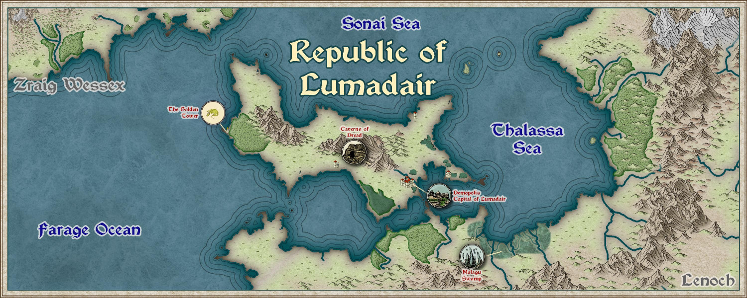
I have previously done the Republic of Lumadair, a portion of my campaign world, in many different styles. (There's an album in my galleries showing the different approaches.) I find it helpful to compare styles with a consistent coastline and terrain.
Anyway, here's a first pass at trying it with the new Ancient Realms Revisited annual.
I ended up using tower symbols instead of cities to show the major unnamed cities. I've only done a few of the icon symbols for major points of interest, though I can do more. Instead of putting the icons exactly where the locations would be, I put them off to the side with a dotted line to the actual location (similar to how I approached my Modern Journeys map).
This sort of forest approach rather than individual symbols isn't my favorite approach, but it's growing on me. For the coastal cities, maybe I should trace the coastline rather than being more freeform? Ralf brought in some Mike Schley symbols (Asian settlements) in his video tutorial, so maybe I will try that with Mike's tree symbols. I'm worried, though, that those tree symbols would make this look too much like a knockoff of Mike's overland style and not its own thing.
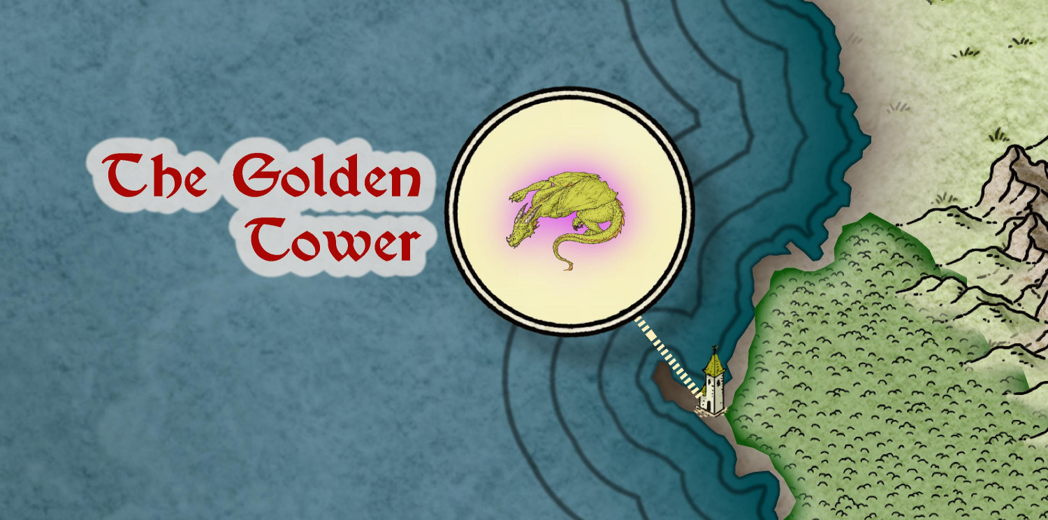
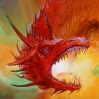
I did one custom symbol of a dragon, but I'm not thrilled.
I used a parchment background but maybe a solid color would be better? (The icon background is on a separate sheet, so I could see if a texturize effect helps.) Or I could put a tower icon as the main icon with a dragon over it. If anyone knows of better dragon symbols to use, let me know. (I thought about the heraldry icons from CA15, but I'm not so sure.)





Comments
The forests seem to look fine at the "whole map" viewing level to me. It's only when you're zoomed-in they start to look a little too flat, which isn't how you'd normally be viewing the map.
I wonder of the dragon's not working for you so well because it doesn't have that same sketchiness as in the other location roundels? If you have it, you could try one of the two original Character Artist ready-made dragon symbols (they're in the "Free" catalogue of the CA symbols, "Monsters.fsc" file). They're vector symbols, so you could adjust line widths and so forth in CC3+ by editing the symbol. Or you could simply try tracing the existing dragon you've got there as a vector drawing to make it look more like the other symbols perhaps.
You might want to add a marker of some kind - even a simple dot - for the Caverns of Dread, as the line-end for that isn't easy to see.
Map's looking good overall, regardless!
Thank you, @Wyvern!
If you have it, you could try one of the two original Character Artist ready-made dragon symbols
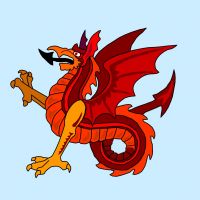
I do have Character Artist, but I haven't used it much and didn't realize those were there. This vastly expands my heraldic symbol options! Here it is using the traditional dragon with a tower icon background. I also tried one with a wyvern off to the side. Which is your favorite?
You might want to add a marker of some kind - even a simple dot - for the Caverns of Dread
I actually did have a cave hole there, but it was kind of small and I used a fill that ended up being kind of a washed-out gray at this zoom. I deleted it and drew in an oversized black "cave mouth" polygon.
I do have Character Artist, but I haven't used it much and didn't realize those were there. This vastly expands my heraldic symbol options! Here it is using the traditional dragon with a tower icon background. I also tried one with a wyvern off to the side. Which is your favorite?
Obviously the wyvern!
However, I do think it works better than the dragon, because you can see more of the tower behind it too. That said, the dragon stands out a little better generally, but the drawing lines on both are really a bit too thin overall at this scale.
I agree for the same reason: seeing more of the tower. I changed the varicolor to be a slightly darker yellow.
Here are a few more options. Top left is from DD3 Creatures (tried to make it look like it was crawling up the tower), top right is from CA15 Heraldic Symbols, and the bottom two are from Shessar's heraldic symbols (dragon on left, wyvern on right). I'm leaning towards Shessar's wyvern in the lower right.
I'd agree with that I think - the wyvern's larger and clearer, thanks to the thicker drawing lines, and the "Shessar Heraldic" beasts are closer in general style to the roundel designs too.
Okay, I think this may be done. Added a few more icons and place names.
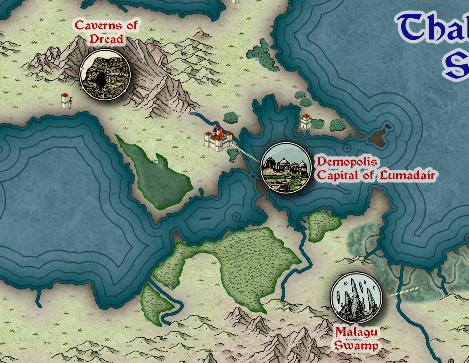
Here's a zoom of the Republic itself, without the portions from the continents of Zraig Wessex or Lenoch.
And here's a zoom of my swamp: