

Advice on how to make the rivers look better
 Brian Ransom
Traveler
Brian Ransom
Traveler
Hey guys.
I'm trying to figure out how I can make my rivers not so glaring in my map. Would a glow along the waterways work? should i try a blur?
Comments
You could do that, or maybe you could use Change Properties on them all to make them a thinner line width?
You can find out how wide they are right now by using the pick properties eyedropper tool. The line width should then be shown at the top.
Then use Change Properties to make them slightly thinner.
You could try a darker color. At least that would differentiate the rivers from the sea. Rivers to me have always been darker than other bodies of water. I think it would have the effect you're looking for.
I would suggest maybe fragmenting the rivers a little. By which I mean start at the coast and put down the main branch of each river with the highest line width as it goes inland from the sea. Then at what you think is a good branch point shrink the main river width down and add a tributary. Then do the same again as you near the source of the river, perhaps adding some small rivers randomly down the upper length of the river. The idea is that the most notable section of river will be down by the coast where it will make most sense for it to stand out due to its size, and as it gets smaller closer to its source the line width shrinks down so it blends in more to the other terrains.
Let me start out by saying, I actually don't think your rivers look that bad. You might want to considering filling in more of the map and seeing how it looks before doing anything drastic. Individual elements stand out a lot more when most of the map is bare.
With that being said, based on my own experience, my suggestions to potentially improve you rivers would be the following:
1) Make them more wiggly. Even if using the fractal path, manually jog back and forth or make S shapes that are more like a natural river path (or at least what we expect from a natural river path).
2) Consider not using the fractal draw method for rivers, but instead use the path/polygon draw method. The fractal path isn't terrible, but in my opinion it creates overly jagged paths that feel off from what we expect from a river. If you're manually jogging anyway there's less need for the additional fractalization.
3) Try changing to water-normal bitmap instead of water-lightest. That causes the river to blend in a bit better with that art style.
4) Add a blur effect on the river sheet to make the river's edge less sharp. I'm not sure how visible that will be on a fully zoomed out map like what is shown in the image above, but it helps more when zooming in.
5) Maybe add some more variation along the length of rivers. Like on the very long river in the center of your map, some parts can be relatively straight, other parts as they hit different types of terrain can be more meandering, etc.
6) Add more tributaries and then make the rivers thicker as they flow together. At each junction start a new river that is thicker than the previous tributaries. This helps a lot in terms of making the rivers look realistic, albeit it's a lot more work.
However, if you do this, I don't recommend simply adding the river widths together as this will result in overly thick rivers if you have a lot of tributaries. Instead you need to add only a fraction of the smaller river to the larger one and reduce how much you add as the river gets thicker. For example on one map I used the following method:
*Reduce combined river size by the following (based on larger river size): 0 to 1.999 -0.25, 2 to 2.999 -0.5, 3 to 3.999 -1, 4 to 4.999 -2, 5 to 5.999 -3, Min increase 0.25 (Except 0.5 width rivers: they are small enough to be ignored on size 2 or above).
For example, if a river of size 2 was joined by a river of size 1, then the resulting river would be 2.5 [2 + (1 - 0.5)]. If a size 5 river was joined by a river of size 2 the resulting river would be 5.25 [(5 + (2 - 3 = min increase 0.25)]. Obviously you can come up with your own technique for doing this. (I really wish there was a tool in CC3+ that could automatically handle combining rivers in this way.)
7) If you intend to add symbols for the mountains (rather than just using the mountain background texture) then generally speaking, I would place them before drawing rivers coming from them. Depending on exactly where each symbol is, you may want to start the river at a different point (you can kind of make it appear to be emerging from behind the mountain). Having more of the terrain in there may also make it easier to figure out places where rivers would start. (If you're not planning to use mountain symbols then just ignore this suggestion.)
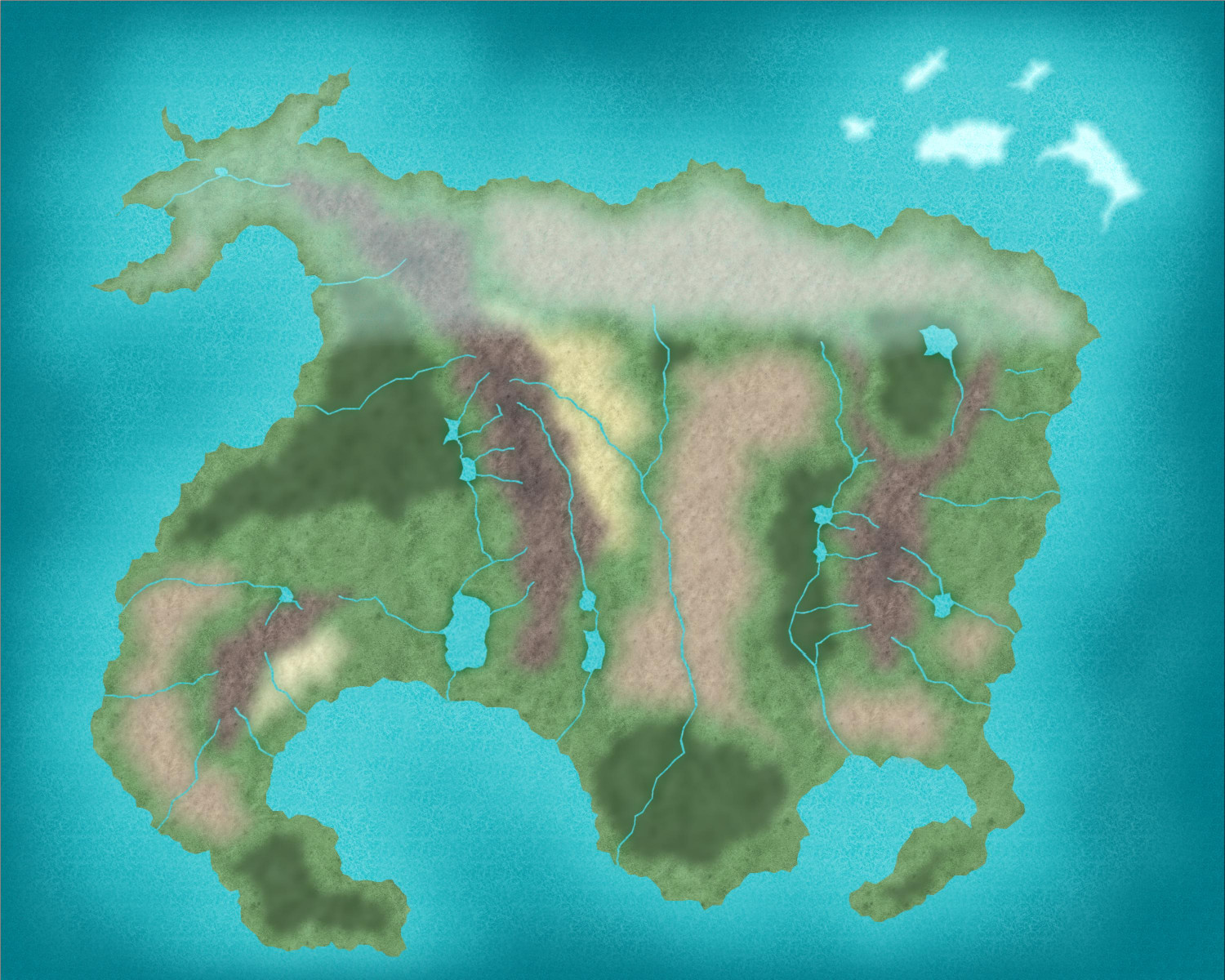
Thanks everyone for your suggestions. I had forgotten about the eyedropper tool, and while i didn't use it to change river sizes (I actually ended up not changing those anywhere), I used it for other things, so thanks Sue. Kertis and Nagorak I tried the suggestions about changing the color of the river, and that did most of what I wanted. I also turned all the fractal paths into smooth paths as was suggested. I also made the long river that went through the plains meander a bit more, but after looking at several maps of major river systems, most are actually pretty straight from the continental level view, so I kept most straight. I also added in a few copies of the lakes and shrank them to add in a lightening in those big bodies of water.
Its a pretty simple looking map, but overall I like the feel of it. So thank you all for your help. This is what I ended up with:)
oops, put a file up instead of the picture.