

Knock Dungeon - An Experiment
 amerigoV
Betatester Traveler
amerigoV
Betatester Traveler
I have been getting back into mapmaking after a year hiatus. In watching the Ancient Cities stream, Ralf did a knockout effect to fix a bridge/canal problem in the city. The knockout as a tool (putting Color Key effect on a sheet, and using that color to knockout that sheet's fill to drop back to the Background) has been used in a number of overland styles to facilitate water or islands (namely, makes lakes/islands easier).
It got me thinking that this would work well for your classic dungeon map. I took the Schley style and gave it a try. It exceed my expectations.
Setup
Setup is easy. Pick your style. For the background, pick the fill style you want as the predominate "floor" of the dungeon. I made a Sheet called "Walls KO" and added the Color Key knock out effect. Then draw the fill style that will be your predominate walls to cover the map. I did have to move the Walls KO to be under the symbols - some of the map effects were covering up the symbols. I did not play this too much but it could be a style setting.
You will then use the Knock Out (KO) to cut out your dungeon. Use lines, shapes, fills, etc with the KO color and put them on the Walls KO sheet.
What is the Advantage of Using KO over the Normal Dungeon Tools?
I have always found the DD3 room and corridor tools to be a bit touchy. CC3 can be an incredibly precise tool, but sometimes it nice to make something quick and easy.
The advantage of the KO approach is you do not need precision when making rooms or linking them together. I will give examples from a map, but simply stated if you have overlapping KO's then CC3 just magically merges them together. For example, if I have a square room and a circular room, I do not need to draw a precise connector between them. I just draw something the gets inside the edge of each one and it just works.
Lets See It.
Here is an fun house dungeon map I threw together using the Schley style.
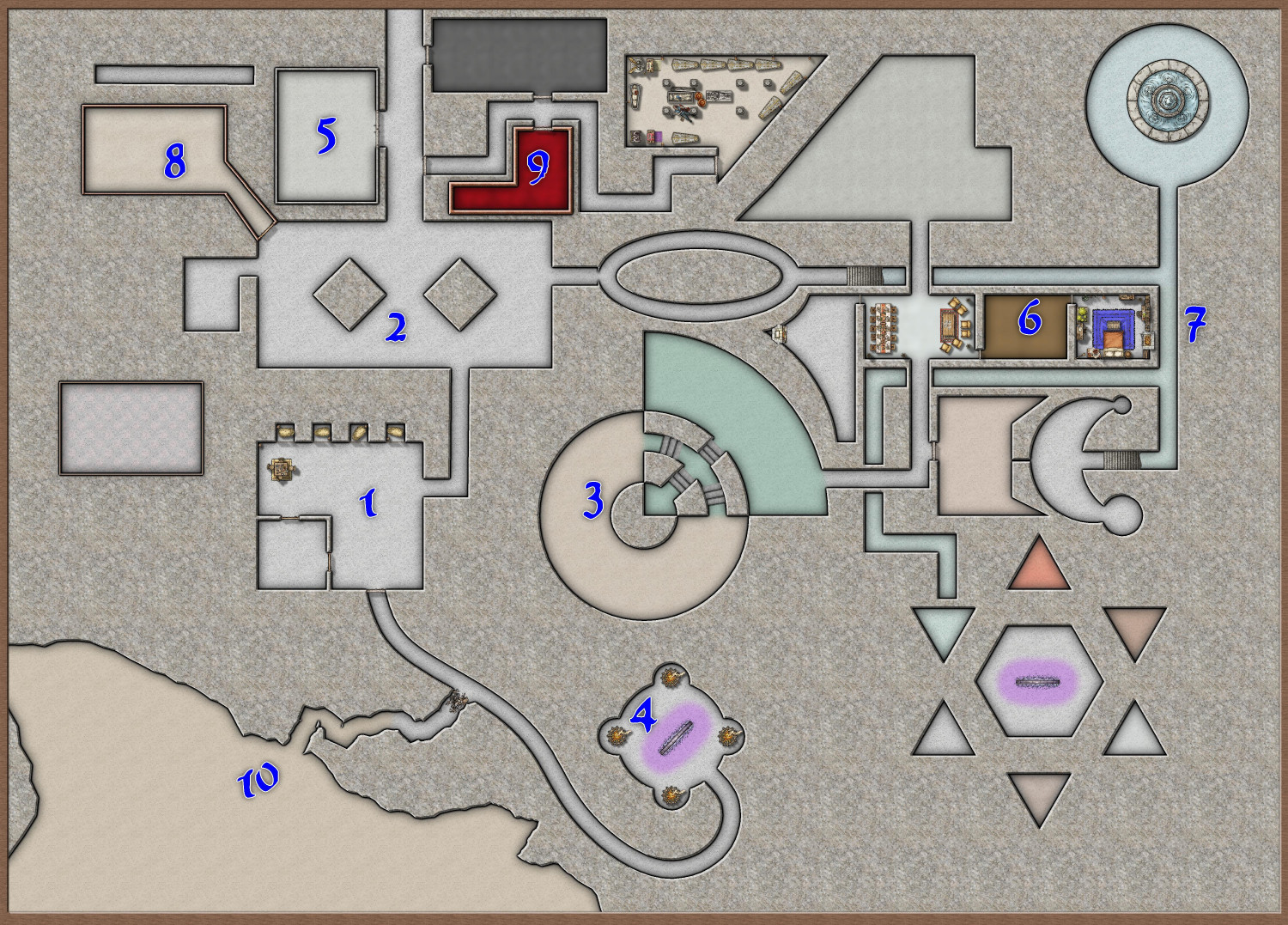
What really surprised me was the ease to link rooms together, and the ease to make some really complex rooms.
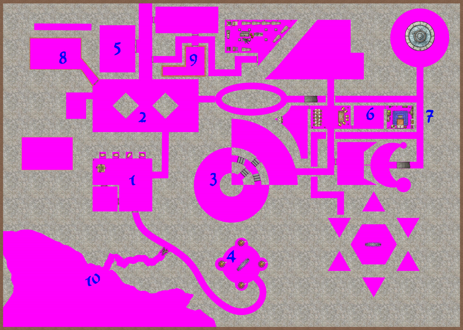
Here is what the map looks liked with effects off
Specific Examples
- The main part of room is just a polygon. The subroom in the "SW" corner is a separate polygon.
- This is your classic multi-poly - two squares and a rectangle, then multi-poly together and change the color fill.
- This is really complex, but it shows what this approach can easily do. The base is a multi-poly of two concentric circles with a wedge overlapped. This made a neat shape in and of itself. But then I needed something to get into the room. So there is an arc then the line going out from the center at a 45 degree angle. These two lines are NOT part of the multi-poly. They just cut their way through. I then copied parts of the room to the Floor sheet and added different coloring.
- This looks like a multi-poly, but its not. Its 4 circles. One big on, and 4 small ones on the cardinal points. Again, the KO just naturally punches out the extra material.
- This does the KO first, then uses a room tool over top of it. This gets having different walls in play. I used the doors coding to cut the Room wall (the KO room already cut out the passage). Note that one has to be careful using the doors in the regular rooms - if its cuts the polygon you used it will lose the fill. I just turn this off when placing most of the doors.
- A simple floor. I did create a new Sheet with less blur for this one to show off the wood.
- I did not fill out much of the dungeon. I did a few rooms to see if there any are other issues. The old shadowing fun that is usually fix with a mask might still be needed. That said, I this approach is best suited for quick maps where that bit of detail is could be overlooked.
- This one is a bit uglier. It also uses the room tool on top of the KO. If I were to redo, I would just use the room tool on the rectangle and just a clean line to connect it to the other room.
- This used the KO to make the base room, but the floor and walls were separately added.
- A fractal line was used to connect the spline line to the cavern. I used a fill on the main cavern and in part of the line (copied the line and broke it) to mimic the depth. The line the connects 1 and 4 is a perfect example of not needing precision. It just starts inside of 1 and ends inside of 4, and cuts the opening in the walls perfectly.
While not numbered, a few other notes:
- The stand alone room in the west (south of 8, west of 1) is just an experiment with using the old vectors fills. I was intrigued by the concept from the Ancient Cities Annual.
- On the right-hand side of the map I aimed to give some depth by having stairs does and the appearance of a passage going under another passage. Then I used a water fill for that lower area.
- The room in the South East (stand alone, has a portal) was a nice used of regular polygons (hexagon, triangles) and the mirror copy. Just added some floor tool effects to vary the color. The purple glow I added through making a special sheet with glow for the portal.
- (added) One last advantage. If you have a connector you just do not like, you just delete it. The entry points to the rooms just "heal". That presumes you have not explicitly added another style of wall to the room. But that should be done last after you are happy with the overall layout.
Conclusion
For me, this feels like a nice alternative to both make a dungeon quickly yet still be able to make some rather complex rooms with easy.
I have attached the CC3 file for those that want to play with it concept.


Comments
Hi @amerigoV.
You're preaching to the converted here. It's how I do the majority, if not all, of my dungeon maps. In the Schley style particularly, and I assume in many other dungeon styles, there is a sheet called Wall Mask which normally sits directly above the Walls sheet. This is what I use, more or less exactly how you describe it, the main difference being I draw the walls first, then move the sheets around so the walls are on top of the mask and then I trace around the walls with Wall Mask colour key tool (can't remember if I had to create it or it already existed).
Your method is great for quick maps though. Try this on your sample map: select a 1 ft wall tool with the same fill style as your walls and trace your colour key effect. You'll see what a difference it makes to the edges.
I'll give it a shot!
I added another knockout color to illustrate the lack of precision needed to connect a few rooms or modify them.
When using colours other than the default one I recommend sticking to the colours in the top two rows of the palette, since they are permanent and can't be edited.
The C0lor Key is such a powerful, underrated tool. The Marine Dungeons annual uses it for the brass inlays, but it also uses it for sandbars, cutting away at the sea to expose the sand of the ocean floor. When I was creating my lighthouse, I was struggling drawing the ocean in a way that left a hole in the center for the island. Then I realized: what is an island (for the purposes of CC3 mapping) but a very large sandbar? Made my life so much easier. Later when I was using irregular polygons to create cave walls for my Sea Elf Outpost, I discovered that I had accidentally fully enclosed a room without leaving space for a doorway. I was tempted to just say that it was only accessible through a secret door, but the Color Key effect was able to create an opening for a door identically as I would have drawn in. And with my ziggurat, I used it to create wear-and-tear and erosion, chipping away at the previously-pristine levels of the temple.
A very versatile tool!
My favorite thing about your approach, using it to cut rooms into the dungeon, is how easy it is to add, expand, and change rooms and corridors. No need to edit polygons, move nodes, or delete and redraw. Just draw more polygons in the correct color!
Thanks for the tip. I only used a second color for illustration of how sloppy I could be :)
Can you extrapolate on this further? The first two rows on the pop up color picker?
What do you mean permanent?
When you open the palette there are two rows at the top that can't be edited. The rest of the palette can be edited just by picking one of them and clicking Define Color.
If you set one of the editable colours as your knockout colour and then edit that colour in the palette at a later date the polygons of that colour will become the new shade, but the colour in the Color Key will remain the same. That means the knockout will no longer work.
That's why the default knockout colour for the Color Key effect is colour number 6 - the magenta in the top row of the palette.
OK awesome great info to know.
Thanks
Brilliant!
I'm going to try it.
😁
Cal
I am working on the interior of my ziggurat temple, and although I initially had a different approach in mind, I am finding it to be much easier to use this knockout approach.