

One Page Dungeon Contest - Cave Map
 KertDawg
Administrator, ProFantasy 🖼️ 4 images Surveyor
KertDawg
Administrator, ProFantasy 🖼️ 4 images Surveyor
Greetings! I mentioned a little while ago that I planned to enter the One Page Dungeon contest this year. Since cartography is a favorite hobby of mine, I wanted it to have some map elements to it. I have a few versions worked out, and I'm pretty happy with the progress. I wanted to show off some maps that I plan to use.
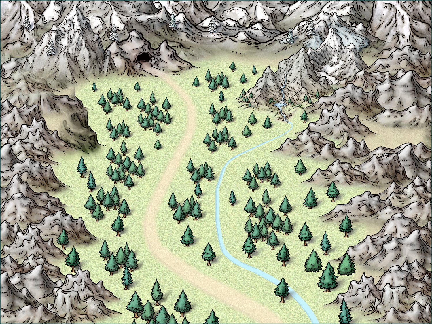
The first map is an overland map of the path to a cave. Since the entire work has to be on one page, there's not much room for such a map. I decided to make it light and in the background like a watermark. The map is cropped vertically on the page so that the path and cave are on the left half of the page. That puts it under the description text and monster information. Again, it's light on the page, but it shows some of the theme.
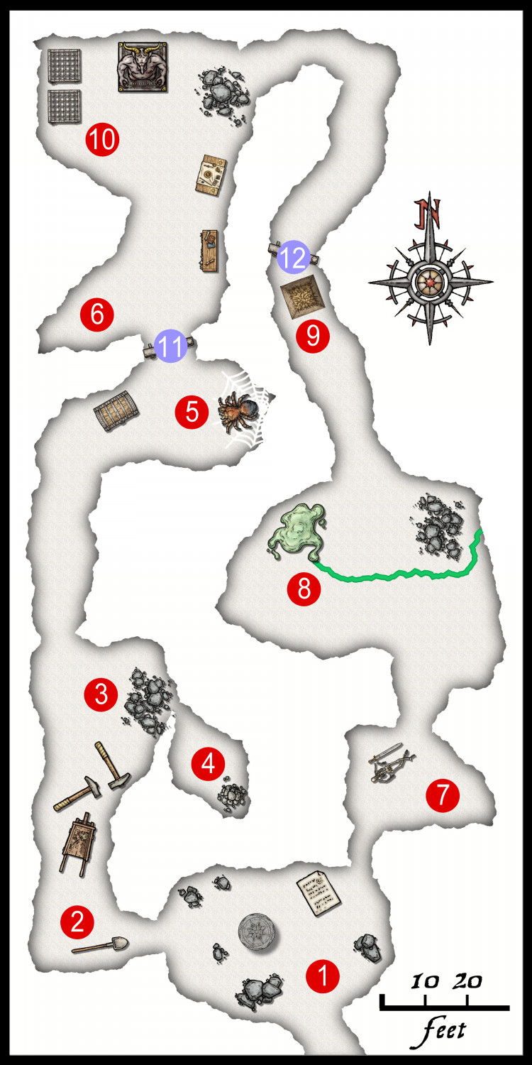
The second map is that actual "dungeon." In this case, it's a cave. I realized that each little bit of space I have on the page is very valuable. I chose to make this map about one half of one column, so roughly a quarter of the page. So, I had to keep things very clear and simple. I'd have loved to add tracks, rubble, and more mise en scène, but it just made the final page busy and unclear.
I hope the explanation of the use of the maps make the design clearer.
I'll post the entry when it gets submitted in July!


Comments
There's certainly a real challenge to fitting everything onto a single A4/US Letter page, so good luck with that! Looking interesting so far, certainly.
There may be a couple of mountain symbols not quite properly sorted in the top left of your overland illustration yet, and perhaps the spiderweb in the caves would be better done in a darker colour, or otherwise highlighted more clearly. Will you be adding a grid to the underground map too, and perhaps a scale for the overland map?
Might help as well if you could somehow get the contest theme to figure in your overland map (for those unclear, the 2024 One Page Dungeon Contest has a "Full Circle" theme).
Yes, let me take a look at the sorting. I spent a while on the spider web, and it was difficult to get it to sort on the sheet properly for a few reasons. I'll try a darker color at your suggestion.. I didn't include a grid. It looked busy when the size was reduced on page, and things got unclear. I may revisit that, perhaps with a subtle color.
The theme of the contest is very evident in the text. I don't want to let too much slip out, but... The cave is really caught in a time loop. The main puzzle is very on-topic. The cyclic nature of the cave plays into that. The overland map doesn't show that, as it's just supposed to fade into the background. That's why I don't want to include a scale on the overland map.
Thank you for the input. I'll try it!
Here's an update. I filled the background with a very simple, blurred bitmap to not distract the eye. I added a grid, thank you for the idea. With the background fill, I thought the dark glow around the web worked a lot better, so thanks for that idea, too.
Excellent! And good luck in the contest!