

[WIP] Temple of Fah (May Annual: Stairs and Steps)
 Royal Scribe
🖼️ 388 images Mapmaker
Royal Scribe
🖼️ 388 images Mapmaker
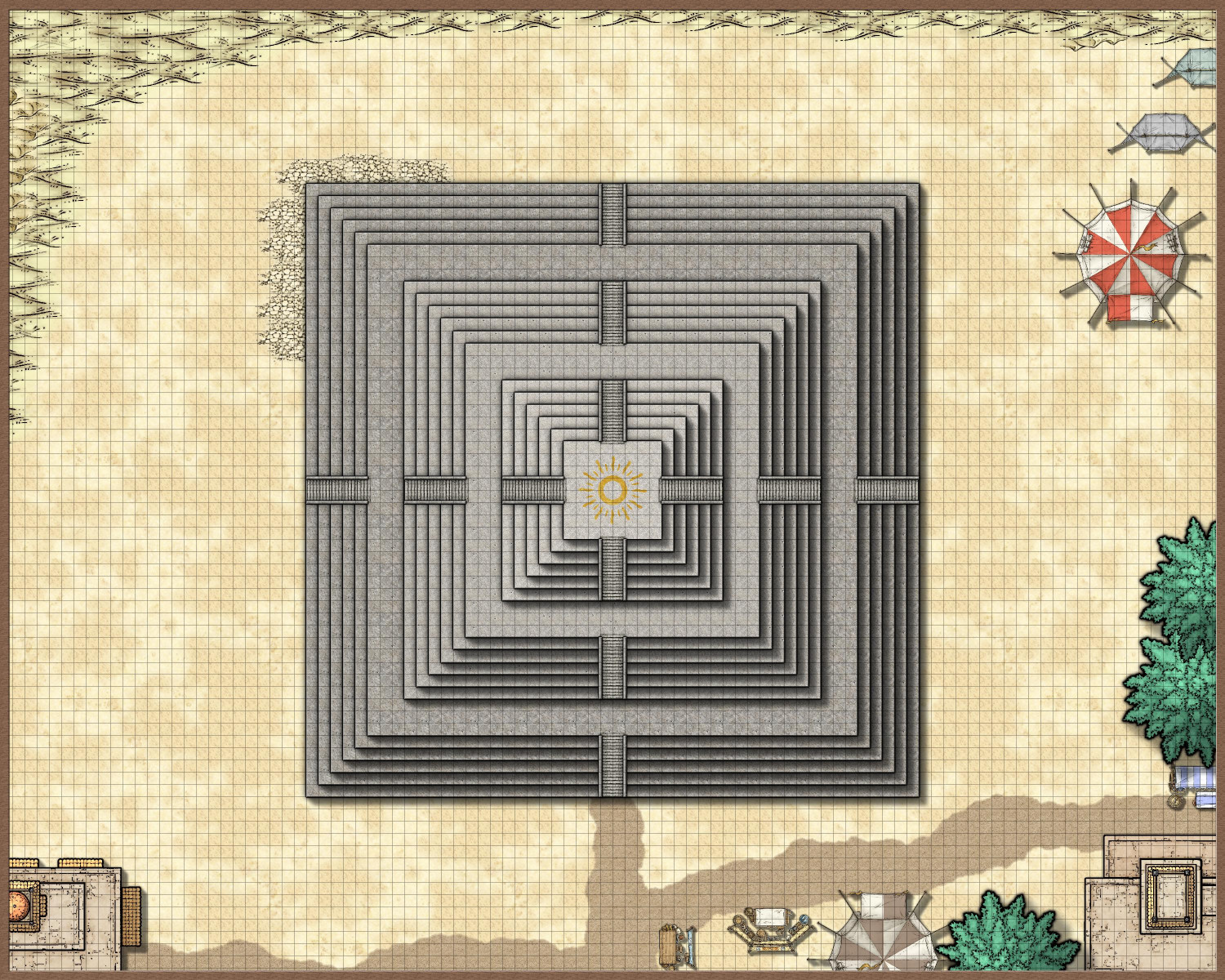
I was playing with the Stairs & Steps annual, and (inspired by a recent episode of The Amazing Race, which I'm finally getting caught up on), I started to design something inspired by the steps of El Peñón de Guatapé in Colombia. I ended up gravitating to Marine Dungeons to do it in, but for my first foray into using Stairs & Steps, I wanted to start with something in the Mike Schley style.
One of the human cultures in my campaign world is a desert culture with a religion loosely inspired by Egyptian mythology. (They also have a militaristic government where powerful noble houses sponsor warriors who fight in grand competitions every four years to accrue points used to determine the number of seats each noble house has in the ruling council. I came up with the idea 40 years ago when I first watched the Olympics on television, and the idea keeps coming back every four years.)
Anyway, their religious temples are in the form of pyramids and ziggurats, and the latest Stairs & Steps annual gave me the impetus to create a ziggurat in the desert. This is designed in SS4 Dungeons of Schley, with bits of SS5 Cities and Schley and SS3 Mike Schley Overland thrown in.
I am seeking aesthetic input on a few things:
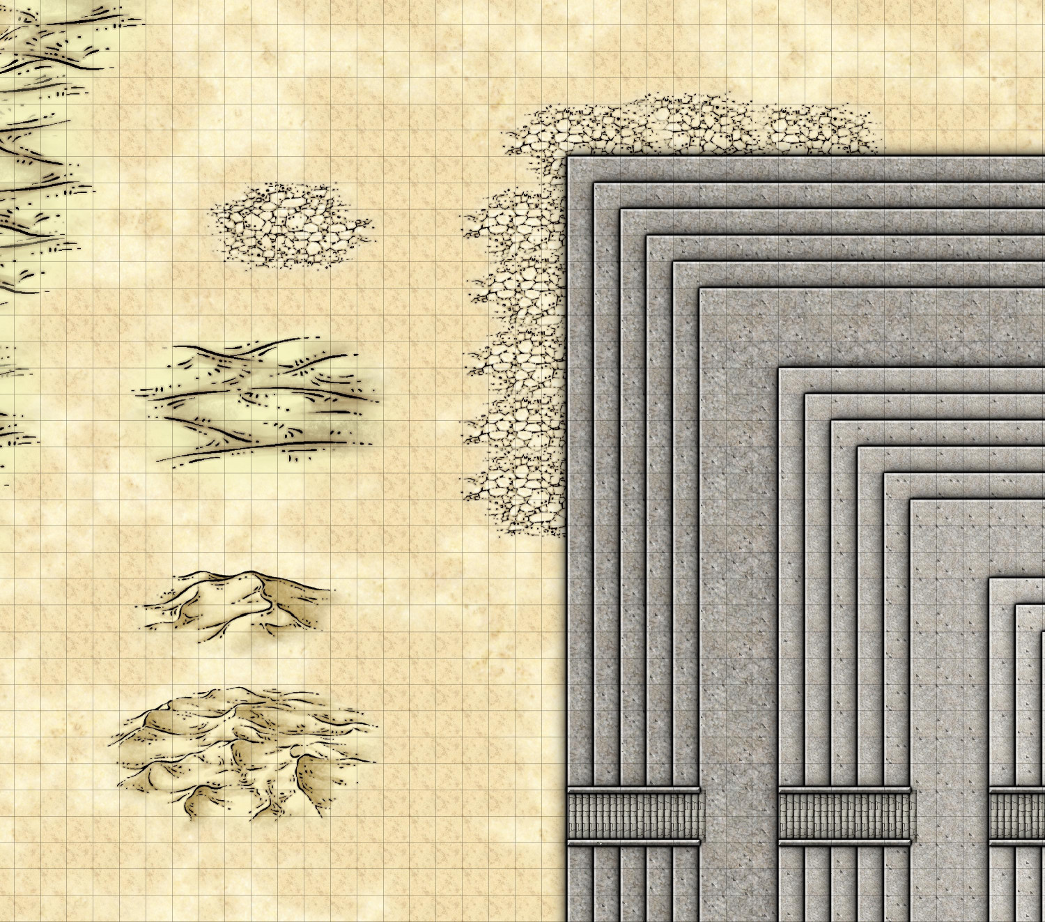
- For the desert terrain, I chose a sandy background as the default and added a layer of a sandy texture over it. But I have also been playing with the cracked seaflats, sand symbols, and dunes symbols. Thoughts on what works?
- I thought maybe putting the cracked seaflats around the border of the Ziggurat and then some dunes near the borders of the map. (One of the images I'm embedding zooms on some examples.) Should I put the sand symbol through? Just on the northwestern part away from the buildings? Not at all? I always triple-guess my aesthetic choices.
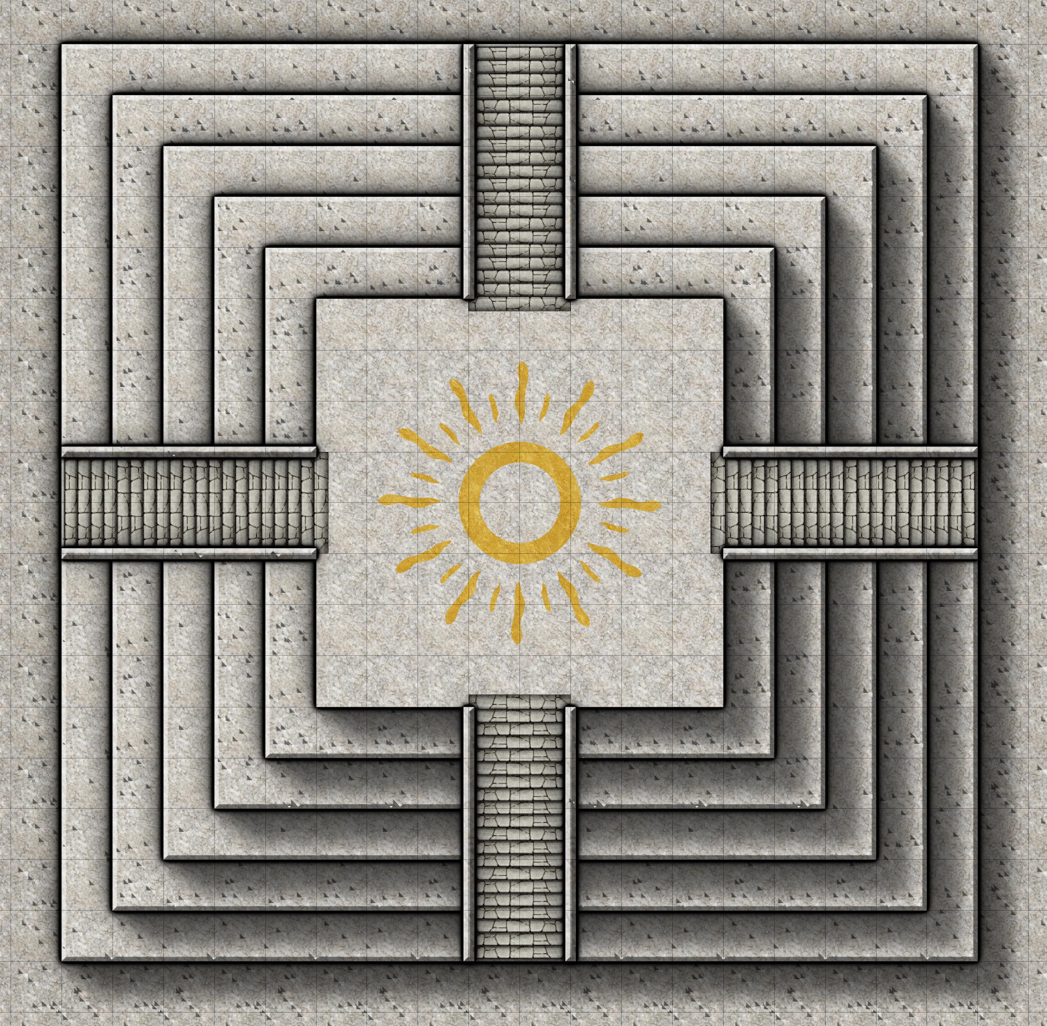
- Inspired by the bronze inlays in Marine Dungeons, I wanted to do something similar on the top of the ziggurat. I created a crude inlay representing the sun, but then used the goldleaf texture from Sue's Parchments. Do you think that works, or should I instead use the bronze texture from Marine Dungeons?
Here is the full map to date, with a few zoomed-in images to illustrate my questions. (Oh, I am aware of the pock-marks in the temple. I plan to put a layer of a dark gray color or maybe the goldleaf fill below each level of the ziggurat to fix that. But part of me wonders if the pock-marks actually make the ziggurat look weathered?)


Comments
That is right up my alley. Very nice.
Made some tweaks, particularly to the desert in the northwest corner. I added a TERRAIN SYMBOLS sheet of cracked seaflats. Over that, I did a second TERRAIN SYMBOLS 2 sheet for the sands symbol. And then finally, a third TERRAIN SYMBOLS 3 sheet for scattered dunes.
Also addressed the dimples in the temple by adding a layer of the gold foil for each level of the ziggurat. I probably won't add more color key "etchings in gold," but I had to add something, and now I'm all set if I do want more.
And recommendations?
To my eye, the pockmarks are too regular in the image to work as weathering. Plus you may find that at different image resolutions, they don't always look the same anyway.
If you want the ziggurat to look more weathered, I'd suggest using fewer neatly-straight lines. Try drawing them instead with a new tool using a low-level fractal polygon, at least in places, and you might want to show some areas of greater damage if the structure has been standing for hundreds to a few thousand years (take a look at the Egyptian pyramids for ideas, for example, and, given the grey colouring, it may be worth looking at some of the more worn examples of diorite statues from the same region for ideas of how they look too). If it's been repaired in places, that might be an excuse to some some subtly different grey stonework over a few "stone/brick" equivalent areas.
Just a thought, but if there are four main staircases, shouldn't they each have a road/track leading to them (even if those are old, worn and hard to make out completely)?
The dunes aren't really working to me, because while everything else is seen top-down, they're viewed side-on. I'd be more inclined to experiment with some terrain drawing tools and textures instead, including trying some of the various darkness Solid bitmap fill options with a suitable bevel or lighted bevel effect to make them look sufficiently hilly and dune-like.
Yeah, I agree about the pockmarks. Once I zoomed in more, it was very apparent that they did not look like weathering. I put a lining layer (of goldleaf) behind each level to get rid of them. I was going to put in a path or road around the circumference of the ziggurat. I will do that, and maybe some more worn/faded roads leading into the desert.
All of the desert dunes symbols are on separate sheets that I can hide to play with other terrain effects. There are five different shades of the partially transparent sand textures. I will play with them at different scalings to see if I can add more dimension. Interesting idea about experimenting with beveling. I will try that.
I've been playing around with Wyvern's great suggestions.
I tried to give the ziggurat a more weathered look by using the FRACTALIZE command. The default settings were way off but I played with it enough to think that with time, I could get it to look right. The problem was that I tried it on a single layer of the temple, and even with just that single layer, it added so many nodes that it slowed everything way down -- and that was just the first of eighteen levels of the temple! So I think my temple won't look weathered after all. Maybe the gods are preserving it. ;-)
Then I hid the desert symbols so that I could play with the different textures and effects to create the illusion of dunes. The Dungeons of Schley style has five sand fills (with 1 being the lightest) and five corresponding partially transparent textures to overlay. The main background in my map was the middle one, Sand 3_SS4. Over the entire map, I also added the Sand 2 T_SS4 texture on a sheet called SAND TEXTURE 1 BASE, which has an inner edge fade to soften it. I then added another sheet called SAND TEXTURE 2 PATCHES, where I drew patches of the textures 1, 4, and 5 (2 already applied to everything, and 3 being the same as the main sand).
For the dunes, I added another sheet, SAND TEXTURE 3 DUNES. It has three effects: Edge Fade, Inner; Bevel, Lighted; and Blur. I then added dunes, trying with first the Solid 10 fill and then some of the sand ones -- but actually, I kinda think the Sand 3 blends in best.
Here's how it looks:
Here's my Bevel settings:
And here's the FCW:
Thoughts? More dunes? More sand patches? More anything else?
As an aside, learning these desert techniques is very helpful. Last November, one of the first maps I attempted was a Blue Dragon's desert lair. I abandoned it, but I've learned so much in the last six months -- time to revisit it!
Those dunes are looking really good in places, and the mix of textures really adds something to the "flatter" areas. You could even add a few rocky outcrops (use rock or cliff symbols, but with a sandy texture on a sheet above them, so it looks like the sand covers part of them), or ruined wall lines.
The reason I suggested only a low-level of partial fractalization for the ziggurat's "layers" was mostly because of the nodes problem, but also because the edges only really need to look a bit "nibbled-at" in places at this scale.
What you could try - though it'll take more time and effort - would be drawing using the straight polygon tool, but drawing the edges as uneven to damaged in places (this is probably the point where you start to feel maybe you should have added fewer steps to the ziggurat overall!). That should greatly reduce the number of nodes. You could do that along part of each straight polygon's area using the Edit option with the appropriate drawing tool. That might be useful, as you'll still see where the original straight edge was, making sure you're drawing the "nibbled" bit inside that line.
Or you could try the Simplify command on each fractal polygon immediately after drawing it, though that may not leave a very satisfactory impression.
Good ideas. Thank you! I’m going to pull out the Tome and study the fractal settings. Mostly I was just experimenting and guessing.
The node editing idea sounds promising — and will ensure that the wear looks like erosion (the fractals also caused portions to jut out, the opposite of erosion).
I've found the fractal settings can take a lot of playing around with to get right; commonly now, I either just go with the default drawing tool settings, or simply use the straight polygon options instead. Every now and again, there'll be a glut of problematic lines show up, simply because the fractal tool has added too many nodes in too small a space (possibly because I've needed to set two "click" points too near one another to get the shape right).
What you can do is just draw a straight guideline you need the fractal bumps to be behind first, and then as each new stretch of line comes up, if it looks wrong, just hit the spacebar key to try another fractal option for that part. (And keep hitting the spacebar, only to wish there was an "undo" option to go back to the one you've just spacebarred past, in my case...😏)
Oh yeah, I keep forgetting about the spacebar option with the fractal draw tool. I was trying to fractalize the existing entities, but not sure I’ll have enough control with that option. Hope to have time to experiment with it this weekend.
I decided against trying to "erode" the levels of the ziggurat. It was a lot to change, and I decided that I will keep the technique in mind next time I do one. Instead, I focused on adding layers of the sand texture to each level of the temple (except for the top portion that the priests are more diligent about sweeping). I tried to vary the patterning by starting drawing from different corners, but I'm not sure that helped much. I might alternate which of the sand textures are used, as I did set each to different scalings. I like the color and scaling of #4 the best but I really should change it a little so you don't see angled paths of no sand like on the north face.
I also added the edge of a mountain using the same techniques as the dunes, but with the bevel isn't smoothed as much, and I used a dark brown earth fill. Maybe I should move the mountain to the NW or NE corner?
Have you thought of using a Color Key to bite bits out of the edges at the top of the effects list (which would mean you only get bits bitten out rather than also added to the line)?
Or maybe using solid colour with a Displace effect, followed by a Texture overblend to add an undistored fill to the distorted outline?
(If those sound like really odd suggestions I've only just woken up this morning.)
Oh wow. I’ve used the color key before — sounds like an interesting idea. The Displace effect with a Texture overblend sounds very advanced! I will pull out the Tome and study those.
I would try the Color Key first. It's easier than setting the other one up.
I tried the color key to nibble away at the textures, and it worked. But even better (and more obvious): I could, and did, add additional sandy patches to fill out the...fill.
But the color key suggestion gave me the idea of using it to nibble away at the temple itself, creating missing chunks (with magenta fractal polygons) and cracks (with a magenta fractal lines). I hope I didn't overdo it, but the nice thing about using the color key approach is that it's a lot easier to remove some of them than it would be to fix moving nodes around, for example.
I had already placed a gold inlay beneath each layer of the temple, but other than the very top, I didn't need it to be gold. I tried changing them to the Solid 10 and Solid 20 fills, but that allowed the pockmarks to return. So I changed it to a brown color and then added a gray inner glow.
If nothing else, the erosion takes your eye away from places where I missed fixing the repeating patterns of the texture.
That looks just magnificent - love the effect of the 'nibbling'.
Thank you! I always forget what a powerful and versatile tool the Color Key effect is.
Very pleased you'd found a good, workable solution to the "erosion" issue.
It is surprising sometimes how little extra you need to do to distract from the repeating texture patterns. Of course, there are others where you struggle to manage this no matter what you try, but hey!
That's just showing off. Outstanding map
Thank you all for your kind words. Love this community.
I'd love to be able to see how you achieved those erosion effects. The discussion went over my head.
Sure, no problem. Once my work day is done in a few hours, I will do some screen captures and exports to walk through it.
Okay, I made some screen captures and JPG saves to illustrate the process.
The first thing to know is that there are 18 levels to the temple, with a wider landing (15 feet instead of 5) on the 6th and 12th levels. And the second thing to know is that every level actually has three sheets:
(1) the main sheet for the level, with the stone fill;
(2) a sheet below it of a different color, because the beveling effect on the main sheet can cause weird pockmarks if it gets confused with the colors below the sheet with the beveling effect; and
(3) a sheet above the main one for the level for the sandy debris.
I called the sheet below the main one for each level of the temple "Inlay," because at one point I thought I might have brass or gold inlays on each level, but I ended up only doing that at the top.
Here's what Level 6 looks like with all three of its sheets on but all of the other sheets hidden (except for the 5th level as well as the stairs, just to provide perspective):
You can see erosion around the sides as well as some cracks (like from the stairs on the south side, as well as a little above the western stairs).
On the "inlay" level below, I put a polygon of solid color. I made it brown, because if it was the same gray as the stonework above, the beveling on the sheet above it would get confused and create weird pockmarks. But I also added a gray inside GLOW effect so that it look gray when it showed through the erosion:
Okay, here's how I did the erosion. First, I added the COLOR KEY sheet effect to that sheet, using the default magenta #6. (Also, it's important to put that sheet effect first on the list, before the Glows and Bevel and Wall Shadow).
This effect tells CC3+ that when it sees anything of that magenta color on that sheet, cut through whatever's on that sheet and instead show the sheet below it (in this case, the brown-with-gray-glow on the Temple Level 6 Inlay sheet).
I then used the fractal polygon tool to create small bits with that same magenta color, as well as the fractal line drawing tool to create the cracks. Here it is with the sheet effects turned off so you can see the magenta color, along with a zoomed-in version to see it a little better:
(There's a fractal crack in the stone above the fractal blobs. You can barely see it but it works when the sheet effects are turned on.)
When the sheet effects are turned on, anything on that sheet that's covered by by the magenta polygon will be cut away, showing instead whatever is on the sheet behind the stone. It doesn't matter if the color key cutout extends onto the white part, because there's nothing to cut away there and the sheet below would have been shown anyway.
Here's what the whole thing looks like with sheet effects turned off.
Crazy how powerful CC3+ is to be able render all of those effects to turn this mess into an identifiable ziggurat.
If anyone is interested, here is the FCW file. (It's slow loading when the sheet effects are turned on because of all of the nodes added by the fractal bits.)