

Advice on what looks better, please, on a completed map

Hi all,
I'm publishing a second novel (first of a two-parter, with the second part coming out in a few months). I've drawn up two maps, one of the land in which the story is set, and the second of a key area in which key story elements take place.
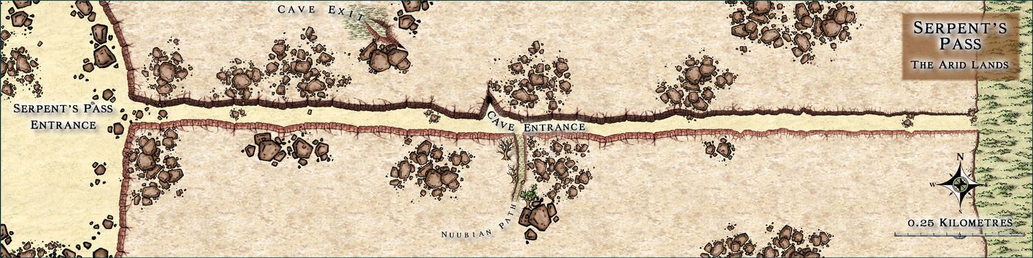
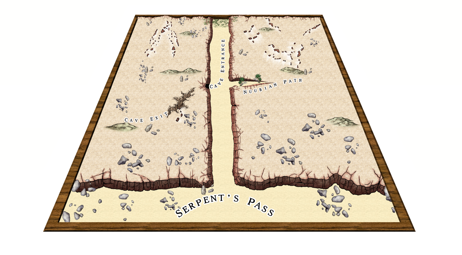
The second map is below. The horizontal one is long and narrow and I'm not sure looks that good in the format of a novel (5.5 x 8.5 inch), but could be considered 'passable'. The other version of that same map was inspired by Christina Trani's "Lich Ream', which is a neat trick in false perspective. I've tried to emulate it and ... it looks ok, I suppose. As best I can tell it looks ok on a page, but without actually buying a print version of the novel it's a bit hard to tell. I guess I could always change it once published (the beauty of KDP).
I'm after your thoughts, if you would be so kind (please and thank you). What is your preference? And any advice in that regard?
(edit) Info on the landscape: It is arid, mostly dry with life clinging on in places. The ground is largely rocky and gravelly with patches of sand (the desert is ~150km north). The pass itself is a split in a long, raised section of land that leads into a mountain range. The sides aren't high cliff faces, but more like really steep inclines still dangerous to climb, between 30 to 40 metres high. At the rear of the pass it is much lower, being two to four metres high.
Many thanks!
Simon
Comments
Hi Simon :)
Both are good looking maps, though I recommend getting rid of the drop shadow on the text on the first top view map for the sake of clarity.
If this is an ebook you should really check what they both look like when they are reduced to the correct resolution for publication. Check in particular if the labels are legible.
If they are for a printed book (and unless the book is going to be printed in full colour), I recommend printing both of them the correct size in black and white to see what they look like. You might find that a black and white style is more appropriate in that case.
Thank you for the advice, Sue :) The book will be black and white. I will print them to see what they look like. I did with the top-view and saw it didn't work that well, which is why I went for a different attempt.
By the way, your two maps Derandil and Merelan City rock! Beautiful to look at! A ton of effort went into Merelan City - must have taken a while :)
Thank you :)
If the black and white version looks a bit muddy in a range of greys, perhaps consider using a black and white style instead?
I remember Merelan City very well, but I have to confess I don't remember Derandil.
EDIT: Oh I remember Derandil now. It was the example map for one of the City Cliff issues. I probably forgot it because it didn't take 4 months to create like Merelan City did.
I agree with Sue, for a b&w printed book, a nice and clear black and white style usually gives the best result.
Yeah, as someone who's been preparing illustrations, diagrams, graphs, etc., for print publication for decades, draw it in black and white from the start, and keep things simple. Some of the delicate lines and shading on the cliffs, for example, may not look great on a BnW print, especially if the size is to be reduced to something like a typical paperback novel page, and the mottled fill will likely end up looking just grubby. Line clarity is often key too; the use of ruled-line hatching and dot-shading in printed drawings and maps didn't end up that way by-chance, after all.
Hy @DrGibbon . I don't know if it's intentional or not, but in both maps the grass is "on top" of the cliffs.
Probably because the grass is on the Sheet Symbols TREES. If you want the grass to be under the cliffs - create a Sheet Symbols TREES (any name - I name symbols trees grass) and move it so that it is under the common sheet symbols (where the cliff symbols probably are).
In this example file I created a sheet "replicating" your draw.
Cheers
@Ricko Hasche thank you for doing the example! I really appreciate it :) It was intentional on my part, to put the grass slightly overlapping the cliffs. In the story that part of the landscape has a tad more vegetation and while I was drawing the map, I attempted to illustrate that by putting grass on both the cliffs and the land. Where I've gone wrong in previous maps is getting lost in the details and, quite honestly, enjoying the process of creating something beautiful. In doing so I lose sight of the medium I'm drawing the map for. But to your point, I probably should just keep it clean.
@Wyvern I do think I'm beginning to grasp that now :) They say in writing you sometimes have to kill some of your darlings. It's probably the same for any other creative endeavour, including map making. I'll look to simply this map and make it cleaner.
@Loopysue Merelan City took you four months?! Jeepers! It shows. It's a gorgeous map.