

Trying to salvage a very old map....
 Calibre
🖼️ 39 images Mapmaker
Calibre
🖼️ 39 images Mapmaker
Hey all,
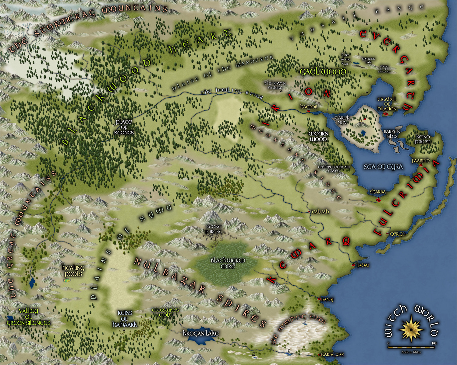
I'm working on this map currently. It's an old, old map of Witch World. One of our players has decided he wants to GM (Using GURPS) and the setting is Witch World by Andre Norton. I drew this map from an online version of Escore. Many of the regions are original to me; some are not. As you can see, the TEXT really needs work. I'll update you on my progress.
If you have any advice, hit me with it 😁
Geoff


Comments
Oh, I should advise: I've used [symbol manager] to already start replacing symbols. Scaling with that tool remains annoying as usual. Also started replacing some of the fills with newer styles as well....slow, tedious work heh heh.
Geoff
Here is the TEXT only:
I'm thinking a change of font. The current one is Tolkien and it leaves much to be desired. I will replace, perhaps with Middle Ages...hmm hmmm. The sheet effects simply must be changed.
Geoff
I am not sure what issues you have with the font, but one thing you could do is use different fonts for different categories of labels. You may also do some slightly different effects with them.
Ok, working on text...
Thanks, Julian
I think Tolkien font should be used sparingly. Still working on focus for text. Once I have that, I can proceed heh.
Geoff
Ok, progress:
Though text at extreme zoom-out is still fuzzy which I dislike. Hmmm.
Maybe an overall increase in text size is called for.
Geoff
If you're using the Outer Glow effect for the text, you might want to try just using Glow instead, as that sometimes seems to be less "misty" when used with text. Or you could try with a pale glow around some of the lettering, not a dark one. Larger text should help, certainly, but you may need to use different sheets for the different text sizes so you can adjust the effects more easily (and also perhaps separate sheets for the darker and lighter text colours).
Thanks, Wyvern. I do have multi sheets for texts and so on. Couldn't live without em 😁
Pale glow, eh? Never thought of that. What do you think about just removing all those trees? Certainly not typical move for our maps here, but could lend some clarity.
thanks
Geoff
PS: no, it's just Glow; not outer.
Well, disliked the pale glow, but some editing has lent some clarity.
Latest version, however, stands in violation of my old typographer Instructor's dictates:
No MORE than 2 fonts/typefaces per design; choose 1 serif and 1 sans-serif font/type only!
What he doesn't know won't hurt him muhahahha
😁
Geoff
Text is always difficult in CC, and tweaking the various glow effects can be very tedious sometimes. I did wonder if maybe the blur was a bit too large on the "normal" Glow effect instead, and that was what was making it look misty.
The pale glow often works better against a darker background, although it can depend what look you're aiming for. Sometimes a pale misty glow will work if the text needs to look like it's looming out of fog or mist too, for instance.
The text's much clearer on your latest version, although one or two labels could maybe be a little larger still (that could be just the Forum image's res, I appreciate). "Howling River" might benefit from being moved off the river line a touch more too, perhaps.
Does using italics or boldface on the same font compromise your typographer as well 😉?
No comments besides AWESOME!
A couple of questions, however.
1) You guys know that there is a Gurps worldbook "Gurps Witch World", right?
2) Does your friend do any write-ups or such, of his games?
Yes, we have that book. I found a jpg of the far eastern part of the eastern continent and just drew it from that. I added alot of my own ideas for regions and cities, etc.
Writeups: what kind? He's not much of a writer; I do most of the writing but in my own campaigns heh heh. He typically just has a few notes for his games.
Geoff
Oh, I'd just love to hear about the logistics of such a game. Not only the Gurps technical aspects, but also how the land is presented. Are all of the players well versed in the lore, or are most of them new to the setting?
"When" in terms of the books is the campaign taking place?
Only the GM and I are versed in the Lore, but the others are coming along. Logistically, we're loading in as much data into the online gaming platform we use. Unfortunately, the copyright holders have only allowed a limited license for the GURPS system, so much of it we have to 'data entry' ourselves. As for 'when', I think he's setting it shortly after or during 'Three Against the Witch World'. He really liked that novel 😁
One caveat: he has decreed that the novels are a 'theme only' and he reserves the right to alter anything he wishes. Fine by me heh. And, the others, of course, have no idea one way or the other.
Geoff
Into the West...
Here is my WIP for some of what lies beyond The Great Mountains, westward. There are many errors, so please be kind 😁
Umm, should I explain how I did this, you think, Ms. Sue or anyone?
I'm not sure it would be helpful or redundant 😁
I've often wondered if anyone would like to know how I do my maps. Only Dak has expressed a brief interest and I got that post late so felt it would be pompous to answer well after the fact heh heh.
So, I'll just put this out there: if you want the FCWs of any of my maps, I'd be happy to oblige. Or, any explanations, etc.
thanks
Geoff
Since you've kindly offered, I would be interested in seeing the FCWs of any of them. I learn a lot by going through sheet by sheet, studying what the mapper has placed on each sheet and the settings for the effects they use.
Okie dokie
Just keep in mind that it's not finished heh.
Geoff
You've already posted one, but I'd love to see the fcws of any map you create for this world.
Are you using Gurps 3rd or 4th edition? How will you handle the magic? As in the worldbook?
Will do.
I'd like to explain what I do, but I'm not sure how much detail an explanation should have?
We're using 4th edition.
Geoff
I incorperated the Gates bringing other People into my Crestar world, as an idea I got from Witch World. There is something in Crestar that uses Philip Jose' Farmer's World of Tiers series.
Awesome, JimP. That sounds really interestin.
Well, I've bitten the bullet and spent hours reconstructing the map. The original was drawn back when I was still learning basics; I'm still learning more aspects of CC3+, of course. So, after grueling hours of scaling, inserting and fighting the COLLAR command like mad, here is what I will be working on for the foreseeable:
This is the entire Eastern Continent as far as we will ever know. My original idea was to just do separate maps for each area; after due consideration, I decided one large map and sections will be cut out to expand as needed---which is what I do for all other maps I draw. Not much on this atm, but I had to merge Estcarp with Escore---wasn't easy and there are still errors, but I can live with these heh.
Geoff
Revised Estcarp:
Progress so far...
Plugging Along...😁
Geoff
I must say, this map is one of the weirdest maps I have ever seen or had to draw/replicate. The continents are only partially shown, but they have bizarre shapes. I suppose it could be because of the ancient war of the Powers. shrug
Oh, and of course, I've altered them as I saw fit. heh
Geoff
@Calibre Re your Text comments earlier:
I agree with your typographer instructor for designs featuring predominately text - they certainly benefit from complimentry sans and serif fonts with one being used for headings and the other body text and low level headings. As the old saying goes; you should the know the 'rules' before breaking them.
If you wish to use multiple fonts on a map go for it but I would recommend using one font per feature type, e.g. Font A for Mountain Ranges, Font B for Forests, Font C for place names etc. Tweaking the glow effects can provide a solid outline for text to make it stand out or you can do the opposite and increase the glow distance and reduce the opacity to provide a light background to the text to make it pop.
Agreed.
Geoff