WIP - first crack at a larger scale city
 JackTheMapper
🖼️ 4 images Traveler
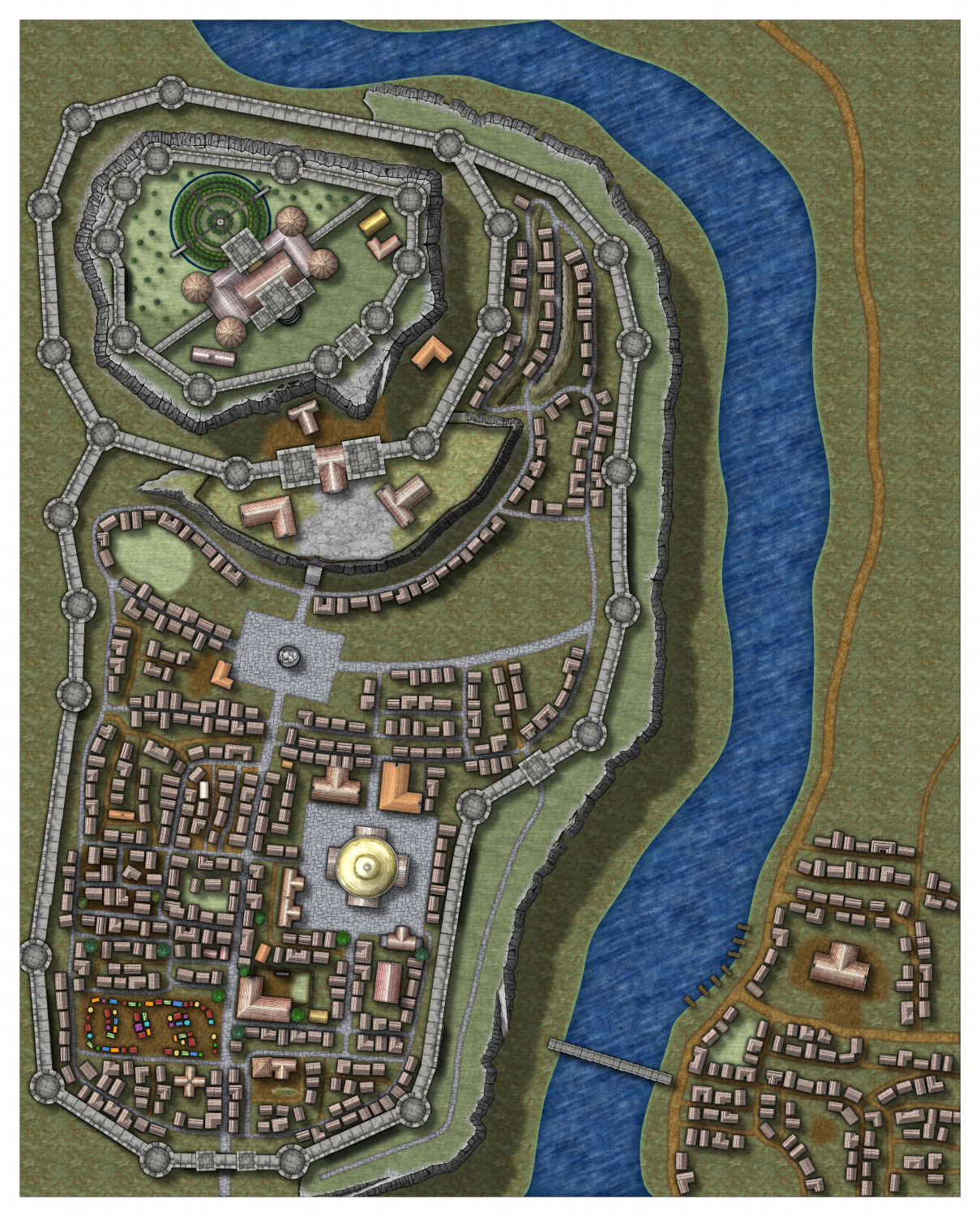
Hello! I've generally just mapped smaller towns and villages and this is my first crack at a larger CD map. Clearly it isn't close to done yet, but it's giving me a chance at experimentation, and I'm eager for constructive criticism and feedback. I'm particularly happy with the circular garden behind the castle in the upper left, and the use of @Loopysue's cliff faces east of that, in the winding road between the castle and outer walls; I think it lens itself well to adding a sense of topographical depth. Definitely aware of some places that need tweaking or cleaning up.
But feedback, please! Quite looking forward to improving this experiment!
Tagged:









Comments
It's looking really good already. If you want a few more tips about using the cliffs, Ralf did a live mapping session on them here.
Watching it now! I sometimes find the cliff tool leaves gaps I have to fill in manually, but I think it's because I resize the symbol before I start to trace--that's the cliff face around the castle, not the one from Forest Trails.
They only really work at the default scale of 1.
You can use them at other scales, but not as a connecting symbol. To do that you would need to right click on the map while you have the symbol on your crosshair, and set the bottom two checkboxes like this, then paste them individually.
Thanks! Underscores the importance of choosing the right size for a map, rather than resizing everything!
Interesting map.
The cliff lines look a bit "Escher" in places to me, especially where they angle back on themselves, and how the different lines relate to one another. Maybe try either using a normal end-slope piece without turning them all back on themselves, or change the shadows on the walls to reflect the fact the walls would have to be the same height as the cliffs to carry on along the same horizontal line onto the clifftops. The other "walls" option would be to make parts of the walls look like they angle up or down to accommodate the clifftop terrains (steps on the parapet walkways, say). You could use a mixture of all these ideas, of course.
I imagine some of the tweaking you mentioned would likely be rescaling a couple of the bitmap fills, and maybe blurring the strong lineaments on the water texture in some manner, as those look quite odd right now.
Good advice, thank you! I'm playing around with keeping the cliff look without the Escher weirdness. I don't think I need the double back at all--it might visually appear like the cliff is there all the same. I love the John Roberts style, but not the water, so I'm playing with sheets on that right now.
Lord, pen and paper is easier, but far less prettier than CC3 can do 😁
If you don't like the water texture in that style you could try importing an alternative water texture from another style. It's probably going to be preferable to using blurs on the existing one.