

Best ways to use stairs (Mike Schley Dungeon style)
 Royal Scribe
🖼️ 388 images Mapmaker
Royal Scribe
🖼️ 388 images Mapmaker
I am in the process of designing an inn using the Mike Schley Dungeon style. I have a pair of stairs, one (the one that's farthest north) going up to the second story where the guest rooms are located, and the other descending down to the cellar.
I've always struggled with how to make stairs inside buildings look right.
- Should both stairs be on the Symbols Flat sheet? Or are there special sheet effects that you would apply to stairs up and/or stairs down?
- Am I correct in assuming that the straight edge is for the side you would enter on this level, and the ragged edge is where it disappears above (for stairs up) or below (for stairs down)?
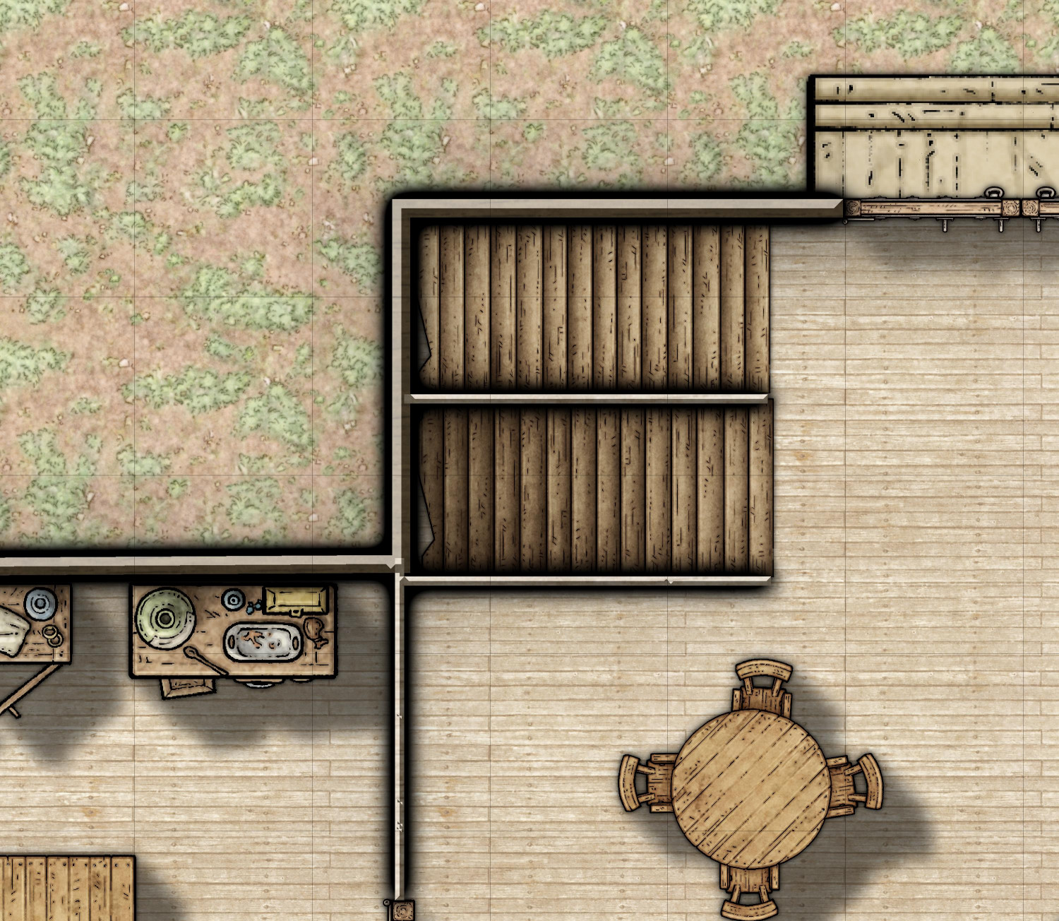
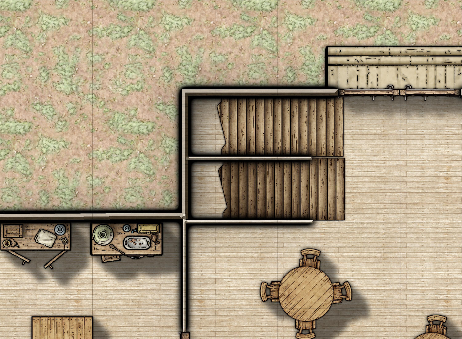
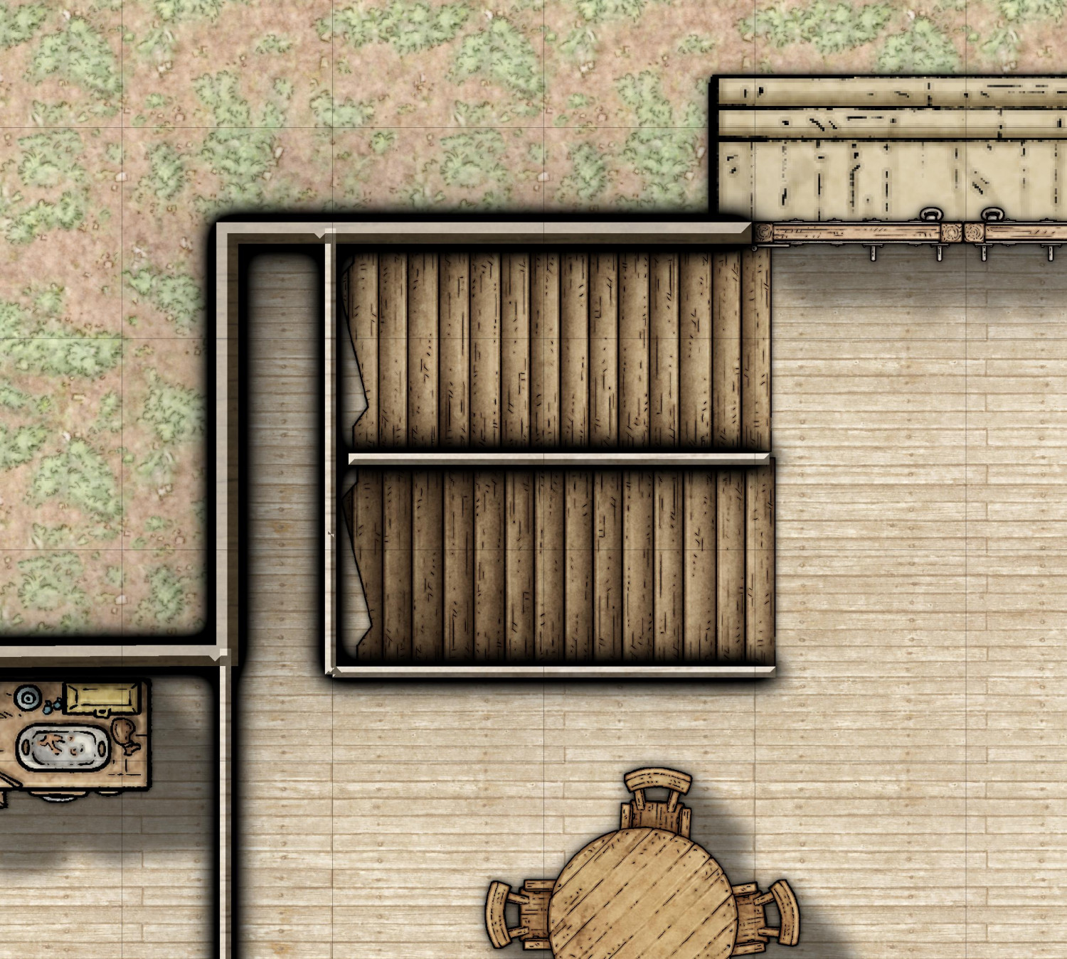
- It seems weird to have the stairs dead-end at the wall -- wouldn't it be better to leave room for a landing at the top of the stairs? But when I pulled them away from the wall, the space looks weird. Is there an effect you'd recommend for that space? Or what about walling it off like in the third image? Are there other effects you'd do for the bottom of the cellar stairs or the top of the stairs going up?
Any thoughts or insights are appreciated -- and if you have examples in your own galleries to point me to, I would love to check them out.

Comments
It's very much a personal thing, and because of that you may or may not find this png useful depending on what you decide to do. It's a gradient shadow that you could use to make the 'down' appearance of the down stairs more obviously 'down', though it may have the result of making the up stairs look a bit flat.
As for leaving space for the landing - that again is up to you. I have a personal preference for the second image, but other's may disagree.
Thank you, I will try that for the stairs going down to see if it helps.
I added the shadow that Sue recommended on top of the stairs going down to the cellar, and I think it's great. Definitely conveys "descending."
I also added the shadow below the stairs going up, so you only see a shadow where it reaches the top -- an attempt to convey a shadow from the floor above. (In seeing this embiggened version, I may have to adjust that shadow slightly to be flush with the north wall.)
For the stairs descending to the cellar, I added a door at the top of the stairs and a half-wall (new WALL SHORT sheet with the Glow effects at half of what they are for the WALL sheet). The idea is that there is a closet below the stairs going up where the innkeeper stores brooms, mops, and cleaning supplies. Wouldn't want them to topple into the cellar if there was no sort of wall there.
I came up with another idea (though I like the above one and will probably use that for the stairs connecting the second and third floors of the inn).
For a different area altogether, I was looking for spiral staircases that go both up and down. I know I've seen them somewhere in my symbols, and I thought it was maybe in the Bogies Map Objects or Dundjinni Archives. I didn't find that, but I did a pair of straight up-and-down stairs. It looks like a cherry wood, so I changed the floors to cherry as well. They don't quite match, though, so I put the stairs on Floors Raised to give the idea that the landing is a step up. I also had to create a custom symbol of just the landing in order to extend the landing to cover the double doorway. (I could have changed it to a single door, but this allows me to use the same landing symbol on the other side of the room for a small stage used by troubadours and bards to entertain for a few coins.)
I also used the shadow symbol that Sue provided to accentuate the shadows going down to the cellar. It looked fine without it, but I think it looks better with more shadows. The symbol also reverses which of the stairs goes down and up. I could have mirrored it, but it seemed fine as is (and this way the broom closet under the stairs going up is a few feet closer).
Mixing styles is pretty tricky - especially when one is a highly refined ink and wash style and the other is photorealistic. It's often less jarring to stick to one style in a map if you can.
Hmmm, good point. I saved a copy of the version done above it with the Mike Schley symbols, so I will go back to that one. Thank you!