[WIP] Dragonlance
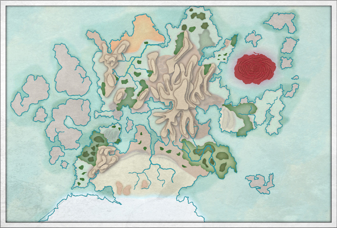
I like the idea of Worthington Historical, so I decided to try and make a map of Dragonlance using that style. I am not sure if it works, but it has given me the excuse to learn it. I am thinking Midgard or Jon Roberts would look better for a Dragonlance map.
Ignoring that, some of my issues are the blending of different terrains. I both like and not like how I did the mountains in layers. Any suggestions are welcome on how to improve the look of maps in this style.
Tagged:


Comments
I like it, but then I like the style :)
You may not have to go so intense with that red whirlpool, though. The style is very pastel.
I like the style too, which is why I tried the style. I've lightened the blood sea a bit.
That looks better :)
Ok, here is everything but the labels.
I think this is the final version, unless someone has some suggestions to fix/improve. I do like the style more now that it is complete, but I am not sure it says Dragonlance to me.
It looks really good :)
Maybe adjust the positioning of a couple of the ocean names just a little to prevent them getting so close to the land? And that Blood Sea label is pretty unreadable as it stands. Maybe it's one of those rare instances where you need to break the rule about the blue ocean labels and turn the label for that one a very pale blue - quite close to white? I wouldn't make it absolutely white, though, because it would stand out too much.
As Sue says, it looks really good.
Re your earlier comment about the mountains; have you tried softening the edges a bit by playing around with the effects, particularly the outer glows? Alternatively, you could reduce it to 2 layers, 1 for the base mountains with a bevel effect and another for the snow topped peaks.
I moved the southern ocean names a bit out. I slightly moved the northern ocean, but I can't move that too far away from land. All I could do is shrink the name to keep it farther from land. I changed the Blood Sea text color and increased the outer glow a bit.
I added a wall shadow to the mountains to give them more of a sense of height. I turned that off so you can see the difference.
That looks better :)
This is amazing, I love it.
I noticed looked at the blog, it was the image for Maps of the Month, so I thought that was cool.
Any chance of the FCW file?