How to blend and shadow
 Arkangel
Traveler
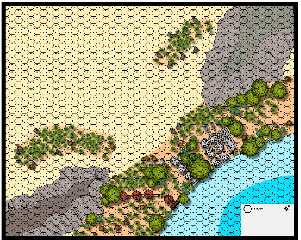
I've been using CC since it first came out but these past few months is really been the first time I've used CC3+ (and associated programs) this extensively. I'm creating a series of locations and associated battle maps for my game, but really want to know more about the sheet effects. This is my latest map: an old (but refurbished) pumping station in the middle of a desert wasteland. What I'm trying to do and can't seem to figure out is two things (and probably more): I want to sort of blur/blend the outer edges of the red patches so they fade in with the sand, and get shadowing and shading for the rocky escarpments. I tried applying both a edge fade and drop shadow, but those turned out not so good. Any help or suggestions would be great.


Comments
It sounds like the effect you need is the Edge Fade, Inner. Make sure your red polygons are on a sheet of their own and add this effect to that sheet. If you can't see any difference you might need to edit the effect to change the distances involved.
Loopysue beet me to 5 seconds.
I would also say you might want to try blur in conjunction with the edge fade, inner, depending on the effect you want.
If I wanted to do shadowing for the mountains/escarpments would a shadow lighting effect be better, or use a drop shadow effect and then darken the shaded sides?
A Bevel, Lighted sheet effect might be better than any of those, since a shadow will appear at the base rather than shade the sides. The effect will need some editing, but playing around with effects makes learning how they work a lot faster.
I didn't even think about a bevel. Kind of like the ones used on DD3 walls, right?
Just thought I would show you what a difference both the lighted bevel on the escarpments made and I added some smoothing to the water edge. Looks fantastic!!
Here is the nearly complete map. I turned the hex grid off, and am going to probably add some more ferns and boulders around the base of the escarpments. I found a whole new symbol set of vegetation I'll be touching up with.
Legend are dificult to read. There is space to increase the font size.
Will the top left corner of the map be used for a massive battle?
Cheers
Yes, unless the PCs decide to swim across the lake. which they lack the equipment for. They'll have to come in from the top left, but that's also where the rest of the enemy camp is, so it's kind of a killing field in between.
Here's a question, and I'm certain it stems from me missing something in one of the videos. How can I make a wall, a "solid" object that neither light nor shadow can pass through? Or is that even possible? Here's what I'm talking about:
The shadow is passing through the wall when I want it to stop all light and shadow.
Unless you use Point Light shadows, no, you can't really block shadows. Sheets are rendered one by one individually.
Technically, since your shadow from the wall is shorter than the shadow from the statue, you are kind of saying that the wall is lower than the statue, so the shadow should technically pass it anyway. These are one of the problems with using wall shadows indoors. They give a nice visual, but they are pretty unrealistic, since most rooms are lit from within, so the walls never cast shadows into the room. Sometimes, replacing the shadows with glows looks better, but that doesn't change anything regarding the statue.
The ways to handle the statue would be to either make the shadow shorter, or use something to overlap it, for example by creating a copy of that floor on a sheet that is after the symbols in the drawing order. That works fine, but can lead to a rather complex sheet setup if you need to handle many shadows like that. And of course, the last option is to increase the length of the shadow of the wall.
I totally see what you are saying. Yes, it does give them a cool visual, but you're right if it's lit inside why would there be such long deep shadows? I mean I can use the lights function (which is what will happen as the place is on emergency power and only a few lights work or flicker. But if I wanted this room to be fully lit, then I should shorten the shadows and , as you said, use the glow on the walls. Drop Shadows are funny because unless you have the right angles, it can make the object appear to be floating - which is nice if that's what you're going for.
I don't recall where, but I either read or saw a video where they said you can set the walls to something to avoid the lights from torches and such from going through them. It said this was ideal if light wasn't going to pass through them like a cave wall. I'm beginning to think that it's more light-based than shadow based.
It's just odd that the shadow doesn't cover the wall, it slides under it.