

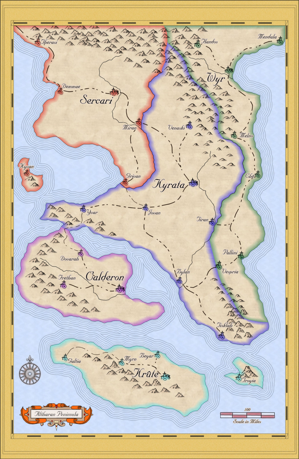
The Altharan Peninsula - a quick map using the Mercator Annual style
 TheIneffableCheese
Traveler
TheIneffableCheese
Traveler
Hi all,
I decided that I want to continue improving my abilities with CC3, so I've decided to try doing at least a map a week in various styles. Some might be used in my home game, but others (such as this one) are more about creating something interesting. Anyway, I threw this together in spare moments over the past couple of days. I'd love any feedback!


Comments
Nicely done . I love this style. Looks a bit light in the vegetation department though. Maybe some trees to show major forests.
My initial vague inspiration was pre-modern Italy, so multiple political divisions in a relatively small area. As such, my brain was in a more political division space when I created this. However the joy of digital is the ability for multiple iterations. So here I've added some forests:
+
I then decided to play around with the city-state / regional names.
I moved them to another sheet so I could apply different effects, and changed them to the colors of the borders and got this:
I am still a little concerned that it is not obvious that the names of the regions are also the same name as the major city-states (think "Athens" or "Thebes" or "Sparta"), but I kind of like the re-enforcement of the color.
Very nice map. I've thought about creating a map in the Mercator style for a while, but never really gotten to try it.
The coloured names are a great addition. They look good and make the names of the main city states stand out, so they improve style and purpose. :)
I might play around with the city state colours a bit more - maybe try some "warmer" colours like dark yellow or orange instead of the cyan or purple, but that's more a matter of personal preferrence and not of "better" or "worse".
So clean and elegant! I really like it! Well done!