

Don't know what projection this is
 jbclaypool
Traveler
jbclaypool
Traveler
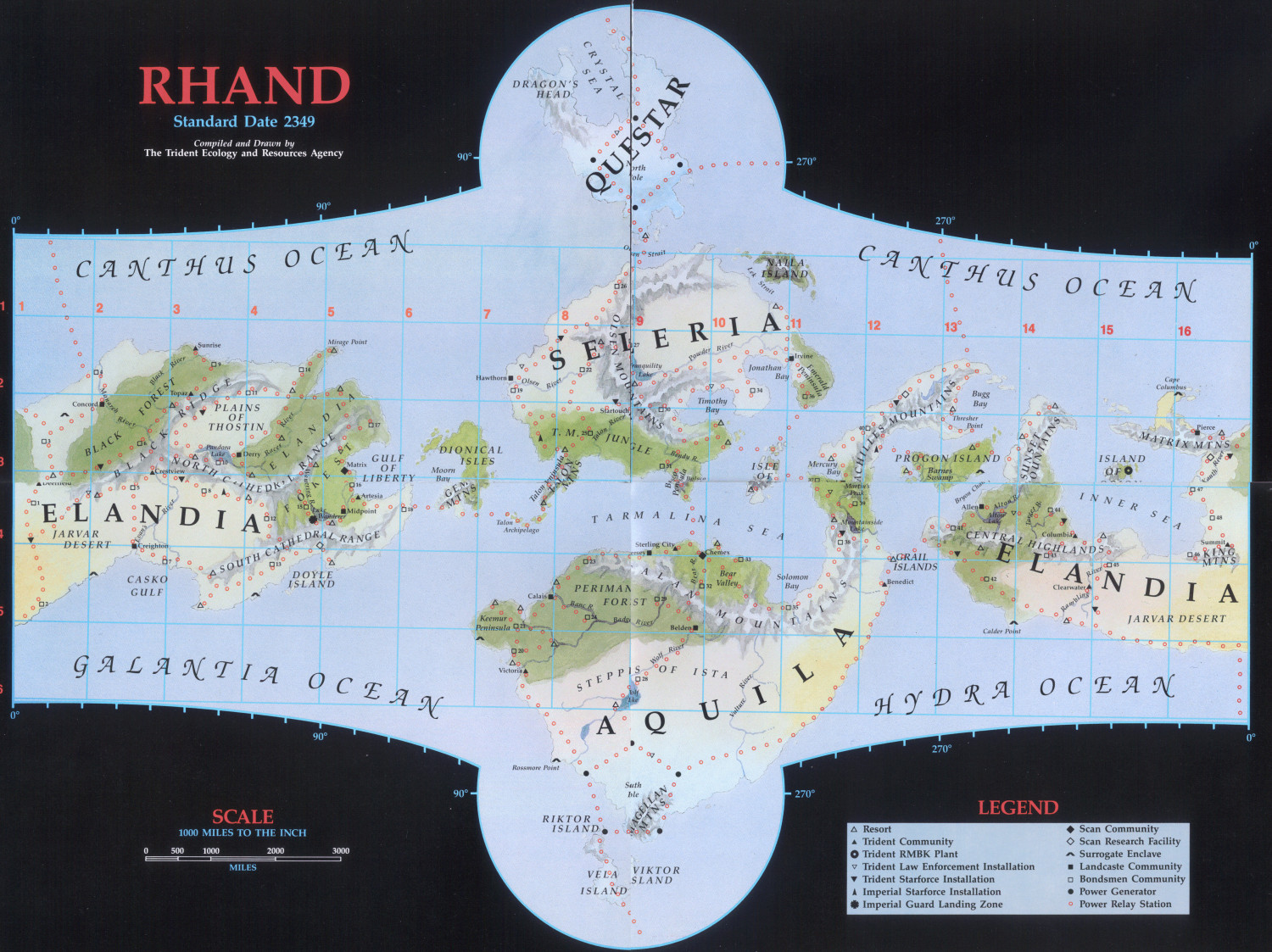
So I have an old game supplement with a map projection that is similar to Wagner Stereographic Endcaps, but not quite. Anyone know what it is?
Comments
I suspect that it's not a well-defined projection but one of those artistic "We've heard about map projections and agree with the principle, but we're artists here, not geographers. This is how it's going to be. And we like scale bars, so you get one of those."
Unless that planet is not actually cylindrical, of course. Something like cylinder or a capsule (cylinder with hemispherical endcaps) would work nicely for what's shown here and the scale bar might not be so inaccurate as to be useless in those cases.
If it's a spherical world, then the square and even graticule would mean something like Plate Carree, but those polar projections would be something else entirely and I have no idea what those swooshing things are off to the sides. The scale would vary wildly across the map, making it worse than useless for measuring.
This would not be a map that you'd want to use for anything other than general "these things are kind of close together and generally the same sizeish". It would be a lovely piece of artwork for a middle manager's wall to show where the corporate offices and sales territories are, for example.
Ok. I'm going to crop the picture and try to fit it to a wagner stereographic encap as a rough template, thanks.
It looks like this world is cylinder shape.
Well, we've had round worlds, flat worlds, ring worlds and disc worlds, so I guess it's ok to have cylindrical worlds :)
After a fair bit of digging around online regarding the game this originated with (Living Steel, by Leading Edge Games, from 1987), so far as I can tell, the planet Rhand was intended to be a planet much like Earth - so NOT a cylinder!
The original version of the Rhand map seems to have been done as a fold-out poster for the 1987 boxed set, and was a much simpler-drawn version than this artistic presentation. That map had two separate rectangles (for the east and west "hemispheres", probably centred on the equator, although no latitude lines were shown, only longitudes), and two separate polar circles. This colour-artwork version was included in a later single-volume work called Rhand 2349 in 1991 (see the RPGGeek page for it). You can see both maps together for easy comparison on the Wayne's Books blog posting here by scrolling down to the "Poster Map" section, about halfway down the page.
The map illustrated above seems to have been an attempt to combine these four original planetary sub-maps into one, so as J Slayton already ably noted, it's not any kind of real map projection at all, simply an artistic view of the planet. Sort-of. By the looks, the scale bar was simply copied and pasted from the map on the poster, and should probably be ignored for this map, as it has no actual meaning here.
All flat maps of spherical worlds have some kind of distortion. If the purpose of the map is met, then it doesn't really matter if the distortions are systematic and reversible.
Also, note that most earh maps prior to the mid 19th century were both incomplete and incorrect. Sometimes these "problems" were due to accidents of survey or communication; other times it was for propaganda purposes.
So, while that map of Khand is in no way "correct", it is precisely suited for its purpose: to give the viewer a sense of place and give their imagination a place to take root and flourish. That's really the best that you can hope for with maps of unreal places, isn't it?
And let us not forget that all spherical maps of flat worlds have some kind of distortion as well.
Is this another "artistic" projection? It's intended to be a hemisphere.
It looks similar to a McBryde interrupted, but flipped left to right.
The hard left and right vertical edges (plus how "Thosreth" and "Kiskaathen" runs into the top and bottom edges) suggest at least some clipping. Judging by how beautifully round the "craters" are all over the place, I would say that this map projection most likely falls in the category of "artistic" rather than analytical. Something as simple as a Sinusoidal projection might be good enough to push this back into something like Equirectangular.