Call of Cthulhu Campaign Maps
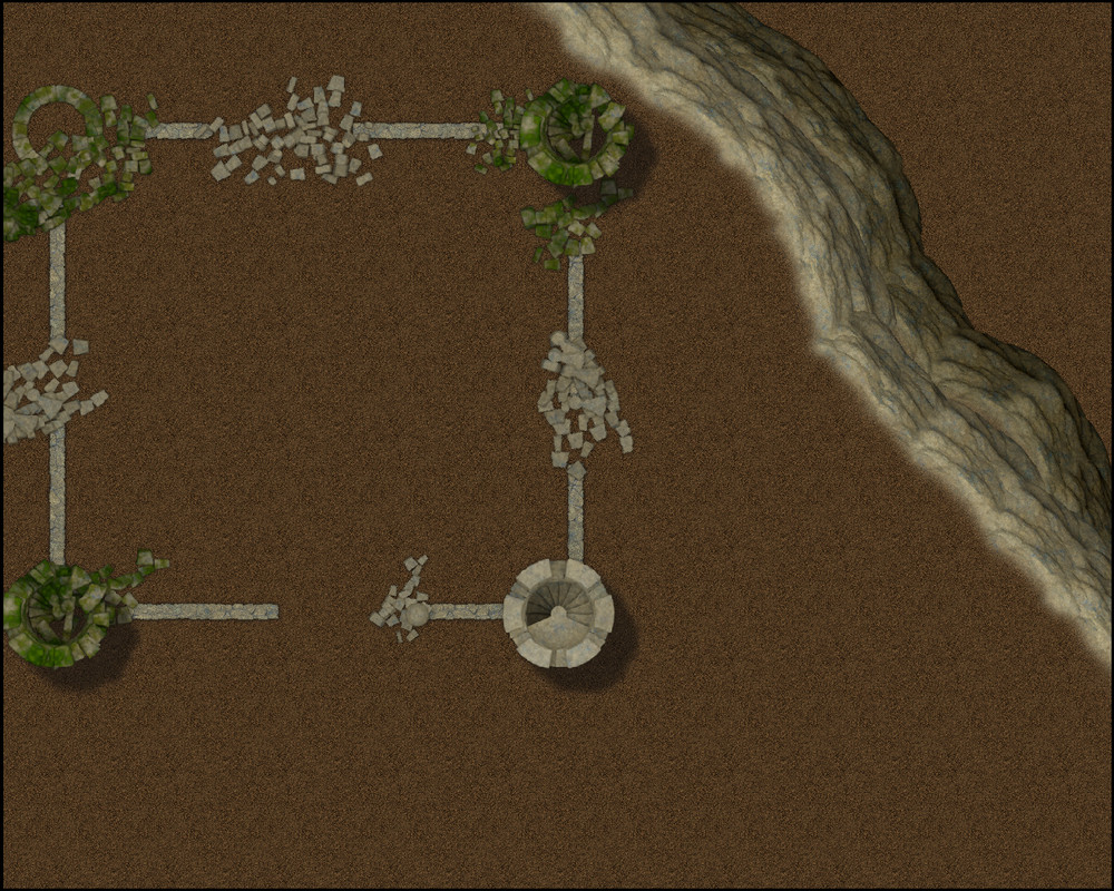
For my sporadic CoC group, we've just started the Fungi from Yuggoth campaign using the Curse of Cthulhu version. The original campaign was written 40 years ago or thereabouts and it shows. So I've decided for fits and giggles to re-do the maps in CC3+.
The first series of maps will be Baron Hauptman's castle - one of the key villains, a vile sorcerer intent on bringing about the end of the world as we know it...
The campaign is set in the 1920's, so it will be an interesting prospect.
This 1st WIP is of the exterior of the castle (no current map in the adventure, just an illustration), next will be the upper floorplans, followed by the dungeons/catacombs.
Who knows, once I'm done with these three, I might send them to the folk at Chaosium and see if they're interested...


Comments
Nice!
I'm doing some CoC maps as well (mostly either for my own story, or loosely inspired by existing ones).
If you check my profile you'll find them there and you're welcome to use them if you want.
Thanks mate. Feel free to do the same, just don't share the ones in the Commission album.
Now I've had to dredge out my aged "Fungi from Yuggoth" to see what this was all about!
Be interested to see how this develops. The book's sketch suggests you could add all sorts of clutter (i.e. bits of external buildings and half towers) attached to the outer front wall at least, which is odd for a castle to say the least! Also, the intact tower looks to be the one to the left of the main gate, not the right, though I wouldn't blame you for swapping things about a bit 😁. Odd there were no better plans for the whole thing though, as the original book's plans seem a bit rough and ready even by 1984 standards!
I'll re-check that tower positioning, thanks for the tip. Could not agree more re the quality of the original maps - obviously cartography was not a priority in the production budget! Looks to me like they're the authors own sketches.
In the early days of Call of Cthulhu, we didn't really worry a great deal about maps, not like today. Also back when Keith's "Fungi" was published Chaosium was still young and in its cottage industry phase.
Yeah, the D&D maps of the period, particularly dungeon and floorplans, weren't that flash either. Different times...
The advances in technology over the last few decades, particularly in regards to DTP and digital art programs, and the grwoth of the hobby have certainly changed consumer expectations...
Oh I don't know. By 1980 we'd already had maps of the quality of Judges Guild's "City State of the Invincible Overlord" (1976), and the T1 TSR D&D module "Village of Hommlet" (1979), as well as Chaosium's own "Dragon Pass" boardgame map (1980). Might be more to do with time pressures and available budgets for specific projects, I suspect. There was quite a bit of artwork and maps in "Fungi", maybe more than could all be accommodated ideally well. The castle's (lack of) maps seem a bit odd overall though, and maybe they came in too close to deadline to be changed. We may never know - lost in the mists of time...
Well, as I've been working with Chaosium since the early 80s, I have a general understanding of how things were done...
I don't doubt it Scott. I was though really responding to Jim's comment about D&D maps back in the early '80s not being so great either. It depends where you look, I suspect, and I was using all the products I mentioned when they first appeared, so my memories of the maps back then aren't nearly so negative. I did wonder if the Dragon Pass map (which is still my favourite board wargame map) had been done as a special item, given the central importance of the map to the game, but again it's a high-quality map from the very early 1980s.
Some maps back then were good, but my maps, which the players never saw, were well... average.
I should have said some of the maps…
There were some excellent maps and some that were not so good. In particular I’m referring to the old-school blue maps in comparison to say the levels of cartography from D&D 3.x and beyond which is really where my TTTPG journey started in around 2000. I still have nostalgia for those maps and they have their place but when you compare to a Mike Schley map…
Any module from the 1980s, were typically blue maps from TSR. I kinda liked them, but they more relied on text descriptions than also showing symbols on the maps. I still have them.
I still think of the blue maps as "new-fangled", but that merely dates me! Some of those were so poorly printed though, you could barely read them (from what I saw, anyway), aside from sometimes being rather too basic for their own good. The hex board wargame maps by companies like SPI and Avalon Hill were pretty much the high-point of gaming cartography during the 1970s, though some were better than others. The Judges Guild "Wilderlands" hex maps, and especially the Dragon Pass gameboard, moved towards more "real" looking symbols, partly what attracted - and still attracts - me to them.
I inquired at a game store about 1980 why those maps werre blue, and I was told to prevent copying.
White on blue or black on red doesn't copy well in old copy machines. Not impossible, but it did make it more challenging.
But mostly, I suspect, it was because "that's what everybody else is doing."
I am running a CoC campaign is well on Roll20 and looking for resources to create maps with the right atmosphere.
The annuals provide some great styles; Par Lindstrom's, Moody Mansions, Modern Journeys (overland), Horror House & Cthulhu City, the 1800's floorplans, the 1930's street map and overland map, Dracula Dossier, Early Modern City. Not to mention, o I won't, the Wild West style if you're playing Deadland SW or Down Darker Trails (Cthulhu). Plenty to keep you busy!
Thanks JMAbbott I was looking at a few of those annuals and I am in 1923 SD at the moment but I have a trick up my sleave to get to Down Darker Trails. In the Maps for 1920's I was thinking of Trying the Western Style but also bring in some more modern style elements. Moody Mansions is one I have not looked at closely but will since it is in your list above.