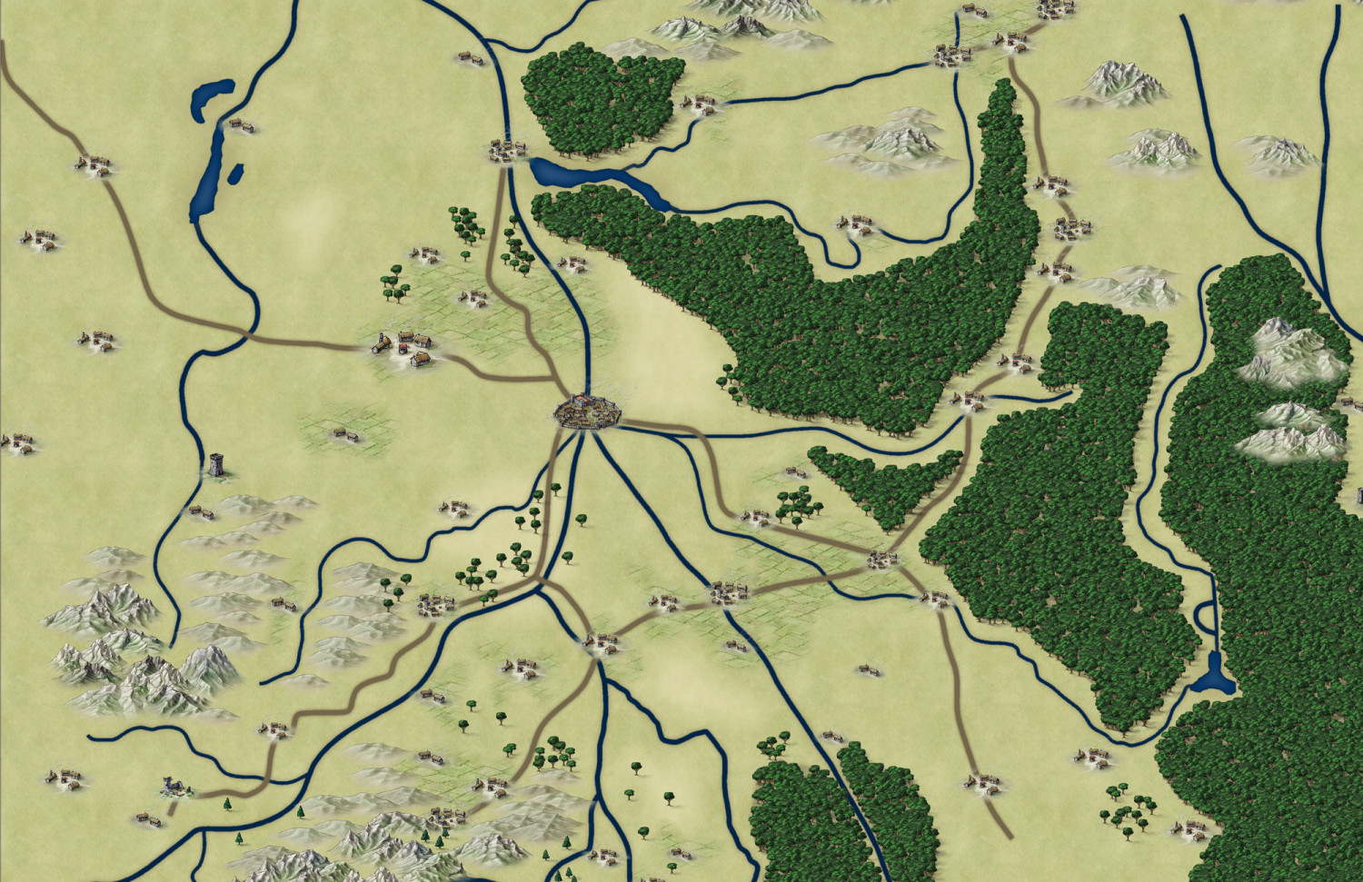
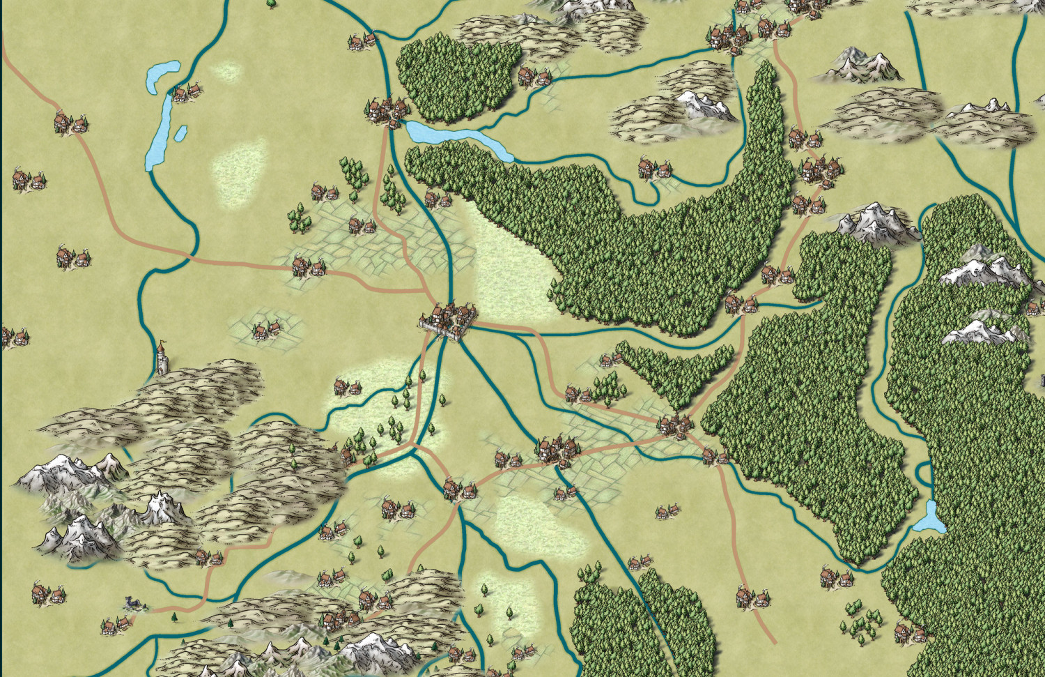
Which style?
What do you think - which style is better? I'm recreating the map for our current WFRP's "not-campaign". My favourite style is Mike Schley - but I'm currently making a set of maps for our new world in this style so I thought I'll choose Jon Roberts for a change. But I'm not entirely sure it was a good idea...
Note this is a work in progress, also switch to Schley is not completed (done for testing purposes). What do you think?
Best Answer
-
 JulianDracos
Mapmaker
Darklands is an annual and it does have farmlands.
There are two aspects as to why Schley looks dated to me. First, Roberts has a crisp style with higher contrast and better blending. The trees have a nice strong dark green. The water is again a nice dark color. The mountains/hills easily blend into the land. Schley, on the other hand, has a more muted color. Things are not crisp. Its sort of looks handrawn but not exactly.
Second, Schley still just reminds me of dated D&D (which makes sense since his work has been used in D&D for a long time.) D&D = generic and old to me. It is not something that I associate with being cool nor a grim/dark style setting.
The best I can explain it is the difference between gloss pain and matte paint. Gloss almost always looks better to me that matte. Schley is matte to me. It looks ok, but it takes a lot of work for it to wow me. Other styles are gloss, which means they are going to look better to me without much work. Part of that is due to the artwork and part of that is due to more contemporary styles have more involved sheet effects.
However, if you look at any of Ricko's art, which typically uses Schley, you can see how awesome things look if you have the skill.


Answers
I guess it depends on what you prefer. I find Mike Schley to require too much fiddling to look amazing. Meanwhile, there are many other styles where it takes minimal effort. But it depends on taste. As a general taste of you maps, I prefer Roberts. Schley always looks dated to me based on the art style, color selection, and the age when the style was created (art is often a product of its time). But it really depends on what you like.
The best thing about Mike Schley is that it is the default. It has the most symbols and they keep getting added to.
For me, I think if I were doing a WFRP map, I would use Herwin Wielink or maybe Darklands just because those styles seem to fit the setting better.
Yes, Wielink is great, but I already have maps in this style for our earlier campaign so I wanted to choose something else. Does Darklands have farmlands? It's a nice style indeed and I may consider it (it's in annual, right?). But you surprised me - to be honest I thought Roberts looks dated, but I guess it really depends on one's taste.
Darklands is an annual and it does have farmlands.
There are two aspects as to why Schley looks dated to me. First, Roberts has a crisp style with higher contrast and better blending. The trees have a nice strong dark green. The water is again a nice dark color. The mountains/hills easily blend into the land. Schley, on the other hand, has a more muted color. Things are not crisp. Its sort of looks handrawn but not exactly.
Second, Schley still just reminds me of dated D&D (which makes sense since his work has been used in D&D for a long time.) D&D = generic and old to me. It is not something that I associate with being cool nor a grim/dark style setting.
The best I can explain it is the difference between gloss pain and matte paint. Gloss almost always looks better to me that matte. Schley is matte to me. It looks ok, but it takes a lot of work for it to wow me. Other styles are gloss, which means they are going to look better to me without much work. Part of that is due to the artwork and part of that is due to more contemporary styles have more involved sheet effects.
However, if you look at any of Ricko's art, which typically uses Schley, you can see how awesome things look if you have the skill.
Thanks!
I particularly prefer the Schley style for small areas (kingdom, zone map, towns, places etc) and not large maps (continent or mundi).
In the community atlas for example I used schley for both large and small maps to follow a pattern. however for my private maps, when dealing with entire zones of realms I opt for other styles (like Roberts or Herwin Wielink, 13th age or Annual Ancient Realms for example) for maps of large zones, and I use Schley to map small areas.
The reason for choice the Schley style comes from the huge amount of different icons that allow for more variety of subjects.
That said, I particularly love John Roberts' style but unfortunately it's very poor in icons, which could have been remedied with the update he's had recently. It wouldn't be bad as a suggestion to profantasy also working with monthly content of new icons by John Roberts.