

Farveld - I'm having problems with which structures work best
 HelenAA
🖼️ 19 images Mapmaker
HelenAA
🖼️ 19 images Mapmaker
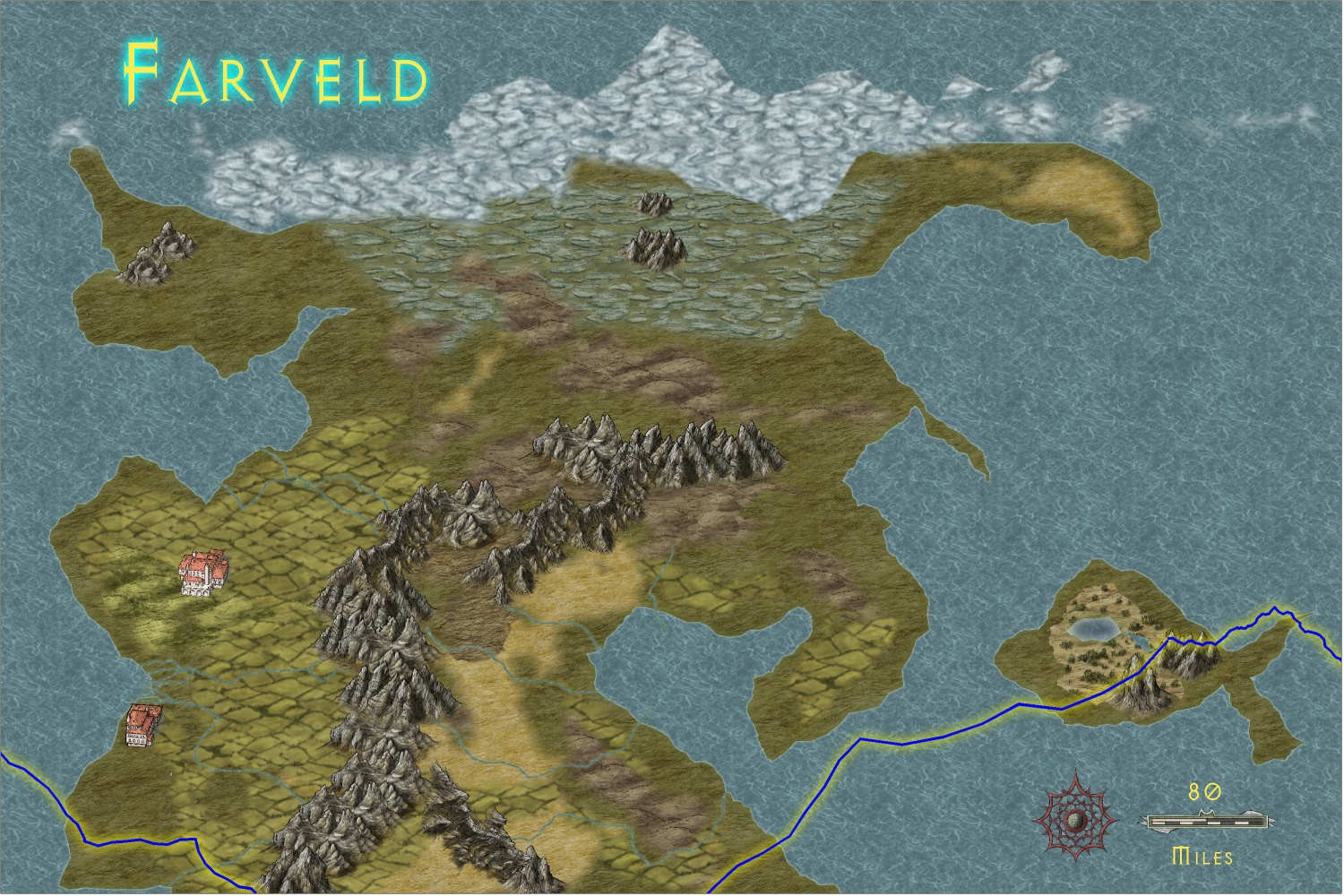
This version has got a couple of SS6 symbols but I don't know if I like them. Please help.


 HelenAA
🖼️ 19 images Mapmaker
HelenAA
🖼️ 19 images Mapmaker
This version has got a couple of SS6 symbols but I don't know if I like them. Please help.
Comments
I am no expert, but to my untrained eye they look brighter than the map. (If that makes sense). The first thing I noticed were the buildings, then I looked at the map. Maybe choose a colour where the walls aren't white... I just bought SS6 so I honestly don't know if there are any like this.
I do really like your map.
Yes, I agree with Maenoferren.
The perspective match is good since both are isometric styles, but the tonal contrast is a little harsh. Herwin Wielink is quite a dark style and not easy to find a match if you start mixing styles. You could experiment with sheet effects on a separate sheet for the structures, but you would have to use the DELAYDRAWSYM function and set it to zero every time you open the map for colour modifying sheet effects like Adjust Hue/Lightness, or Colorize to be applied to the symbols. I also have some doubts about whether the SS6 symbols will look good if they are generally darkened, but there is no harm in experimenting if you really want to keep them.
Alternatively, you could use the native structure symbols within Herwin Wielink, or chose some from another overland style that matches the general darker tone a little better.
I would go with the native Wielink symbols. I can just tell my looking at them that they are drawn in very different styles.
However, if you are going to stick with SS6, then maybe use the vari-color symbols? Pick something dark. Maybe even using a small drop shadow effect might help.