Steampunk Overland Proof of Concept
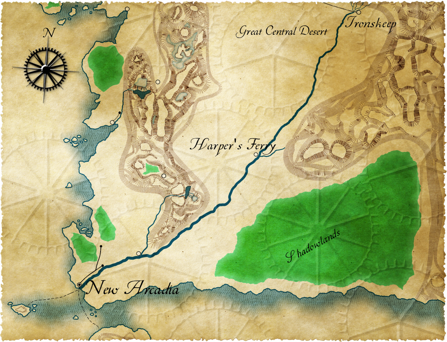
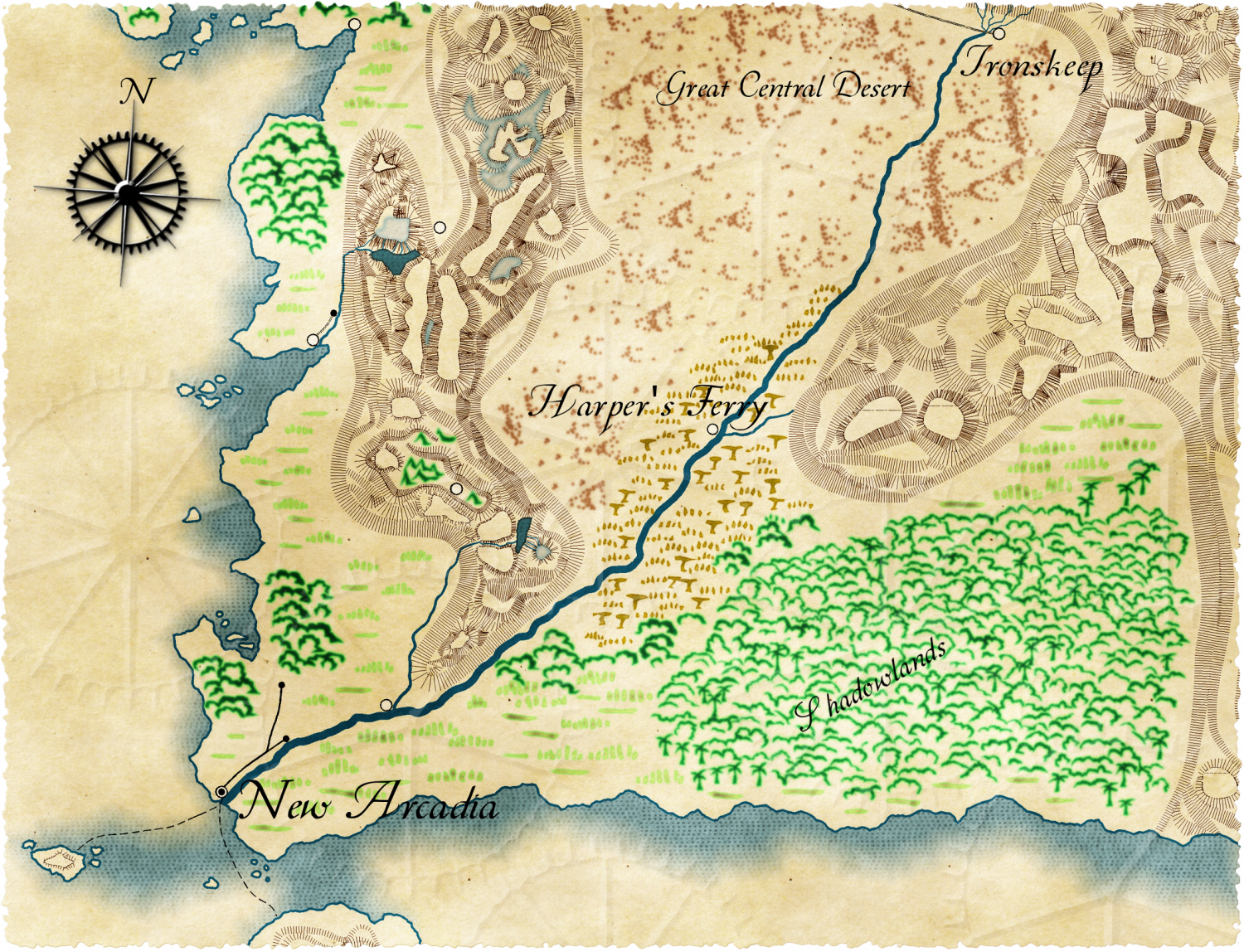
I looked at some of the maps from the Victorian era. Many of them look like older versions of our current map styles. I was able to look at the topographic maps to get an idea of something that I think, at least in terms of the mountains, fits a steampunk look.
However, there really weren't any symbols used on those maps. Some of the US Geological Survey maps from the late 1800's used color for at least tree areas. Mostly these maps were concerned with mountains and water. I decided for two different approaches. One is to try and use color to indicate tree areas. The second I used symbols from the landform. I am not sure I like either option 100%.
While I wanted to do everything in CC3, I decided to make it a bit easier on myself and use GIMP for a bit of post processing. The maps do need some more labels, but I am tired of messing with them since I just wanted to see what I could do with this style. I am going to play around with some of the other styles in an attempt to do something steampunky.


Comments
Looks good.
What parts are you postprocessing with GIMP?
I do like the second map best.
I like the symbols on the second map for the forest. The other symbols I'm not that sold on. But I am more inclined for the second.
As for GIMP: distressed border, aged paper, compass, and gear background. As I had to use layers, some of the colors got changed. Here are the original images without GIMP so you can see the difference.
The only suggestion I have about the forests is to reduce their scale - looks out of place with the scale of the mountains - ditto the other symbols.
I see what you mean by the scale now. The mountains have small lines. One of the reasons I did it this was was because I figured the map makers wanted to be lazy. But, I guess is they were to spend all of that time on tiny lines, they might spend a bit more time on the other symbols.
One of the reason I am not 100% happy with the symbols is that they are too think in comparison to the lines for the mountains. They look a bit too hand drawn compared with the lines for the mountains. But, there is nothing I can do about that since I am using two different styles.