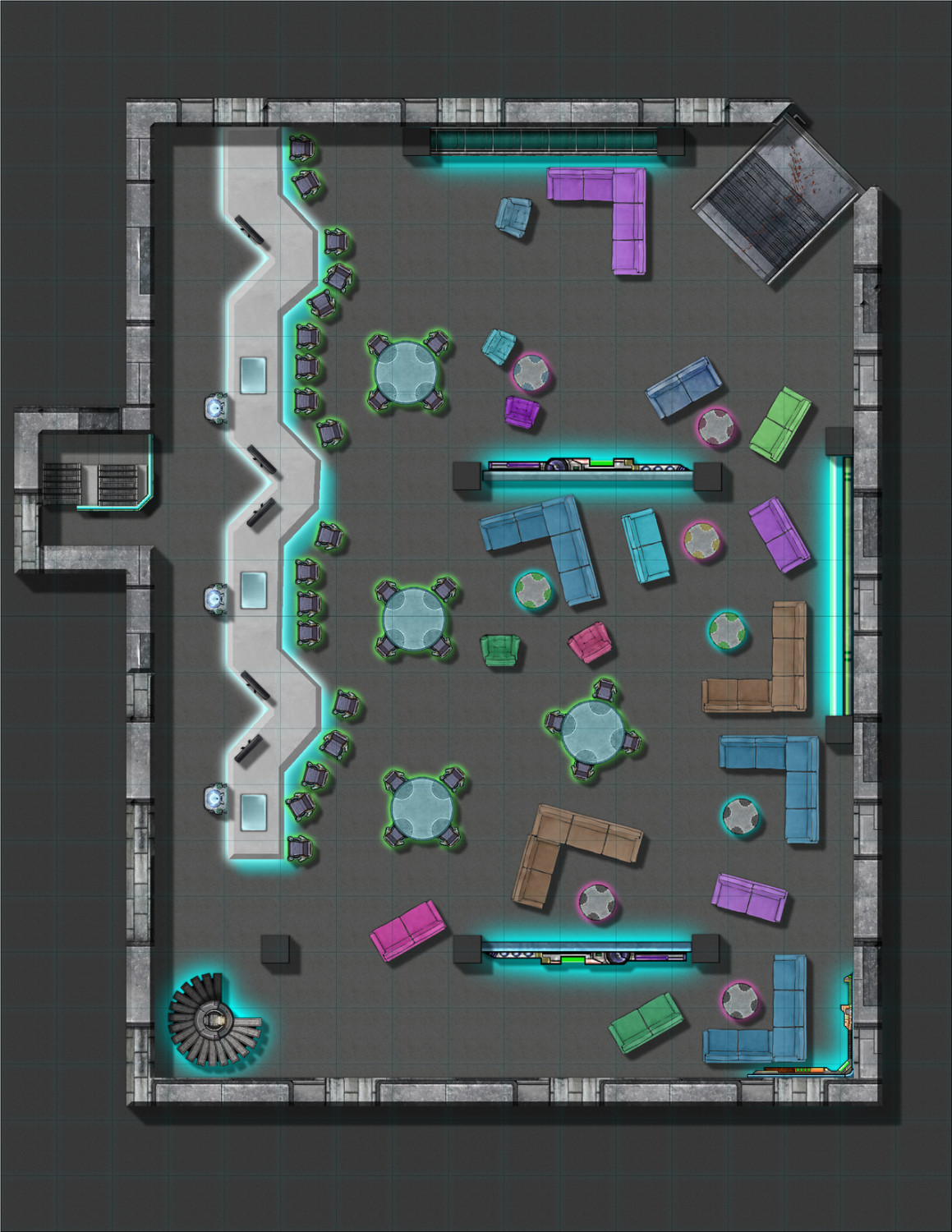
My First Floorplan: Cybperpunk Club
Here is my first attempt at a floorplan. I used SS3 and Cosmographer. The only parts I know I am unhappy about are the background/floor. I would also like to make make the lighting darker for the club. Not sure how to do that in CC3+.
Any ideas on how to improve this or make it feel more cyberpunk? CC3+ doesn't offer a lot of symbols/fills that are suitable.


Comments
Nice map :)
I'm not familiar with either Cosmographer or with using SS3, but if you can switch the lighter grey floor for the darker grey floor that will make the club look darker than outside for a start. Then if you want to go even darker use a Hue/Saturation Lightness sheet effect on the floor.
Cool :) I need to do something modern, too - haven't really gotten into the modern floorplans yet.
You might want to go for broke and activate lighting.
Add the "Wall Shadow, point light finalize" effect to a rather "high sheet" like the map border, then start adding coloured light sources (turquoise around the "neon furniture" and maybe a different colour behind the bar/ near the entrance).
Thanks for the suggestions. I made the changes. I never worked with the point light before. I had to learn how to do it. It is very useful. I only watched half of the lighted dungeons tutorial so maybe if I watched the rest I would learn even more useful tricks that would help with this map.
There does seem to be an issue with the lights on export. There seems to be a strong band of light making a rectangle near the top. That is followed be a sudden darkening. That is not how it looks in CC3+ I have adjusted the angles and intensity, but it doesn't seem to go away on export. The colors on the light also don't blend on export. Maybe I need to turn variable light back on?
have you set EXPORTSETMPPP to at least 40000000 ? this may help when exporting the image.
I never messed with that command. I just did now. It helps some, but there is still a strong dividing line in the center that doesn't exist in CC3. I might try exporting in PNG to see if that makes a difference.
Try increasing to 80000000 - helped on my aurura image. what is your anti alias set at it should be at least 35% but don't go too high.
Ok use the following setting to render the image.
Enter this command:
EXPORTSETMPPP - enter key
80000000 -enter key
then do your save as and select the image type you want and adjust options as below if needed. You can change the Width and height if you want but don't go too far above 35% antialias
Here is how I set up the options in the save dialog before saving the jpg / png
Also if you want editing lights to be easier create a sheet for each color and make sure you put each color light on the correct sheet. That way if you want to edit the pink lights hide all the other color lights and your light list will be easier to deal with.
So following Jeffs instructions, here is what it looks like now:
Any other suggestions?
Not really - apart from "Turn up the volume and have fun". 😎
Maybe I'd choose a different background around the nightclub (something from the network maps to emphasize the "Cyperpunk-Feel", or maybe even solid black) but that's more personal preference.
Great map. :)
Yep looks good now. Glad I could help. The lights behind the bar don’t look so strange now.
You have a purple/pink light in the upper left corner that appears to be set at 180 and facing the wall. It has a very hard line caused but the setting but the same corner in the lower left has a 360 light. I would change that upper light to 360 to remove the long harsh line it is creating unless that was the intent.
Try changing the light at 33,187 from 90 to 360.
Global effects like point lighting really require that the whole drawing be exported in one pass for best results. The EXPORTSETMPPP command sets the maximum number of pixels in an export band before the drawing needs to be split to another band. There is also a 10% collar around the export image to allow for effects like blurs and fades to bleed properly off the edge of the image, so that needs to enter into calculations.
In this case, if you want a 5000x5000 image output with a 35% antialiasing, you'll need a 6756x6756 image (shown in "work size=" below the antialias slider) plus 676 (10% of 6756) pixels on each side for a total of 7432x7432 pixels needed to get a single export band. That's 55234624 (about 56M) pixels, or slightly more than the commonly-recommended 40M pixel value for EXPORTSETMPPP, and much larger than the factory default of 4M pixels.
After a little calculation, 5000x5000 at 15% antialiasing (5617x5617) will export as a single band within the commonly-recommended 40M EXPORTSETMPPP value.
Setting EXPORTSETMPPP hugely larger than the smallest amount necessary doesn't normally cause problems, but there can be times where an export will fail if EXPORTSETMPPP is set very large and the requested export size ends up being than can be provided due to memory fragmentation. In that case, a simple restart of CC3 can be enough to allow the export to go, but sometimes a little manual calculation may show that the export just really isn't possible in a single band. The maximum number of pixels that can be generated in a single band will depend on the mix of effects used in the drawing, so it's hard to give a hard value that will commonly work.
There was no light at 33,187. I might have moved or deleted it. I tried altering lights in that area, but it didn't seem to help. Anyway, I just deleted all the lights back there, created a new sheet for that part, and then redid the lights. I think it looks better. I added a few more symbols. Since this is for Cyberpunk Red, I decided to go with a red background. I thought about the computer system stuff, but wasn't sure it would work.
Cool. Like the red background really well.
I think the only think that could be added is the club's name and a scale bar - Maybe in glowing red... ;-)
But for playing, it looks great as it is.
Yep looks much better. Good job on the map.